Thursday, May 1, 2014

Can an Artist Control Her Viewers’ Perception?: Bobbie Burgers, Flowers, and Two Burdens of Time


Once it leaves the studio, a painting ... acquires a social identity and a life of its own, being priced, bought, sold, loaned, shipped, stored, exhibited, evaluated, restored – an independent object, a possession now belonging to someone else, a commodity which can belong to anyone.  
--James Breslin, Mark Rothko: A Biography, p.305

Mark Rothko and his contemporaries wanted their audience to see that abstract paintings were not haphazard daubs of paint; they were about something. Rothko, William Baziotes, David Hare and Robert Motherwell founded a school of art called “The Subjects of the Artist” in 1948.  The school stressed the centrality of the subject, a difficult thing for a mid-twentieth century audience to understand.  Many viewers, at the time, rejected abstract work as merely decorative.  (Even now, pricey furniture catalogues offer abstract prints for sale, together with rugs and sofas). But interior design was not the intent of the New York School

Robert Motherwell, the most articulate of the group that would come to be called the Abstract Expressionists, wrote that

An artist’s ‘art’ is just his consciousness, developed slowly and painstakingly with many
mistakes en route .... Consciousness is not something that the painter’s audience can be
given; it must be gained, as it is by the painter, from experience ....

Without ethical consciousness, a painter is only a decorator.

Without ethical consciousness, the audience is only sensual, one of aesthetes.
                                    (from “The Painter and the Audience,”  The Collected Writings of
Robert Motherwell, p. 108)


Reception: Ethical or Aesthete?
With this in mind, we arrive at the work of Bobbie Burgers. Her exhibition, “Suspended Between Sweetness and Sorrow,” has been at the Caldwell-Snyder Gallery in St. Helena over the month of April (there was some discussion of continuing the show for two more weeks) and Burgers will be showing in Stockholm, Toronto, Montreal and Vancouver this year.

One audience for her work fits the description of Motherwell’s rejected aesthete. The paintings are lush, luscious, all over Pinterest and on designers’ and diarists’ blogs where delighted people repeat ... how pretty it is.  And it is so beautiful. Here is “Dismantling #3,” a diptych in acrylic on canvas, for a total size of 60” x 96,” from my iPhone (better resolution photographs may be coming from the gallery):


And here is a closer view of the joined canvases:


Full bloom and big enough (both in actual size and in conception) to surround the viewer with flowers at their peak. Burgers’ best work is like this, I think: big enough to, as she says, feel “intimate,” and in one range of colors so that the mind stays firmly in, say, whites, blues and purples and can really take them in. (“Fewer elements,” Picasso told Francois Gilot, ‘create s feeling of strength in reserve” – Life with Picasso).  Derek Stefan, the very kind and knowledgeable gallery attendant, says he always feels as if the flowers “move.”  There is background action here... but more on that in a minute. Stay in aesthete mode.

Consider an artist whose work is also beautiful: Mark Rothko. When we look at his oversized paintings, particularly when we are in a room filled with them, we may feel the softly delineating colors calm us, as here in “Untitled, 1950-2 (from the Tate Modern):


I have noticed that people tend to tiptoe quietly around his work. The rooms are dimly lit and very quiet. And yet we would, if we had been trying to guess the artist’s intention, be wrong. Mark Rothko said his paintings were “skins that are shed and hung on a wall” (Breslin’s biography, p. 306) and spoke of the “tension” in his work (p. 281) and its exposure of his “despair” (p. 286). Breslin’s biography delves sensitively and affectionately into Rothko’s depression and its relevance to his art. Skin in the form of paint.

The painter Robert Motherwell mentioned something that dovetails rather well here: “a remark of John Dewey’s ... sticks in my mind: We tend to think that we end with our skins, but actually we are always interpenetrating with reality .... That is where so many biographers fail. They think that if the ... [painter] is miserable that accounts for their miserable expression. It can be the exact opposite. In a depressed state an artist may produce the most radiant things...” (interview with David Hayman, July 1988, The Collected Writings of Robert Motherwell, ed. Stephanie Terenzio, pp. 286-7).  And Rothko did just that. But we don’t see those shimmering colors as skin that has been shed – at least not until we hear that’s what the painter thought. (And then – is that too much information?)

Writers are not immune, either. In a 1988 interview, John Cleese said “If I pick up a book by Bertrand Russell, I find that he is dealing with insights and ideas that have got enormous comic potential, far more than if I start flipping through S. J. Perelman. Because, in a sense, I suppose as you get older you get more interested in the ‘Big Jokes.’ “ Probably not Russell’s plan.  But humans tend to find comedy and beauty where we can, the painter or writer’s intentions be damned.

Now to the second kind of art, the kind that attracts the second, more serious kind of audience. When an artist’s work is considered too beautiful, art critics begin to call the work unworthy.  And sometimes art can simply be greeting-card pretty. But the art that I love, that stays with me, offers a deeper layer of emotion or meaning. It’s something more than just a pretty face.  It is what that New York School wanted us to see: there is a subject, something for the audience to feel. And whether or not a viewer stops in front of a painting and responds to that subject? That is something that no artist can control. Either the depth is there or it’s not, and the difference... well, it’s pretty subjective. I have written about artist’s statements at length here, where artists try to help the viewer see that “something is created there all by itself,” beyond what is, at first, visible. (Here is one such entry:
http://artistinanaframe.blogspot.com/2011/11/artists-statement-viii-something-is.html and there are others in the series. What can we say about our work that will resonate with everyone?

This artist, Bobbie Burgers, states that “my florals have moved from being portraits of flowers, to being portraits of time” (Foster White Gallery site, Seattle, 2013 show). I am not quite sure that I agree.  There have been many works of art about time, and my favorite is a four-minute video, “Still Life,” by Sam Taylor-Wood.  She filmed a basket of fresh fruit and then, using time-lapse photography, films its decays. Here are two stills from the process:


(the film can and should be seen at the Exploratorium Museum on the Embarcadero in San Francisco, on loan from the Fisher Collection, but is currently available at https://www.youtube.com/watch?v=BJQYSPFo7hk ). Film is wonderful, no? But ... it is more difficult to trap the passing of time in two dimensions

So let’s look at Burgers’ work more closely.  Here is “Dismantling 1” (again, iPhone):


Unbelievably FAT yellows, concentrated in the upper left corner, flowing down.  The flowers could not possibly feel more abundant, more filled with color and the blossoms are caught at the precise moment when ... well, you know.  But this doesn’t seem to me about time, except that she catches these flowers in full phase... because, in that sense, capturing a moment, all art is about time. No, I think it is something else.  Let’s find out what that something else might be

Motherwell has said that, to meet his standards (and I realize we don’t have to do that, but it is a good set of standards, so let’s go with it for the moment), a painting must reveal what he calls the painter’s “consciousness,” Part of the truth of a painting is not just the artist’s own expressed consciousness, but what she has absorbed, knowingly or not, over a lifetime.

The principle influence that I see is Joan Mitchell. Here is “Sunflower III, 1969,” (112 ½” x 78 ½”):


In an interview, Mitchell becomes positively inarticulate when asked about her public reception:
In France, I’m an ‘American gestural painter’ which is, the lyric on top of it, very pejorative ... and here [in the States] I’m a ‘Frenchie’  ‘cause I have color and the decorative ... ‘ooh, ooh.’  (You can’t win).  And on top of it all I’m a girl, a woman, a female....     (from Joan Mitchell, a film by Marion Cajori)

Joan Mitchell comes into Burgers’ work  in many forms: in that "decorative" first impression, the sheer size and reach of the paintings, in the lines etched here and there in the background, in the long, clear drips.  That same clustering of blossoms into an upper corner of the canvas, this top-heavy lush world, immerses the viewer... something about the weight of those colors as they spill off the top of the painting surfaces seems to bring the viewer into the world more fully than, say, a canvas completely filled with color. The spaces leave room for us to come in.

Burgers doesn’t concern herself with the fields or vases, the roots, stems, leaves or bowls of water that might su[port these flowers. It is color, drip, and the occasional clearly-defined blossom that defines the work. And I guess it is the drips, the background scratches, the sheer emotional weight of the pieces in a full-on exhibition that makes me feel that yes, this is a work about the artist’s “consciousness,” not about time, but about feeling. Again, with the low-resolution shot, but I think you can still see what I mean. The emotion is in the details. here, first, a detail of “Contradictory Emotions #2” and then a detail of “Sense of an Ending,”:


Think, too, of the titles. Again, it’s a question of the artist signaling her intention. It isn’t about time. It’s about that life experience, poured into the background behind the fullness of the flower.

Wednesday, March 12, 2014

Phillip Hua: "The Secret of the Picture"


It’s a little risky, judging paintings.  And Marin MOCA has presented one of the trickiest types of exhibitions: emerging artists (“Emerging Artists of the Bay Area,” through April 13, 2014). 

Sometimes emerging means only “new,” new technical discoveries, digital wizardry, explosions (akin to those in many of the newest movies).  Kenneth Baker has chosen five artists (Justine Frischmann, Al Grumet, Carl Heyward, Phillip Hua, and Jennifer Kaufman) who are each accomplished in their chosen media. But it is a combination of discovery and ... something harder to describe... that draws me to the art of Philip Hua.

Let’s talk about the technical bits first. Hua teaches Digital Media at the Academy of Art University (he has a BFA from AAU, from 2003).  On his website, Hua explains that he begins each work with a digital composition.  But it’s what he ends up with that takes your breath away.

Here is “Preparing for the Long Term,” one of the walls at Marin MOCA:


This is the picture as you see it from across the room. It coalesces into something that looks traditional, brushstrokes creating a natural world: a bird, blossoms, a branch, pale sky. But that isn’t exactly the first experience. We round the corner, and we see a detail:


We see the “branch” and the “blossom”;  close-to, these patches of color are not re-presenting the natural world at all. There is a beautiful sheen, and a mysterious grouping of soft colors; the picture changes as you move around it. This work does what every artist I have ever known wants their work to do: it stops you in your tracks. The labels tell us that these paintings are all composed of “pigmented ink and packaging tape on The Wall Street Journal newspapers, mounted on Dibond.”   These are simple materials, brought together, mastered. The work, Hua says, begins digitally, and then he prints that composition, and then paints onto the selected newspaper pages and pieces, and then covers that over painstakingly with packing tape (sometimes vertically, sometimes horizontally).  The bright white of the pages is meant to change into varying yellows, over time, the colors of the stock market graphs will shift to lighter shades. Art and commerce, ars longa, vita brevis: guess which Hua is betting on?

Hua has truly found a way of making art that is new.  But it isn’t just this, it isn’t merely the process, which is enough, by itself, it would seem.  It’s the way the results make you feel.  
And that’s what I mean, about it being risky to judge paintings.  So take a step back, for a minute from the technical to that less-easily defined “secret of the picture.” What is it, exactly, that makes us pause, that we cannot quite define? Is there such a thing, if we can’t define it? A terrific article published in The New Yorker in October 2012 --“Priceless: How Art Became Commerce,” by Rachel Cohen (10/8/12, pp. 64-71, and there is a new biography by Cohen too) begins to answer the question.  The connoisseur Bernard Berenson guided Isabella Stewart Gardner and other early twentieth-century collectors towards “authentic” works.  There were technical points, Cohen writes, but it’s that other thing that fascinates her (and now, me):

The reason Berenson was so good at authenticating pictures was that he knew their secret lives as well as their public ones .... In a letter from Florence, he described spending two hours before Botticelli’s ‘Primavera’: ‘It seemed so much greater than ever, and an everlasting rebuke to people who want to submit art to [trial by headlines?] newspaperology .... You can say that it is beautiful of course, you can call people’s attention to the transparency of color, to the half tints of golden cherry and olive green, to the flowers painted in low relief ... and a thousand other things, but you can’t “give away” the secret of the picture.


Cohen says that the “secret” of a painting, for Berenson, was that indescribable “aesthetic” value. The “feel of a Leonardo, what Berenson called ‘the vitality and vibrant energy of a Da Vinci,’” was the kind of thing Berenson would call attention to: it was his strength but, as x-rays and other pigment tests came into being, his weakness.  His eye was that indefinable “something” that the modern world increasingly de-valued. But feeling, and sensibility, do matter, don’t they? Look at this detail of Hua’s “Growth versus Income”:


And I guess that is what I would like to leave you with, here: go and see these works.  That “secret” of the painting will come to you, I know, when you are standing in front of Hua’s works.  Take the risk.

Tuesday, February 11, 2014

Space as the Object as Object: Damien Flood at Green on Red Gallery, Dublin, Ireland


“In art there is only one thing that matters: what cannot be explained.”
from the notebooks, Georges Braque

We were visiting Dublin in January. Green on Red is a fine experimental art gallery there, with a terrific curator and a great space, and I have written about it before: (http://artistinanaframe.blogspot.com/2012/08/anything-is-mirror-vexed-endings-at.html).  Through February 22nd, their newest show, Damien Flood’s Interior Sun,” is on view. The largest paintings, works such as “Interior Sun,” (150 x 125cm), will pull you in immediately,


and become your true love (at least, for the moment that you stand before them) offering clean, stark, fore-grounded heroic strokes of movement against quietly  complex backgrounds. The space is clear, the brushstrokes objects in themselves. The nobility reaches back to an Abstract Expressionist core. These paintings are the sons and daughters of Motherwell and Twombly. Flood calls these resolved works “‘pop songs’ “ (interview with James Merrigan, Afterworlds, 2013, published by Green on Red Gallery, Dublin; from here on, Afterworlds).  Flood on the “pop song” process: “when that painting happened, it was ‘bang!’ “ But he also says, “I know the pop songs work too well, and I know that curators will usually love them. I don’t get anything from them” (Afterworld).

Now, to be fair, Flood hasn’t said this about any of the works in this show. But I am going to go on record and say that the term “pop song” does indeed include “Interior Sun.”  So I am now going to break with “Interior Sun,” get the lovely, catchy, so-familiar, so-deep melody out of my head, and go for the Miles Davises and Keith Jarretts of the show.

I want to visit with the smaller, noisier paintings, the ones that are still moving and growing and changing, like living organisms.  Flood mentions that “the paintings that really work for me are the ones I really struggle with”  (Afterworld).  A painter’s hardest moments, I have always thought, are those where the painting is going along very nicely, behaving, it’s working, and then, suddenly, the damned thing rises up and resists the painter’s every move. When I am painting, this resistance, this sudden awkwardness on the part of the painting, can make me think “it’s over.”  But looking at Damien Flood’s show, I realized that, no, that’s when it’s all beginning!  Take a look at “Slouch” (90 x 75 cm):

In the notes for this show, the gallery tells us that we can see “the jostle of marks and strokes and lines” here. Just as we are often pulled in to paintings that are resolved, noble and clear, we should also be ready to be pulled into this kind of layered ambiguity. Here, there is a lovely little patch of blue a little north of center, falling lines of paint enclosing it, a just-a-bit-off grid upper left, a few drops of paint left, drips, a field of muddy green paint below.  This painting is an utterly lovely mess.  It shifts... it won’t be caught.... fighting the reasoned sense of space is that pattern in the back,  and the drips, and the colors, and the sheer effort the painting expends to reduce all your attempts at solving it ... to nothing. It won’t be catalogued, or boxed-in, or reduced to a mere thing. This painting has been given its own life. Because, as the show’s publicity says, “there is an unpredictability and courage here that is nerve tingling and alive.”  Yes.

So if this work isn’t the child of Abstract Expressionism, what is it? A new direction,  
a new voice. Pieces from art history, yes, but, as Ezra Pound wrote, “Art is a departure 
from fixed positions, felicitous departure from a norm....” 
 
I have thought about the felicity of clogged and unresolved and still-moving-in-space 
paintings, and I came up with two names...

The first is Elizabeth Murray, someone whose lithographs are on show at Stanford University’s Cantor Art Center.  In an interview several years ago, Murray said that abstract work is always difficult to see:

You’re confronted when you are looking at a painting where you don’t have specific images .... You’re confronted with something that you are challenged to resolve and unify in some way, because there is a unity there. I keep harping on this – and that’s what has to work. What has to work is it has to resolve in secret almost.  --pbs.org/art21/artists/murray/clip1
                                                 
Murray has it right. The viewer needs to be presented with an unresolved work to keep thinking about; otherwise, we may as well all be painting daisies in vases, something to walk by quickly on one’s way to lunch. Take a look at “Down Dog,” a lithograph from 1988, 41” x 50 3/4 “:


Murray has been dismissed (without any analysis or reasoned interpretation, as here with Hilton Kramer: http://observer.com/2005/10/caution-to-viewers-murrays-paintings-may-induce-vertigo/#axzz2t2DjBJwJ) but she has been ably defended by Jerry Salz.  Why isn’t she accorded the respect due her? Salz writes that it could be due to several things:

First, her idea of beauty, while juicy, is dissonant, deviant, and brash. It is an unsettling, tempestuous beauty .... [and] There’s very little visual letup in her art, which can make looking at her paintings vexing .... Her iconography is domestic ...  [but] the vibe is cosmic .... Everything is replicating, shattering or turning into other things .... Her space is orgiastic and overflowing .... Murray has pulled painting apart, moved it around, made it physical.
                                    “Relentless Tempest,” www.artnet.com/magazines/features/Salz

Murray herself has said that, when she went to Chicago for art school, she was no longer under pressure to be “ladylike” or conventional. She loved the students she met:  “As much as I wanted to be an artist, I wanted to be different the way they were different, because it felt like freedom!”   --pbs clip, as above
                                                                                         
I find Murray’s work uplifting and brave, and I think she reaches out to her audience with a fresh, new iconography and a new eye for color. She and Flood are very close in their daring and their unexpected lack-of-exact imagery.  It’s about painting, but it’s also about living, fighting past the pop song to the stillness between the notes behind.

The second artist with a straight line to Damien Flood’s work at Green on Red is Georges Braque.  Flood admires him, as the conversation in Afterworlds shows. Flood’s Braque’s is not the man of the early Cubist discoveries, chained to Picasso. I think Braque’s later work, with its confounding inclusion of the “everyday” object (just given a glancing blow) is far more powerful. Flood’s objects float in the same kind of space as Braque’s and, while Braque’s everyday painted world gives us more recognizable, tactile “things,” there is a shared shadowy light and bent solidity in both artists’ work. Here is Braque’s “Billiard Table,” from 1944:


The corner of the room is almost three-dimensional, but shut off, in real representation, by a dense line that opens that corner like a book, with the billiard table springing out of it.  And just when the viewer sees that, the front-most pool cue resists it, because it is straight...

Now look at Flood’s “Armature,” 30 x 40 cm:

One could perhaps say that the title of this painting, one of Flood’s most descriptive (!), means framework, something to hang onto... but, no. The painted (apparently foregrounded) “object” here is uncertain, hovering, its colors muted, with an overlayer of hesitant blue and yellowed strokes. The longer one looks, the more the “object” recedes ... and then comes forward.  It is open, it is closed, it is floating, it then becomes deadly solid and pulled down by gravity. It won’t be readily resolved. The painting has won.

(Thanks to Jerome O Drisceoil and Martin Rochford!)

Tuesday, December 31, 2013

Inside Confined Spaces and Breaking Free

We drove into Milan... its historic, winding vortex of streets was pretty tough to navigate... and difficult to fully appreciate until we parked our car and walked the cobblestones and piazzas.

My eye kept moving towards the fitted-together, the deliberate, artistic urge to design even the simplest thing. A parking lot, where each stone was fitted into the cement:


The wall of the caffé LARTE (these are real books!):


An even more apparent frame, the Duomo, is pulled together with thousands of figures:

We came to Lyon with this mind-set and... find the same compulsion to repeat and confine and build:
And, a well-protected tree:

So I drew "Bubble Breaking Free," playing with the ways the water breaks the flat patterns of the paper:


Saturday, December 21, 2013

Wild Geese and Fairy Tales


We drove from Macon to see family who live between Annecy and Geneva. We drove up into the Alps in Haute-Savoie for a day of seeing goats, cross-country-skiers, and to eat in a small and friendly restaurant. It was very friendly, that is, until the table next to ours was set on fire (by the meats-over-coals dish the couple had ordered). The customers were not worried... as the waiter was putting out the fire, their only remark was “more sauce, please.”

After our two days there, we left for Freiburg, a city that was re-built (after WWII) according to its original city plan. The streets are narrow and lovely, the store- and hotel-fronts blend old with new, and there is a canal running down one side of all the walking and biking streets. Our hotel has been running on Oberlinden for (roughly) 700 years. Here was the view:


The city’s people are very friendly, and the shops very interesting   —   do you need an umbrella store?

or a lovely restaurant?

Moving north, farther into Germany, we noticed that the houses became more concerned with rooflines... that is, each house and barn seemed hugely roof, against the snow to come. And there seems to be some interest in trapping the sun through solar panels:


We had planned to visit more cities, but, on finding that our next hotel had lied to us (they were not in Heidelberg, so it was impossible to find them there), we decided to change our plans. The autobahn is awe-inspiring; if there are no work-stations or problems, the speed limit is up to the driver, who can go as fast as desired, as long as s/he maintains control of the car. We were also seeing that cities seem more alike, from one country to the next, than countryside, and we thought the German countryside utterly gorgeous, so, why not slow down and see the landscape?

As we drove, we saw geese and swans and hawks, and chased down hotels (that we sometimes could not find) and small and interesting villages. “It’s a wild goose chase!” my husband said, and, yes, that’s what we have begun.
Logs are being harvested and stacked for pick-up. These smaller roads are accompanied by walking and biking paths. It is late in December, but the fields are still green, or ploughed up for the next crop. Vineyards are stacked up on careful hillside shelving. We pass a glassblower’s huge compound, an Audi factory, a “polizei” speed trap (cars here blink their lights, too). Someone has died along this road and her family has left candles and a white marble angel. We stay in two hotels in a row run by families; one speaks English, the other does not.

We drive by the town of Speilberg. It is 7 degrees Celsius. We stay in another hotel and leave the window open. The church bells ring all night. When it is 2:00 in the morning, the louder bell rings four times for the hour, then a smaller bell rings twice, then the louder bell rings once to say it is the quarter hour, then twice for the half hour, then three times for three-quarters of the hour, then at 3:00 the whole cycle begins again.

A covered bridge: “Did you think they started in Vermont?” my husband asks. We are driving in and out of the Schwarzwald, the Black Forest. Woodpiles become very important:

Two shaggy cows. Muddy sheep by a beautiful stream. We drive higher into the mountains, and see snow, ravines, waterfalls, and our car tells us “Risque de verglas” (black ice). The woods are dark and deep... again, Robert Frost didn’t invent these forests... these are fairy-tale forests, thick with moss... and dragons. I start reading Grimm’s Fairy Tales.

We stop for a Renaissance castle, WasserSchloss Glatt, with moat and timbered buildings:

And a town, later, on the Bodensee, called Meersburg, with defensive walls:

This is a fairy tale. Charley looks at the orchards, bare branches now, with a few scattered apples left:


and he says the apples seem to have given way, over the years, to decorated shiny balls and the Christmas tree.

I start a drawing:

And we head for another lake-side town.

Saturday, December 14, 2013

The autoroute in winter

We left Paris and drove the A6 past Fontainebleu... the forest goes on forever. The shadows of the trees lengthened as we drove. It was 2 degrees centigrade when we started in. We saw turned-up fields with frost settled into the lines of the tractor's tires. Just outside the péage (toll gates) at Fleury-en-Biére, we saw a huge abstract painting-- something along the lines of a Joan Mitchell. Just there. We headed deeper into Burgundy, and the road is now called The Autoroute du Soleil (the highway of the sun). A church with a pitched slate roof tells us we are still pretty far north. Clustered village and two distant farms, a yellow "la Poste" truck on the parallel little road.

Mistletoe clusters in bare trees... the mistletoe is green against the greys and browns. More frost, now on the grasses near the highway. A fat French hawk on a fence. The greens in the field sparkle... melting frost? Shadows of trees stretching down their hill.

Then, a "Pays de Charolais" sign, and up come the white cattle against the brown and green grassy hills. We see two more hawks.

Then the "Côte d'Or."  Tidy little (trimmed?) hedgerows around planted fields, and more white cattle. Two trees, nearly disappearing under the mistletoe. Then we see our first field of rolled hay bales.

Molly and Bloom... two people, in one. Molly, in James Joyce's Ulysses, stays at the center of Bloom's moving world. One part of us moves, one part of us stays. This is the time when we are moving, and loving the moving.

It is so beautiful here. Charley sees a hawk hunting.

Fifth hawk, passing the Chateau d'Eguilly. A broken, but still imposing, fort/castle. A village behind, still protected. A hillside, all snow. Clumps of grass sticking together, iced and green all at once.

"Chateauneuf" village off to our left. The canal de Bourgogneon our right. Then, the valley of the Ouche River, all white hills.

"Alert Meteo: Nuit Prochaine Verglas" the sign says, warning that the roads will freeze tonight.

All of a sudden, everything is mist. Like a fairy tale. Then, at the Beaune exit, grapevines covered in white frost. It is now -2 degrees centigrade outside. Sixth hawk. Department: Saône et Loire. Seventh hawk, huge and shaggy. 8th hawk, then birches, with some yellow and some frosted leaves.  -1 degree centigrade. A row of farmed poplars.

Now it is 0 degrees. The grass is green again, but anything standing up in the air is white: bushes, vines, straggly grass, trees, fences. The houses remain grey and beige. Ninth and tenth hawks.

Our diesel Citroen C3 has used 1/4 of its little tank in 4 hours.

11th hawk. 12th hawk. Charley says they are watching the cars.

13the hawk. 14th hawk, wings spread, looking down at his claws.

Fifteenth and final hawk.

We arrive in Maçon. We fall, somehow, into the best, smallest, warmest restaurant in town.


This is lapin en gelée with mâche salad and onion confit at "le Carafé: Les Vins en Liberté," a bistro-cave in Maçon. There are three choices of first course, three choices of second, three desserts. The wines of the night were Minervois and Morgon. A man came in from his vineyard with a bottle of Volnay and gave us a taste... we then talked with some of the customers about wines and Maçon.

Today, we were wanderers.


Sunday, December 8, 2013

Monuments and Archways: Constable and Pissarro


I have this idea that the world of art divides into monuments and archways. I think of a monument as something created at the peak of an artist’s desire to solidify every artistic achievement that has occurred up to the moment of signing the art work. Up against monumental art work comes the archway piece, the one that an artist makes as s/he looks towards an un-realized artistic future.

I’m going to take two small works, both in London’s National Gallery, as examples. John Constable’s “Cenotaph to the Memory of Sir Joshua Reynolds, erected in the grounds of Coleorton Hall, Leicestershire” (from 1833-36) helps my theory by being a painting of a monument,


but that’s not why I chose it. Constable has put everything he knows into this painting, everything about every leaf, the way light falls within a cluster of trees, the way dead leaves blow onto stones... it’s a memoriam to everything he would have us know that Reynolds means to him, but, more than that, it is everything, down to the stag, pictured in an almost photographic perfection.It is letting us know that a painting of a landscape deserves the same recognition as a painting of a battle.

The second painting, my archway painting, is Camille Pissarro’s “Fox Hill, Upper Norwood,” from 1870:


It, too, is a landscape, but something is different. There is a tree, but it is sketched in, a fence, caught in a few brushstrokes, dirty lines of snow where the carriages have come, a man meeting women... nothing is firmly placed. This is not aiming at grandeur. Blink and it’s gone.

Even though the Constable places us in the center of his personal artistic debt, and it’s a beautiful and arresting work, the Pissarro feels more personal to me. The viewer is invited to walk down that same road, in that same contented mood, crossing through the archway that links us (impossibly, but artistically) to a country road in 1870.


Saturday, November 30, 2013

"And be contented to charm/ the birds off the trees..."


Playing. Cole Porter's song "Get Out of Town" (Ella Fitzgerald singing, of course) is playing in my head, against my photograph with iPad sketch-markings:

WHY WISH ME HARM
WHY NOT RETIRE TO A FARM
AND BE CONTENTED TO CHARM
THE BIRDS OFF THE TREES

Watching the birds whirling around the sky... some migrating, others flying up, dark against the pinks and greys of the now-receding fog. Our hummingbird is still for about 5 seconds, taking a very small rest on a branch, then visiting the flowers on the tree outside our window. His body is again on a branch, but his head is constantly moving; he is perched for longer now, 10 seconds, perhaps... tiny movements of the natural world silhouetted on the greys of more distant pipes, air conditioners, stuccoed walls of the apartments across the way.


 And now lines from an old Seals and Crofts song from my college years come back:

Hummingbird, don't fly away, fly away

Monday, November 25, 2013

Mary Mountcastle Eubank: "The Deep Heart's Core"

.... I will arise and go now, for always night and day
I hear lake water lapping with low sounds by the shore;
While I stand on the roadway, or on the pavements grey
I hear it in the deep heart's core.
                       ---From W.B. Yeats's "The Lake Isle of Innisfree"


Mary Mountcastle Eubank is presenting a show called "Edges and Flows" at Gallery Route One in Point Reyes Station, where I am an artist member. Eubank is a founding member of the gallery, now in its thirtieth year. Here are two installation views of her show:


"Out of Nothing," a small (18" x 24") painting near the entrance, feels to me the way the pistil and stamens of a flower might look to a visiting honeybee.    The ceramic shards come cleanly out of the blurred surface of the canvas, but we feel so close, as if zoomed into that surface, and it's as if some small, silent explosion has just happened, and we have landed in its center:


Eubank wrote in her artist's statement that "I want to imagine a replica of a landscape that is not an imitation, but a reflection of my inner response to landscape and place." Pure imitation would be photographic; a reflection of a response is a purely intangible thing, something to take a lifetime reaching. Like Yeats, Eubank seems to be able to reach across pavements and time back into this reserve of blue water and red sands that she so ably portrays in this show. Eubank has written that hers is "a sensuous relationship to the natural world." To be truly sensuous, I think! one must hold nothing back, and that is just what we see here. Wide-open art.

Here is a piece without title or price, representing, perhaps, some of the ingredients in the work on display:


Reminds me of something... My husband, our two children and I lived for a year and a half on the island of Malta, located in the Mediterranean between Tunisia and Sicily. In winter, the mistral blew the red sands up from Northern Africa, and the particles fell on cars, roads, tree limbs... And it was just this color; desert sand could blow right by us, so the world was very small, wasn't it?

Eubank would seem to agree. Yes, the natural world is vast, but each piece of it, each fragment that makes up our world, is part of us, can be small enough to be seen and understood, if only a little, by each of us. The artist has explained that her works "develop with alternating layers of thin washes and heavy impasto, often laced with organic materials, such as sand, decomposed granite and wood ash."  It is an unusual set of tools for painting, but one that echoes the colors of earth and water in Eubank's home, West Marin.

"Passage," a monumental mixed-media painting  (49" x 72"), could be a landscape. I could say it looks like a cold morning pathway seen from The deck of a ship, with icebergs threatening on either side:


But, for this artist, the painting is far more likely to refer to an interior journey. Possibilities are there, rich in color and warmth and light, if you can just steer clear of those icebergs. Those two brown built-up paper objects -- or obstacles -- are deeply etched. We know these rocks and shoals. We have been on them ourselves, marooned for a time until that bit of light at the bottom breaks through and sets us free.

There is another Irish poet whose work has been running through my mind these last few days. Seamus Heaney wrote a poem called "Postscript," published in his book "The Spirit Level." He talks about driving in a car past the kinds of landscape we see in Northern California (or, in his case, the West of Ireland):

....So that the ocean on one side is wild
With foam and glitter, and inland among stones
The surface of a slate-grey lake is lit
By the earthed lightning of a flock of swans....

Useless to think you'll park and capture or
More thoroughly. You are neither here nor there,
A hurry through which known and strange things pass
As big soft buffetings come at the car sideways
And catch the heart off guard and blow it open.

We viewers are "A hurry through which known and strange things pass." If we are lucky, we stop in front of one of Eubank's paintings of the landscapes of the "deep heart's core," and we feel our hearts blown open.


Sunday, November 24, 2013

"And it is. I make sure it is." Hockney and the thrill


“The care with which the rain is wrong and the green is wrong and the white is wrong.... The care with which there is incredible justice and likeness, all this makes a magnificent asparagus, and also a fountain.”  Gertrude Stein, the final Tender Button


Consider the work of Gertrude Stein and David Hockney, and you will realize that neither artist is afraid to fail nor afraid of happiness.  For both, I get the impression, happiness is contagious.

The De Young Museum in San Francisco is showing "David Hockney: A Bigger
Exhibition," (his recent portraits and landscapes), through January 20, 2014. Hockney's landscapes are the thing, though. At the De Young, the show moves almost entirely chronologically, tracing Hockney’s movement through one medium after another in his portrayal of his Yorkshire woods and fields - water colors, oil, video, iPad drawings and charcoal, and, full circle, beginning and ending with classical tools. The classical approaches present Hockney’s art-school credentials.

But, much like his hero Picasso, Hockney appears to find that Raphael or Rembrandt pretty much had the classical thing covered, and he pours his passion into making us see – “how we see.” The works on video and iPad stop viewers in their tracks.

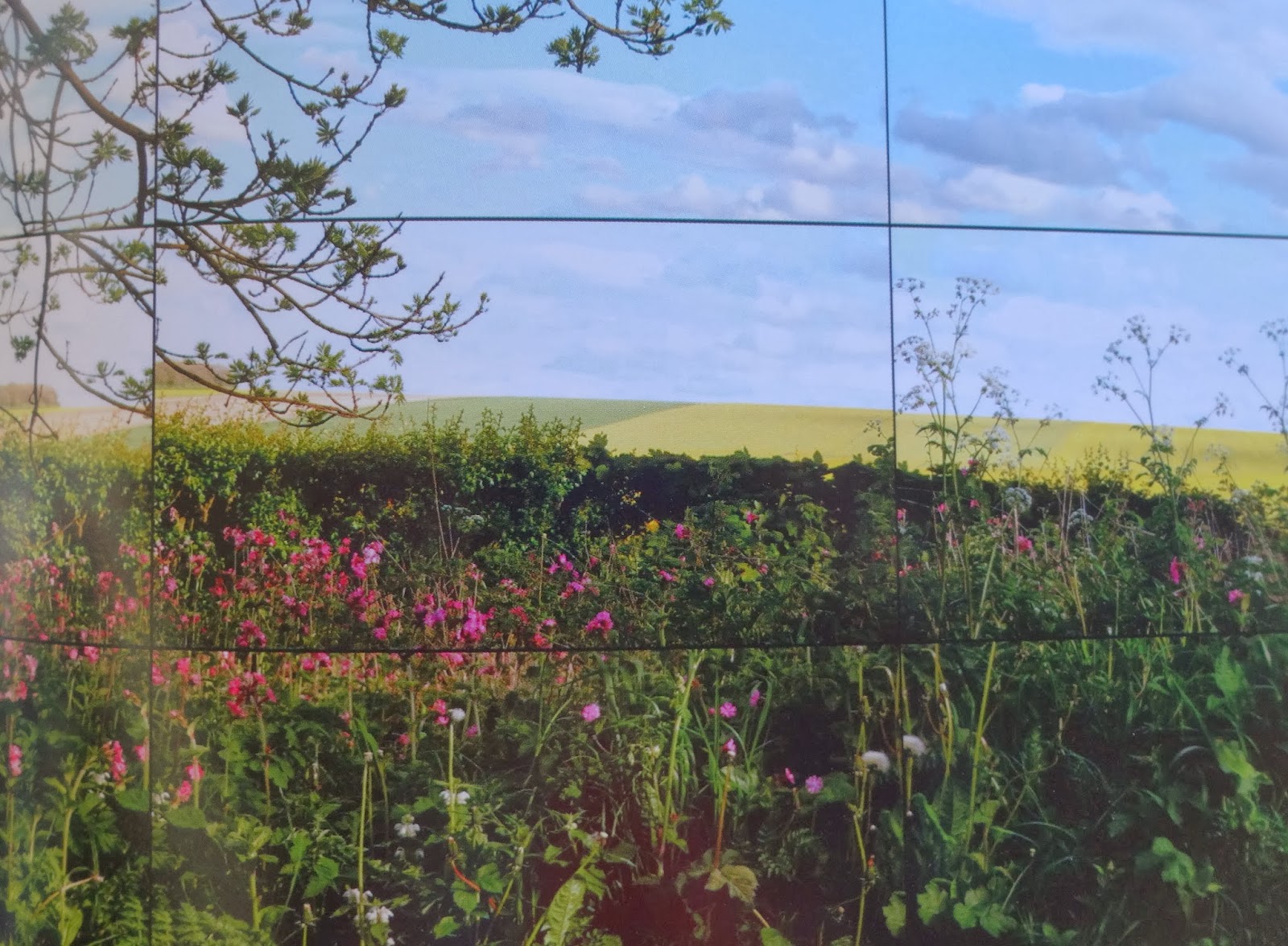
To the video presentations, first. 18 video screens, 3 high and six across,  are combined in a single space, although the boundaries of each camera’s view prevents the screens from fitting exactly, a slight tradeoff for having each angle and distance within the 18 screens in perfect focus.  Hedgrows wave lazily (here is a still from the catalogue... May 12th, 2011, Rudston to Kilham Road):


We look first at one screen, then another, then the time passes and we see we have stood there watching time, watching wind, watching air. We are surrounded, even though we are responding to just one wall of flat screens. We then move to the room of  “trees down the tunnel” that Hockney painted over and over again, here in nine screens (Woldgate Woods, June 2nd, 2010). Here is a still from the catalogue:


 Cars pass, unevenly from screen to screen. Snow falls delicately and slowly from tree branches, leaving one screen’s border, and then entering another ‘s,  just a little askew. Here is Woldgate Woods, November 26th 2010, a still photograph, from the catalogue:


The artist told Lawrence Weschler that mounting these cameras onto his car and driving through the fields meant "at least eighteen different vanishing points, and all of them moving" (catalogue essay, p. 39).  Or, in the case of the room that surrounds us with the four seasons of Woldgate Woods in the De Young, nine screens, nine moving vanishing points.

So what? you say.  Hockney has spent his life as an artist worrying about how to make art that makes us feel the way we feel when we are walking through the world. The now-famous photocollages (here, a detail of Grand Canyon from North Rim Lodge, Arizona, 1982):


offered up multiple (but rather fragmented, like broken glass) perspectives.  The  later paintings moved along further-- here is a detail of  "Mulholland Drive: The Road to the Studio," 1980:


Finally the “Bigger” series arrived; this work is part of that series, and Hockney truly began to find a straight line to our senses. (See : http://artistinanaframe.blogspot.com/2011/09/window-on-world-means-youre-cut-off.html)

He has come all his life to this point... where he shows us how we can see the world we know. It’s a little neglected corner. It isn’t Claude Monet’s towering sharp-edged cliffs at Etrétat, or Caspar David Friedrich’s Alps and fog in “Der Wanderer über dem Nebelmeer“ (The Wanderer Above the Sea of Mist) or any other landscape that would add drama all on its own.  Hockney’s landscapes are where you walk the dogs, where you go to play hide and seek, where you go for a quiet ... anything.  We all know this place. We begin to find that we love it, in all its powerful humility.

Hockney said, in 2004 (I cannot find the reference!) that  “I can get excited watching rain on a puddle. And then I paint it. Now, I admit, there are not too many people who would find that exciting. But I would. And I want life thrilling and rich. And it is. I make sure it is.”

And the puddles?  Well, they come into play in the iPad drawings. Here is 18 December, from the catalogue:


I remember when, at 13, I first noticed raindrops on a puddle, walking to the bus-stop.  But somehow I remember thinking about the dropping water and the “plop” sound it made, hitting the puddle on the asphalt.  These are very simple things Hockney offers us;  simple, yes, but so hard to recreate.

2 January:


Go and see.