Wednesday, November 30, 2011

Nakedly Nude V, Where to look?: Bronzino, Tintoretto & a Nude-in-process

Yesterday we looked at a few characteristics of Mannerist painting ... the two I'd like to concentrate on merge in these next paintings: elongated or exaggerated bodies, and drama-filled small spaces. Let's begin with Agnolo Bronzino's "Allegory of Venus and Cupid" from 1545:


Generally, when the central figure in a painting is a nude, it is difficult for the viewer to look at anything -- or anyone -- else in the picture plane.  Here, that's a bit more difficult; the painter has offered us a fine puzzle. Venus's body is smooth, a bit long in the torso, and, if she had been posed alone, on, say, a divan or a rug, she would appear calm and elegant.  But we immediately notice the figure embracing her, who is captured in a rather uncomfortable, if not impossible, pose, and this body, too, is quite distorted, longer of trunk than would be normal. The figure to the right, and the head and shoulders above Venus, display quite a bit of emotion, more than off-setting the placid content on the faces of the two figures on the left.  Venus was Cupid's mother, so the viewer can hope that Cupid is the little guy on the right.  And everybody else -- or the disembodied others? The background seems to me a swirling collage of faces, masks, doves, twisted blue drapery (later to come of age in the "Demoiselles d'Avignon"?), then a screaming man with muscular arms, someone at the upper left ordering a coffee ... If it is Cupid embracing Venus, then that would explain the Last-Judgment imagery of the picture.  What do you think is happening here?  The uncertainty seems deliberate.

The next painting is Susannah and the Elders, by Tintoretto, from 1555-6:


We can see the elders, at each side of the hedge. They, too, seem quite uncomfortable, but they will soon be able to see ... well, pretty much everything they would hope to here.  This Susannah is substantial ... where Bronzino's Venus was nude, Susannah is naked (see my other numbered nudely/naked, nakedly/nude posts). She is not perfect; she is not anticipating a portrait to come of this quiet, reflective toilette. She is alone, she thinks, and not yet aware of her onlookers.  But she is all we see.  And her calm demeanor pulls us in -- because this moment is so fleeting.  But still we look at her.  Even more, I think, than we look at Bronzino's Venus.

Why is that? We look at the "Allegory of Venus and Cupid" because we cannot be sure what is happening; so, we look all over the canvas, and then all over the canvas, and then catch a detail or two, and then look all over again.  But when we move to Tintoretto's "Susannah," we get the male gaze. And so our tendency is to gaze, as well.  Our focus is certain here.

Thinking about the ways we process the nude and the naked body, I have been working on a new odalisque,  this one with a subdued background, a background that, I hope, might still draw attention. But it can be difficult.  Theodore Roethke wrote, in "I Knew a Woman":

I knew a woman, lovely in her bones,
When small birds sighed, she would sigh back at them;
Ah, when she moved, she moved more ways than one:
The shapes a bright container can contain!
.... What's freedom for? To know eternity.
I swear she cast a shadow white as stone.
But who would count eternity in days?
These old bones live to learn her wanton ways:
(I measure time by how a body sways.)


So, yes, it can be difficult to pull attention away from that naked "bright container,"  whether it is male or female.  Here is a detail of the bones, so far, in my newest painting:


Resting, now, until we do battle again, tomorrow. 


^

Tuesday, November 29, 2011

Too Much Color? Cy Twombly didn't think so....

In the November, 2011, issue of Artforum,  Arthur C. Danto reflects on getting to know Cy Twombly. Danto tells us in passing that Twombly felt the cleaning of the Sistine Chapel created what he called "Mannerist masterpieces." So I went back to my art books for some help. The term "Mannerist" is argued over a fair amount, but generally has come to describe a 16th-century movement, with the central painters being Bronzino, Parmigianino, and Tintoretto. Some characteristics that seem agreed-upon include:  distorted figures, small, crowded spaces and unrealistic settings  -- which create drama -- and, finally,  the Mannerist artist stresses his skill in the painting of drapery, skin, and the effects of light.

Here is a portion of Michelangelo's Sistine Chapel:


When we entered the chapel, it was very difficult to see details like this. The paintings are so far away. But we did see the colors.  And that was a big change; for years, every reproduction I saw of these panels was dominated by grays and browns, shadows without light.  I remember, too, that after the work was cleaned, beginning in the 1980's, many people felt the colors were too brash, too much. But Twombly did not feel that way. So what paintings might he have compared it to?

There was a 2009 exhibition at the Museum of Fine Arts in Boston called "Titian~Tintoretto~Veronese:  Rivals in Renaissance Venice."  In their catalogue, the curators discuss the ways in which these artists watched one another's progress (rather in the way Picasso would come to monitor the discoveries of Matisse).  They competed for commissions.  Tintoretto painted "Miracle of the Slave" in 1548; it was his breakthrough. Here it is:


And we were worried about the colors in the Chapel? Look at this space... look at the ways in which the figures are moving... look at the backdrop (an operatic backdrop, missing only the Supertitles)... look at the gestures... the oranges, the blues... this is wonderful work... Michelangelo is in good company. I love it when one artist calls across the centuries to another.  We will miss Twombly.

Monday, November 28, 2011

Out of the Usual Categories ... "hors-catégorie" ... Cubist, Impressionist... and Into... Brushstrokes

Continuing with Barbara Rose on Jasper Johns ... in Artforum in March 1970, she wrote that Johns's "single images did not depend on Cubist 'rhyming' for their structure ... they were understood first as holistic gestalts .... [and because of the small-sized] brushstrokes" which were "methodically applied with equal pressure over the entire canvas surface," Rose says that Johns's work is "reminiscent of mature Impressionism" ("The Graphic Work of Jasper Johns, Part I," p. 39).

Okay, so let's unpack that for a second ... the front-and-back-and-all-sides images present in Cubist work were not Johns's aim, she argues. Instead, there is an all-over "whole," which is intended to be visible at first glance, and to remain visible as the viewer continues to "see" the work.  So, he is not exactly Cubist, and his steady, all-encompassing brushstrokes identify him with late Impressionist work.  Rose is persuasive. But this is a really interesting angle of attack. If Johns isn't Cubist, can he really be an heir to the Impressionists? Does that place him up against, say, Van Gogh?

I started to think that perhaps at least some artists burst free of categories, and that Johns is one of them.  None of the movements I have seen him tied to fit him, exactly. Yes, there are the bronzed beer cans, but they shift into a painting like "Decoy," from 1971, and then (see yesterday's post), he goes from "The Seasons" straight to Cézanne.  The Tour de France has developed a term for the mountains too towering to be classified, the most demanding for the riders; the term for these is hors-catégorie. There must be artists like Johns that are hors-catégorie, beyond the normal reach of art-historical labels. Where can we find Jasper Johns's peers, his lines of inquiry and influence?

Start with the basics. I like to see, as I argued yesterday, traces of the artist's hand -- in paintings, this is the brushstroke.  So, since that's a famous trait of Johns's work (think of the cross-hatch paintings), let's set up some artists whose strokes are, in Rose's words, "methodically applied with equal pressure over the entire canvas surface" and see what we get. We'll go chronologically, starting in 1870.

I have a new admiration for Camille Pissarro, having seen him at the Legion of Honor recently (see November 7th post) and think his "The Stagecoach at Louveciennes" is a good place to begin:


The clouds, the water on the path, the horses, the tree limbs -- they are not offering us the sort of brush-free illusion we see in a Vermeer.  If we take just a corner of the piece, the lower left:


This shows us -- not quite as clearly as I'd like -- what we could see if we were before the actual work.

Now look at the surface of Vincent Van Gogh's  "In the Cafe: Agostina Segatori in Le Tambourin" from 1887:

 
This is not the Van Gogh we tend to think of ... pointillism and grand distortions are for other paintings. But this is an energetically painted work.  Now look at Braque's "The Portuguese," from 1911:

 
We aren't looking at subject matter here ... but at the application of paint. Again, we are seeing, I think,  brushstrokes applied with "equal pressure over the entire canvas surface."   Here comes a sketch from John Singer Sargent, "A Mountain Stream, Tyrol," from 1914:

  
You can feel Sargent painting here. Now, for Monet, one of the "mature Impressionists" that Rose was likely thinking about. This is "Nympheas," from 1916-1919:
And, yes, there are a few brushstrokes here!  On to the man of the hour, Jasper Johns, and his "Canvas," from 1956:


There is a lot of Monet here ... and now to Joan Mitchell, who has been called Monet's heir, with "Row Row" from 1982:

If you take away the brilliance of the colors, for just a second, (perhaps imagine some grays?) this energy and application is very close to that of Jasper Johns.  I have one more person to bring in. In an interview, Gerhard Richter is asked about his mark-making. The implication is that the application of paint is "quasi-mechanical or anonymous," but Richter responds: "A brush is a brush, whether it's five millimetres wide or fifty centimetres." And he goes on to say that the two yellow brushstrokes under discussion "only look like two strokes of a giant brush. In reality they were painted with a lot of little strokes .... it's all genuine, so to speak" (interview with Benjamin Buchloch, 1986, from Gerhard Richter, The Daily Practice of Painting: Writings and Interviews, 1962-1993, pp. 161-66).  I could not find the two-brushstroke work, but here is a 2009 painting by Richter, called "Vienna":


I think if you scroll back over these, you will see another way of looking at these works, the way of the brushstroke, something that unites them across their named movements. This is Johns's tribe.

Sunday, November 27, 2011

Jasper Johns Traces Cézanne's Bathers and Cézanne was after ... Ingres?

In her article "Jasper Johns: This Is Not A Drawing"  in The Journal of Art (April 1991, pp. 16-17), Barbara Rose discusses Johns's drawings for the 1986 panels "The Seasons," which she says are his "first works to depict the human figure." She notes that Johns remembered seeing Cézanne's youthful murals, his "Seasons," preserved on his parents' dining room walls.  The figures, writes Rose, are "poorly, laboriously, and unconvincingly drawn" and, "as if to mock his own ineptitude," they are signed "Ingres."  Ingres, like Raphael, drew, without apparent effort, the most perfect continuous lines (David Hockney argues, in his book Secret Knowledge, that lenses were involved for Ingres ... check his claims out).  Rose tells us that Johns, in creating his own "Seasons," would face "the problem Cézanne devoted his life to solving: how to draw the contours of shapes without either flattening form into pattern or creating an illusion of space..."   Rose then discusses the fact that many of Jasper Johns's critics have not looked at "The Seasons" in terms of "formal concerns .... as art." She believes that Johns, in "The Seasons," "faces head-on his major weakness as an artist," and says that critics should look into Johns's decisions here: "formal constructions ... how they deal with line, shape, space, et al."

So let's do that, shall we? Today, my husband visited several artists who participated in the Berkeley Open Studios weekend (continuing on weekends through the 18th of December -- and even the 24th in some cases).  One artist, Nancy Fernandez, showed work that highlighted her exceptional drawing skills. She explained that she had studied in Florence, Italy, for three years, according to a classical system (followed from at least the nineteenth century onwards-- this was Picasso's course of study). Students begin by drawing casts, then progress to live models, all in pencil and charcoal, and may only move to colors when they have proven themselves worthy. Artists have -- always? -- copied the work of more established painters to learn how they made their decisions and, as Rose suggests, to see how works came to be "art."

So I was pretty surprised to read a critique by Jed Perl, written in 1996, about a group of late works by Jasper Johns, on display in the final room of the show "Jasper Johns: A Retrospective" at MOMA in 1996-7.  Perl writes, in Eyewitness: Reports from An Art Word in Crisis, that in these works completed in 1994,  Johns merely "crops, edits, cuts and pastes" (147) from master works.  And he goes on to say, "Any art student ought to know that a tracing of a painting isn't a response or an interpretation" and that the final pieces are dominated by rather "lackluster washes" (148).  Okay, you are asking (unless you have scrolled ahead) -- what works did he copy -- what did his copies look like?  I have to say that after reading this description by Perl (someone whose work I normally respect)  I thought I would see a set of works displaying only a few bland outlines -- with a clear absence of effort and interest on the part of the artist.

I happen to have the catalogue for that retrospective, because we saw it in 1996. And then I flipped to the final images, and there were Johns's works:  tracings of "Cézanne's Bathers" (1900-1905, 52 1/8" x 86 1/4") ... and, I have it on good authority, these were not tracings from a painting, but tracings of a poster for a 1991 show in Philadelphia and Washington (that exhibited the "Bathers" from the Barnes Collection).  So here I am thinking, before I really look at the photographs of the drawings, still, these will be silly ... from posters? tracings? Even though I knew that Johns owns a Cézanne himself, I thought, he has to be just playing. Here is the Cézanne that Johns owns, by the way, before we get to the original and its tracings: he owns "Bather with Outstretched Arms" (from 1877-8, Picasso, anyone?):


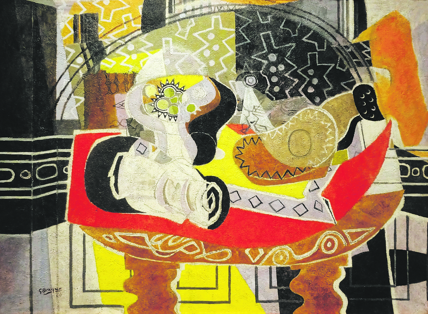
Cool, huh? Okay... I have delayed long enough. The original work that Johns traced, on plastic paper, six times that we know of -- the "Bathers":


There they are. There are a few of these "Bathers," but this is the one that struck Johns.  I believe that he was continuing the work he began with his first painterly figures, "The Seasons,"  and giving himself his own version of a classical education.  I am going to give you three of these "tracings," because I want you to see the variety of Johns's drawing and painting skills here. These are all called "Tracing After Cézanne," all ink on plastic, all from 1994. The first measures 18 1/8"x 30 3/8":


I think this is beautiful ... it catches the light and shadows and makes the most of the background, rather than the figures (a question I am very interested in right now), and also creates a kind of figure out of the right-hand tree.  Here is the second that I like, which measures 18 1/8" x 28 3/8":


This creates a brown sheet or flag-like form in the center, a rooted tree or human outline in the lower left, a very delicate basket of food, and a happy explosion of tree limbs at top right.  It adds much more light than the first tracing.  Then, here is the third, which measures 18 x 28 1/8":

This is the final tracing. I love the way he has selected which lines to bring forward (the outlines of the center-right female and the woman just to the right of her arm) and the sky has really taken off here.  I think we can say that Johns has entered the world of Cézanne, and, I would argue, the world of Ingres:

 
There is more detail in the hairline and along the bottom of noses and tops of lips, but, the forms and the sweep of the clothing, the setting of a mood, the hand of the artist? You decide. Are these in the same worlds, the world of art? I think they are.

Saturday, November 26, 2011

An amazingly sunny Saturday in November

and so we took a drive, to see the Bolinas and Stinson Beach Open Studios (also open tomorrow: see www.marincoastalartists.com). The towns and scenery were lovely, and the artwork rewarding. There is a new art gallery, the Stinson Beach gallery, in that town, and a good, small museum, the Bolinas Museum, there (they are showing "mini" works -- very strong show -- right now).

On the way in, we saw a stand of eucalyptus trees waving in the wind, the leaves glistening as they turned in the sun. Here they are, in a very short film:


And as we drove away from Bolinas, and then Stinson Beach, we stopped and I took this movie of the shoreline just north of Stinson Beach:


So, a wonderful day. Inspiring, brave, inventive art, a lot of wind, and small waves shining in the sun.

Thursday, November 24, 2011

"I don't like Cubism," he said...

We were talking about the current show of Georges Braque's work at Acquavella Galleries in New York, which is breaking attendance records.  There have been many big-name shows (that once would have been undertaken by museums) sponsored by galleries; we saw one, last year, of Monet's late large works, at the Gagosian Gallery in Chelsea. I read that William Acquavella is bringing these works to the public in his usual risk-taking vein:  early on, he brought Sotheby's in to help him buy the entire contents of Pierre Matisse's gallery (Pierre Matisse was Henri's son and, as you can imagine, his collection was unparalleled) -- there were nearly 4,700 works.  Later, Acquavella visited Lucien Freud and bought all of his portraits of the performance artist Leigh Bowery, at a time when no-one thought a naked man could be a painterly subject.  Here is a photograph of Lucien Freud and his model, with the famous "Seated Leigh Bowery" painting, in process:


I love the Leigh Bowery series; he is one of my odalisques (see post from October 6).  But I digress... my husband says he doesn't like Cubism... we talked a bit... (there are many "Cubisms."  I talked about the phases here on August 1).  My theory is that Picasso and Braque worked their way through the discovery of picture planes and all-sides-at-once and the pre-eminence of the line and came out on the other side, Picasso would continue to change styles, Braque would continue to refine a single way of seeing.  I think these later paintings, from 1936, (these are in the Acquavella show) gain from Braque's Cubist experimentation, but are wonderfully complete in themselves. The picture plane is filled -- and yet it still has air and light. Here is "Still Life with Guitar I (Red Tablecloth)":


And here is "Woman at Easel (Yellow Screen)":

You can see the echoes of the flattened and tilted planes, the patterned, collage-like background, and yet there are sources of light here that were not present in the early Cubist works. And by the way, my husband really likes these!!! Go and see the Acquavella show for me... it closes November 30! And Happy Thanksgiving!

Wednesday, November 23, 2011

"The Flight of the Odalisque"

(An illustrated story I wrote, about a painter and his -- odalisque -- model;  here is an excerpt from the notebook, lying open on my worktable):


I think there might be room for a different kind of published words-and-images combination. This is the kind of book I sent to the Art House Co-op's "Fiction Project."  Texts overwhelm images, critics have said; even the labels on the museum walls, the ones that tell you about the date the work was completed, or sometimes add the circumstances under which it was created, pull viewers away. But I think a balance can be maintained -- if we are careful!

Tuesday, November 22, 2011

Francis Bacon said, "You know in my case, all painting ... is an accident."

"I foresee it and and yet I rarely carry it out as I foresee it .... It becomes a selective process what part of the accident one chooses to preserve"  (quoted in Theories of Modern Art, Chipp & Selz, p. 621).  True! I once saw a film of Robert Motherwell and an assistant readying a plate for a run through the press.  Motherwell dripped a few last bits of paint onto the plate, looked at it, and had the assistant rub off some  -- but not all -- of the excess. It's all about the choices we make as artists and viewers.

One summer in Paris, in 1994,  we saw Joan Mitchell's paintings at the Galerie Nationale du Jeu de Paume. It struck me, first, that they were so large that she would need a ladder. Or several. And, second, that she had made no allowance for a mistake. Each brushstroke was accounted for.  Here is a close-up of the kind of work I mean, "Two Pianos," from 1980, which is, in full, 110 x 142":


We once lived near a talented and inventive glassblower named Gary Zack.  One of his "mistakes," he thought, was a wide shallow bowl, rimmed with colors, with a small abstract glass form clinging from the center to the edge; it was not perfect because, as he was finishing it, it came out of symmetry and pulled slightly to one side. He rejected it; we loved it, and brought it home, and kept it through two moves, but the movers broke it during the third move.  The accident was beautiful to us.

So, as I am re-working paintings, I find I make mistakes that I wipe away, and then I make a few that I keep. Here is one of the keepers, a tiny detail, but it adds a fluid line in a rigid spot:

Monday, November 21, 2011

Artist's Statement IX: double vision and the Bowerbird

So, the second paragraph of my working draft (of my artist's statement) reads like this :


"My work may be strongest when it contains contradictions.  Van Gogh spoke about this: “it is as though one dreamed twice, in two registers … the simplest image is doubled: it is itself and something other than itself.”  I paint here and there, foreground and background. The work is still, but it often refers to movement. I have long described myself as an abstract landscape painter, but I am beginning to draw and paint faint odalisques in those shimmering landscapes.  I paint the world I know against the world I imagine."

I run everything I write by my husband, and he read this and said "can you elaborate?"

Okay, so here is a totally different run at the question:
"The 'Odalisque Series' that I am working on now begins with a base abstract work.  For two or three paintings, I began with a work that I had painted months before and re-painted over parts of the piece, or scraped down portions of paint or collage, diminishing but not erasing the original painting.  Other works have begun with a painting that was painted specifically as a base. The nudes --- taken from well-known works by Ingres, Van Gogh or Matisse, for example, or sketched from life -- are then outlined and painted over the base, lightly, usually in a pale white (or peach or blue).  Then the two parts of the work need to be reconciled, and that takes the most concentration, really.  I have found that I like the contradictions in this work: the figure and ground, the color and line, the figure and the abstract, the studio model (here) and a landscape foreign to her (there).  Van Gogh wrote that an interesting challenge for an artist might be: "if, while painting a cottage, he dreams of a nest. It is as though one dreamed twice, in two registers ... the simplest image is doubled: it is itself and something other than itself."  I am following his suggestion and taking it a step further by revealing both images in paint.  I am also taking Francis Bacon's idea of the moving figure, twisted and heavily colored, against a plain ground, and reversing it, so that the image is plain and the ground shimmers and moves.  This is, I think, a true measure of the way we see the world. I paint the world I know against the world I imagine, and this duality has a real power, I believe."

Better?

And, now, for the artist's statement of the Bowerbird. The male Bowerbird of New Guinea and Australia builds a bower to attract a mate; these are not little round nests, but elaborate structures, sometimes two parallel walls, sometimes curved branches that create a roof. The Bowerbird may "paint" the bower with mud, and he distributes shells, flowers, leaves, and any colored found objects around it. Some bowerbirds can also mimic sounds, like the speech of humans or the sounds of a waterfall.

Here is a photograph of a Satin Bowerbird's bower, from Barry Hatton:


And here is another photo, this from Matt Webster, of a Greater Bowerbird bower:


You should also take a look at a video by Josep del Hoyo, from October 2010, filmed in Lamington National Park in Queensland, Australia:

http://ibc.lynxeds.com/video/satin-bowerbird-ptilonorhynchus-violaceus/close-adult-male-painting-bower-using-beak-applying-


Sunday, November 20, 2011

Artist's Statement VIII: "something is created there all by itself..."

So, again, still, I am working through drafts of an artist's statement and I talk about intention and contradictions and influences ... but I haven't mentioned process. And I was looking at some artwork and realizing that process has to be included. The work of painting is not simply an achievement or what it looks like when it's perfect. What gets us started? What does the middle of the process feel like? When do we stop?

So, beginnings. Richard Sigmund uses what he calls the "art of the streets" to get him thinking. But he doesn't seem to mean graffiti. He means the way the traffic signs are painted on the asphalt, or the way the water runs along a gully on black pavements. Sigmund starts by "supporting an optimism, by trying to raise something common into an art world which rewards uniqueness. I am trying to view what we have in our life with an elevated light, to appreciate what we have ... I believe this could possibly bring relief."  If we can all see it, and we can all know it, we might come to appreciate the little things (also, I have to add, a Richard Foreman idea ... bring forth the undervalued and give it a place).  Sigmund says about starting off the actual work that "I make the stretcher, gesso it, and normally get my idea down. This is when the painting starts, as I need to resolve unforeseen problems. I paint until it doesn't present any problems." [I like that. Me, too]. Here is his "Pacific Coast Highway," 1984:


It's something we all recognize, and even the scale is "right," and yet, here, it is beautiful.

Okay, for middles. The artist Alexis Brown was interviewed; the film is posted on "Gorky's Granddaughter" (great site, filled with artists, studios, talk).  She works with screen printing and with the plastic plates used to test lithographic prints (a new, but "unstable" process that she is testing).  Brown starts the interview by showing us vultures and swans and says she wants to make some connections between them.  The interviewer gestures at some really interesting, but less recognizable, patterns on the wall and notes that as Brown overlays prints,  these patterns get going, and "it becomes this cloud of energy." Brown says in response that "It's closeted abstraction .... I really like the smoky effect .... I am taking guesses at my own actions or why I do these things." That's what we do, I think, as we paint; we stop, and look, and try and figure out what we are doing and where the work is going. It's hard, Brown admits, to come up with the same image twice, in the layered "clouds": "these effects are completely uncontrolled."  But they are compelling. Here is a work that shares some characteristics with the one the artist was talking about: "Untitled" from 2010, pronto plate and charcoal.


And, a bit more about process, from Gerhard Richter.  He has moved through so many different styles and subjects! I confess that I really, really love these new (and enormous) abstracts. The film recording his painting process, at the Tate Modern, showed him pulling paint across with large and small scrapers, horizontally or vertically. (And, somehow, he does this dressed in black -- and remains impeccable).  I liked each stage of the work he was over-scraping, and kept getting worried that he would lose it by doing too much.  But he has his own method for knowing when a work is complete. In a 1999 interview, Richter explained why there were no representational works (in the group of small watercolors then on show): "Because it is more exciting with the abstract ones, and it goes faster .... something is created there all by itself, which one only has to observe in order to intervene at the right moment -- in that case, to stop it."  And here is one of his "scraped" abstracts:


Picasso used to say that a painting is never really finished.  How do you know when your paintings are completed?

Saturday, November 19, 2011

There are "grandiose" mountains ... "but for every day a simple little hill does well enough"

Cézanne said.  So, today, filled with other kinds of writing and re-working of paintings in the studio ... is a "simple little hill" kind of day.  But visual imagery is also an "every day" thing, so here is a cloudy night with the hidden Bay:


And here is an old sketch, in lieu of showing the new (not just yet, anyway); it is called "the Key [CLOU] to Cubisme" (why not?):

Friday, November 18, 2011

Artist's Statement VII, Choices: black and white, or color? artificiality, or realism? abstracts? or figures?

I saw "Picasso and Braque Go to the Movies."  I am not convinced by its thesis, that cinematic structures deeply influenced the artists and led to Cubism.  But I did enjoy hearing the opinions of some of the artists and critics, particularly Chuck Close.  He says that he loves the idea that "the color has just been sucked out of" Cubist work. In his own paintings, Close says, "I just didn't want to depend on color ... to carry the painting." And some of Close's black and white works read a bit like holding an old black and white home-movie canister and reeling the film out between your hands. Close works from photographs, copied onto a grid on canvas; here is a self-portrait from 1991:

It is a powerful piece; when you see Close's work in a gallery, often the works are so large that you need to step back as far as possible to allow the work to complete itself.  And this push-pull of the work is quite deliberate, as Close goes on to tell us (in the movie's interview).  Close says he feels at home with "the extreme artificiality of Cubism. It was not about space. It was not about atmosphere. It was not about the way we see things in nature. [I disagree with this, but we'll get to that another time!].  It's highly compressed, intensely flat; you are always aware that you are looking at the distribution of colored dirt on a flat surface ... it is as artificial as it is real. It's the tension between the artificiality and the reality that makes the difference .... it's like you're watching ... [the painting] happen in front of your very eyes."

So let's do that, with a piece in color: "Maggie," from 1996:

Now look at a close-up of her eye:


Here we have the artificiality, the beauty, the pattern ... it's amazing the way Close manages both aspects, the real and the artifice,  in each of his works.

I was reading Brian Edmonds' blog (and saw a video on Karel Appel from 1961 -- still fierce) and he suggested the names of a few Bay Area painters -- people I did not know. I found myself really liking one artist, Elmer Bischoff,  who also played with black and white, and color, and then abstraction, the figuration, before a final return to abstraction.  I am pretty interested in this, since I am playing with both figuative and abstract work myself.  Bischoff said that returning at the end of his life to abstraction was like "leaving a church and entering a gymnasium."  Here is an early figurative drawing (also sometimes called a painting, although it also looks like a monotype-- not on view right now, but owned by SFMOMA); it is called "Girl Looking in Mirror":

Bischoff said that his only demand of his work was that it be "potent." This is, for me, powerful, mysterious, a bit of Rembrandt, almost Caravaggio -- look at all those sources of light! But it is also a kind of dark piece, I think, and a real contrast to this late work, "Untitled # 78" (1984):


This painting seems to me to be exactly what Bischoff said, a bit like entering an unlimited space; it feels a relief.  The tension is still there, for me, in the play between these apparent abstract spaces and their worldly counterparts (are those layers? is that a chasm in a rock? are those folds in material? no, of course not, and yet, if we could just get far enough away....).  He isn't so much depending on color, here, as he is not depending on light and shadow.  And all this -- from both Close and Bischoff -- on a two-dimensional static surface.

Thursday, November 17, 2011

From Paris to the Poitou-Charentes to Watch Hill (Rhode Island): A Sense of Place

I just saw the film "My Best Friend" (in France, it is "Mon Meilleur Ami"), made in 2006. It is a well-written, sweet comedy about a successful (but rather cut-throat) art and antiques dealer who is challenged by his colleagues to produce a "real" best friend.  Like Woody Allen's "Midnight in Paris," this film has moments where the city is almost a character. Check out this perfect restaurant:


This still shows the actor Daniel Auteuil, pondering his (character's) friend-less state. And, later, the cinematography gives us a bridge over the Seine with the wonderful view and, here, amazing clouds:


And, at some point, alas, the movie ends.  I think that one of the reasons I paint landscapes, or place my odalisques into new landscapes, is to deal with this remembering, longing, the beginnings and endings of being in a "place."  I have been working on a painting that began as a muddy triptych, moved to an homage to Joan Mitchell, and now is, perhaps, the newest odalisque work. I have added the clouds and winds from a tempete, a huge storm that we lived through in December 1999 in the Poitou-Charentes:

Wednesday, November 16, 2011

The Anxiety of Influence vs. "It was her voice that made/ The sky acutest at its vanishing..."

"She was the single artificer of the world
In which she sang. And when she sang, the sea,
Whatever self it had, became the self
That was her song, for she was the maker ..."  from "The Idea of Order at Key West,"
                    by Wallace Stevens

So I was just sitting here, sketching ...

And I was thinking about the ways writers and artists balance artistic influence against developing their own artistic "voices" or styles. Stevens's poem, quoted above, gives us a woman whose voice is so surely her own that the sea clings to it.  I attended a reading the other day; the writer's day job was ...   "editor."  And so, in the question-and-answer period, I asked her how she protected "your own voice" while reading so many other contemporary writers.  And she gave us all a long, wandering answer that never circled back to her "own voice." Why didn't she answer?

My memory -- which I will admit, is shaky on this point, so I will be very brief! -- of Harold Bloom's book The Anxiety of Influence  centers on the weight of all those writers (or, in my case, artists) who have come before.  And, that, where one is most influenced, one is most prone to deny that influence.  Picasso, for example, doesn't mention Renoir anywhere that I have seen, and of course we would not expect him to. The lush Impressionist works seem to have nothing to do with Picasso's thin washes of color and focus on the hard-edged line. And yet, and yet: a show called "Picasso: Challenging the Past" came together at the National Gallery in London in 2009, and we see the names we expect: Ingres, Velazquez, El Greco, Delacroix. And then the one we do not expect, Pierre-Auguste Renoir, with "Seated Bather in a Landscape, called Euridice," from 1885-1890, a painting that, the catalogue tells us, Picasso owned.  The curators (Elizabeth Cowling, Neil Cox, Simonetta Fraquelli, Susan Grace Galassi, Christopher Riopelle and Anne Robbins) have placed a Picasso, "Large Bather," 1921, up against it. See what you think.


I have always wondered where Picasso's large bathers came from. This seems pretty definitive to me. But Picasso's voice survives these influences, in part because he has folded them into his "own voice." His style often shifts in reaction to other artists' work. The influence moves him forward.  But it could, just as easily, set any of us back. So how to escape it?

And then I thought of Helen Frankenthaler (not a new thing for me: see November 9th and 14th entries).  She lived with first one, then another of the biggest art-world names of her time, Clement Greenberg and Robert Motherwell. I once heard her work dismissed by someone who didn't know any better as "second-rate Motherwell."  But Frankenthaler, despite the weight of living with these two men, created her own world, just as Stevens's woman does in the poem above. Frankenthaler created color-field painting. She was, in Stevens's words, "the single artificer of the world/ In which she sang." Before anyone else poured thin washes of paint onto untreated canvas, there she was; she had taken the thrown lines of Pollock's paint into a new direction.  And now she has moved on, to a graceful printing style -- influenced by Japanese prints -- and has rediscovered another "voice."  Here are two prints; the first is "Madame Butterfly," and the second is "Book of Clouds":


No-one else works this way. So, to my novelist, if you are reading this ... I hope it helps you see what I was asking.

Monday, November 14, 2011

Artist Statement VI: "The picture did not live within the frame ... it did not belong within the frame"

One thing that needs to be included in my artist's statement is the question of movement. I have always felt that one of the chief weaknesses of traditional landscape painting -- and perhaps even of portrait painting -- is the fact that the figure and ground, the objects and the composition, often show no sense that the whole thing could move at any second.  That is, the model could get up, the artist could turn her head or move the easel closer to the stand of trees, the light is changing ... The Cubists and the Futurists considered this point, but I believe it still needs to be resolved pictorially -- now.

If we look back at Constable's "Hadleigh Castle, the Mouth of the Thames: Morning After a Stormy Night" (see my post from November 10), we see the castle, the river, the rocks, the sky spread out before us.  But -- how wonderful would it be if we could see all the things he could see as he was actually painting? The castle comes into greater focus, or the dog runs ahead ...

In her Lectures in America, in "Pictures," Gertrude Stein talks about movement: "Does an oil painting tend to go back into its frame because after all an oil painting belongs in its frame. Or does it not .... And if it does belong in its frame, must an oil painting be static."  And she answers her own question -- no -- a painting need not be "static," and Stein goes to the example of a painting that seems --to her -- to move, Leonardo Da Vinci's 1499 work, "The Virgin, the Child, Saint Anne and John the Baptist."  As it happens, we saw this painting at the National Gallery in London last year; it is a "sketch" for a more formal painting that was never completed, stretched across eight sheets of paper, but it is more beautiful than any "final" painting could be, I think:


Stein says that "in this picture there was an internal movement, not of the people or light or any of these things but inside .... In other words the picture did not live within the frame, in other words it did not belong within the frame .... [and since then] I have passionately hoped that some picture would remain out of its frame."  And there is internal movement here; you can feel it, walking around in the gallery with it. This can be explained in part by the figures' sinewy curves, and by the background that dances just a bit beyond specificity.  But really, as Stein goes on to say, a painting "must not completely only exist in its frame. It must have its own life. And yet it may not move nor imitate movement, not really, nor must it stay still. It must not only be in its frame but it must not, only, be in its frame." This is, in part, a discussion of the Modernist idea that a painting must be a thing in itself, and not representative of something outside of itself, but I also think this is about the life in a painting, the way a painting can feel like a very brief, exciting moment in a life.

So the artist, and the work of art, have this difficult task, to allow the art to move without moving.  Can this be done now, without resorting to one-point perspective or any sort of illusion? Well, look at Helen Frankenthaler at work:


She is moving, the paint is moving, but it will all have to stop and, at some point, the painting will be in a show ... will it survive? I think so. Let's look at "Madame Matisse," from 1983:


Matisse had painted his wife with an enormous hat and a green stripe along her nose, a painting bought by Leo and Gertrude Stein, actually, and this painting takes that stripe and makes it move.

Part of what I am still working on, both in my statement and in this new series, is the idea that paintings should encourage the viewer to see ... to see just as if you were in the same landscape as the painting, and see the colors and the shapes as you would if you were walking by. Sometimes this will lead to the shapes seeming to be a blur, or to seem as if they were shrinking or growing; other times it will lead to one thing seeming specific, because it is what the painter chose to look at and to paint. We turn our heads, we focus in on objects, as we walk ... anywhere.  Here is an early example of my landscape-as-movement idea, a 2 x 4' painting called "Landscape as Drama":