Showing posts with label David Hockney. Show all posts

Sunday, November 24, 2013

"And it is. I make sure it is." Hockney and the thrill


“The care with which the rain is wrong and the green is wrong and the white is wrong.... The care with which there is incredible justice and likeness, all this makes a magnificent asparagus, and also a fountain.”  Gertrude Stein, the final Tender Button


Consider the work of Gertrude Stein and David Hockney, and you will realize that neither artist is afraid to fail nor afraid of happiness.  For both, I get the impression, happiness is contagious.

The De Young Museum in San Francisco is showing "David Hockney: A Bigger
Exhibition," (his recent portraits and landscapes), through January 20, 2014. Hockney's landscapes are the thing, though. At the De Young, the show moves almost entirely chronologically, tracing Hockney’s movement through one medium after another in his portrayal of his Yorkshire woods and fields - water colors, oil, video, iPad drawings and charcoal, and, full circle, beginning and ending with classical tools. The classical approaches present Hockney’s art-school credentials.

But, much like his hero Picasso, Hockney appears to find that Raphael or Rembrandt pretty much had the classical thing covered, and he pours his passion into making us see – “how we see.” The works on video and iPad stop viewers in their tracks.

To the video presentations, first. 18 video screens, 3 high and six across,  are combined in a single space, although the boundaries of each camera’s view prevents the screens from fitting exactly, a slight tradeoff for having each angle and distance within the 18 screens in perfect focus.  Hedgrows wave lazily (here is a still from the catalogue... May 12th, 2011, Rudston to Kilham Road):
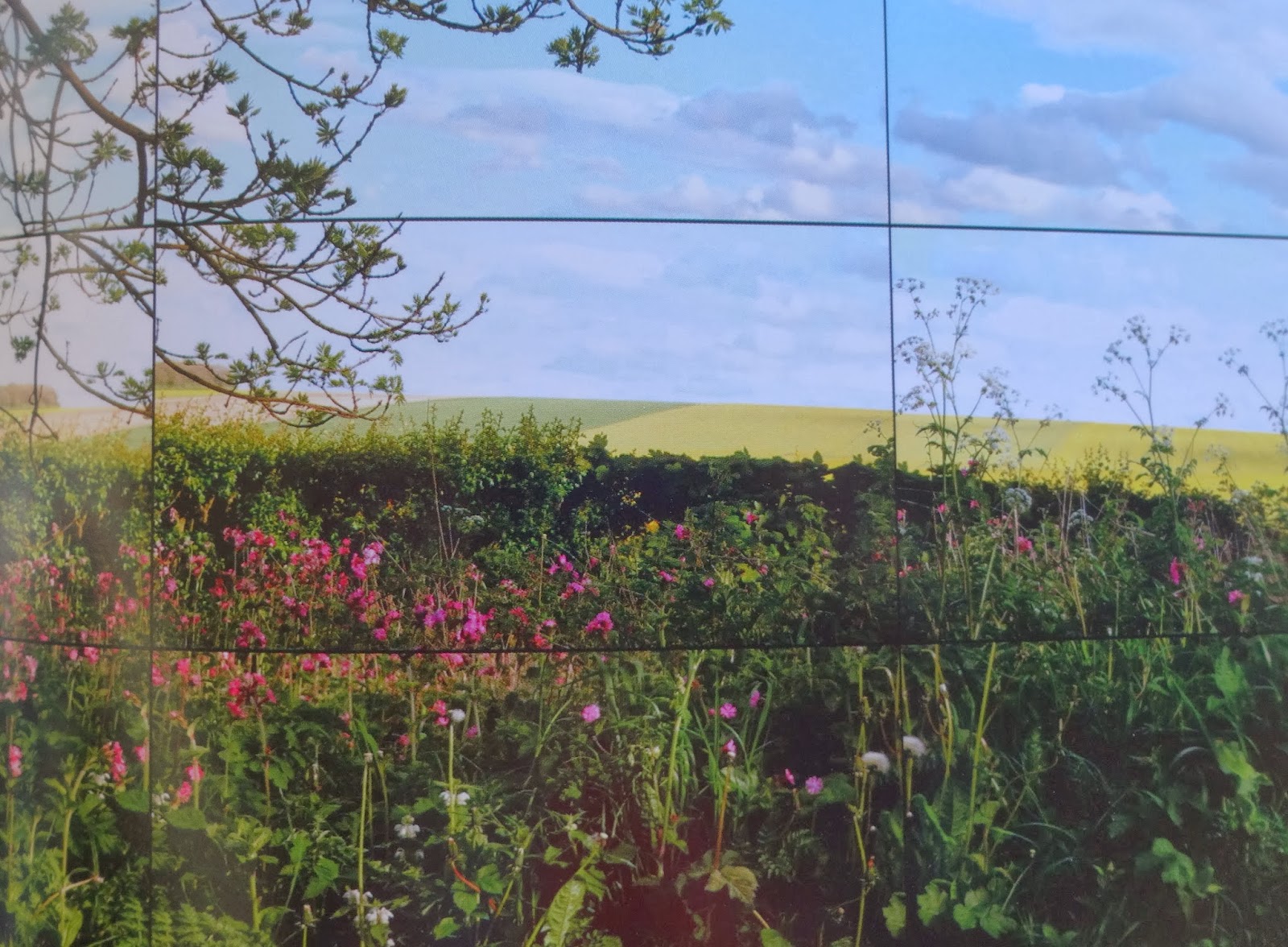

We look first at one screen, then another, then the time passes and we see we have stood there watching time, watching wind, watching air. We are surrounded, even though we are responding to just one wall of flat screens. We then move to the room of  “trees down the tunnel” that Hockney painted over and over again, here in nine screens (Woldgate Woods, June 2nd, 2010). Here is a still from the catalogue:


 Cars pass, unevenly from screen to screen. Snow falls delicately and slowly from tree branches, leaving one screen’s border, and then entering another ‘s,  just a little askew. Here is Woldgate Woods, November 26th 2010, a still photograph, from the catalogue:


The artist told Lawrence Weschler that mounting these cameras onto his car and driving through the fields meant "at least eighteen different vanishing points, and all of them moving" (catalogue essay, p. 39).  Or, in the case of the room that surrounds us with the four seasons of Woldgate Woods in the De Young, nine screens, nine moving vanishing points.

So what? you say.  Hockney has spent his life as an artist worrying about how to make art that makes us feel the way we feel when we are walking through the world. The now-famous photocollages (here, a detail of Grand Canyon from North Rim Lodge, Arizona, 1982):


offered up multiple (but rather fragmented, like broken glass) perspectives.  The  later paintings moved along further-- here is a detail of  "Mulholland Drive: The Road to the Studio," 1980:


Finally the “Bigger” series arrived; this work is part of that series, and Hockney truly began to find a straight line to our senses. (See : http://artistinanaframe.blogspot.com/2011/09/window-on-world-means-youre-cut-off.html)

He has come all his life to this point... where he shows us how we can see the world we know. It’s a little neglected corner. It isn’t Claude Monet’s towering sharp-edged cliffs at Etrétat, or Caspar David Friedrich’s Alps and fog in “Der Wanderer über dem Nebelmeer“ (The Wanderer Above the Sea of Mist) or any other landscape that would add drama all on its own.  Hockney’s landscapes are where you walk the dogs, where you go to play hide and seek, where you go for a quiet ... anything.  We all know this place. We begin to find that we love it, in all its powerful humility.

Hockney said, in 2004 (I cannot find the reference!) that  “I can get excited watching rain on a puddle. And then I paint it. Now, I admit, there are not too many people who would find that exciting. But I would. And I want life thrilling and rich. And it is. I make sure it is.”

And the puddles?  Well, they come into play in the iPad drawings. Here is 18 December, from the catalogue:


I remember when, at 13, I first noticed raindrops on a puddle, walking to the bus-stop.  But somehow I remember thinking about the dropping water and the “plop” sound it made, hitting the puddle on the asphalt.  These are very simple things Hockney offers us;  simple, yes, but so hard to recreate.

2 January:


Go and see. 


Sunday, March 18, 2012

"Surface is Illusion, But So is Depth," says David Hockney: A Face by Rossetti, a Face by Manet


David Hockney recorded a film called “A Day on the Grand Canal with the Emperor of China, or Surface is Illusion, But So is Depth”; it is from 1988 and is only available now on VHS, which is really a shame (there is a post about the scroll at hardcorepainting.blogspot.com, however). I think Hockney’s comments in this interview reveal the ways we see.  And they may also reveal the ways we should be thinking about creating new art.

The film is a running commentary on two scrolls; the first dates from 1689, before Chinese artists were exposed to Western perspective, and the second is from 1770, and has become … almost Western.  Hockney examines the first scroll, which he clearly prefers; it is 27” high and about 72’ long, and the figures depicted are an inch high at most.  The artist depicted an Emperor’s journey in a barge down a river and the anticipatory activity (people are running… “he’s coming!”); we can look towards the villages expecting him.  Hockney unrolls the work, and says that “you can decide where to look … we can move down this street, at this angle … [it is an] intimate view” of life in the “back streets.”  And it is splendid to watch: we see cooking, people raising chickens, people lining up for the Emperor.  As the scroll opens, we can control its edges, we can move forward or back, we can even see over walls. Hockney contrasts this with a Canaletto, which is, he says, is too aware of walls, and boundaries, and a Canaletto view of Venice, say, is “a kind of window,” and so “a wall” is “an appropriate place to put it.” In the Western way that we see, we think too often of the camera, which is, Hockney says, “outside” of the depicted space; the first scroll is “inside.”  You are not looking “through” at anything. You are able to very nearly see around things, as if you were moving in the landscape. The first scroll shows you two sides of houses, as if you were approaching from either side. The figures do not grow smaller as they grow distant.  Mist separates jumps in time. “There is always movement, linkage” and there is, continues Hockney, “an incredible shimmer of life.”  But then Hockney show us that in the second scroll, the landscape recedes, figures seem stiff, isolated, posed.  I think this may also be the place where Hockney says that “when you stop moving, you die.”

Keep this in mind as you look at these two portraits. I saw the face at left this week, (at the show “The Cult of Beauty: The Victorian Avant-Garde” exhibited at the Legion of Honor in San Francisco), Dante Gabriel Rossetti’s “Bocca Bacaciata: The Kissed Mouth,” from 1859, and on the right, we see Eduard Manet’s “The Railway,” from 1872-3:


There is a small problem of dates here, of course, and we’ll take a minute to acknowledge our poetic license. Manet and the Impressionists were, for Rossetti and friends, precursors, painters to react against, and yet this painting of Manet’s was completed at a later date than Rossetti’s. But the two faces are hauntingly similar, and so I am asking for a bit of Keatsian “negative capability” here. And that’s actually rather appropriate, since Rossetti’s poetry was heavily influenced by Keats. Rossetti and the Pre-Raphaelite circle were reacting to the Impressionists (as well as anyone from Raphael, forward) because, as Rossetti apparently wrote himself in the journal “The Germ,” artists of their time needed “an entire adherence to the simplicity of nature.”  The landscapes must be real, the bodies must be real.

Okay. Now come back to Hockney for just a moment.  What is “real”?  Is it the one-inch Emperor, and his freely-painted back streets, open to any angle?  Or is it the more scientific, but rather stilted, world of the second scroll, with its boundaries like a window-frame or the view-finder of a camera?

Rossetti’s painting, seen “live,” is astonishingly small (12 5/8” x 10 5/8”).  Still, it is compelling. Rossetti’s model here was Fanny Cornforth, who would later become his second wife. “The Kissed Mouth” seems photographically realistic; there are perfect shadows and wrinkles at the neck, stray hairs, a face trapped in a too-small space, no lush eyelashes, and no direct gaze. The woman here almost retreats into the wallpaper; the flowers in her necklace echo those on the wall. She is still. The illusion is perfect; there are several figure painters working in this mode today. Rossetti and his group believed that Raphael, the Mannerists and the Impressionists had prescribed far too much about the ideal body, its dimensions, the spaces it must inhabit in a painting, the light, the way one pigment reacts to another … and so we are here looking at a painting which is very nearly … a photograph.  She belongs, I would say, to the world of Hockney’s second scroll.  The “depth” here is certainly illusion, and a good one. This woman is reflecting, we think, and we almost don’t want to bother her by looking too deeply at her.  

Manet’s painting was not placed with the Impressionists at their show that spring of 1874, but instead was exhibited at the Paris Salon.  It was not well-received, as historian Isabelle Dervaux tells us: "Visitors and critics found its subject baffling, its composition incoherent, and its execution sketchy.”  Here is the full painting:


And there is a really fine interpretation of Manet’s probable intent at the blog “Every Painter Paints Himself,” dated 13 January 2011, by Simon Abrahams, where he says that “the artist’s alter ego” is “constructing the very scene we are looking at, fusing the activity in the studio with that of the scene itself.”  You will need to read the full essay, I think, to see why he argues this; do read it].

Manet’s model for the woman gazing at us was Victorine Meurent, who gazes out at us, as she does in “Le Dejeuner sur l’Herbe” and “Olympia.” But here, she is even less fully drawn-in.  She is very much in the world, yet she remains mysterious; the tilt of her head suggests she may be about to move.  And that uncertainty is what keeps us looking.  A critic, Tim Lubbock, wrote that  “Manet's magic is not to insist on finding the eternal in the contemporary. It’s just a subliminal resonance”  (Friday 18 April, 2008, in The Independent, online).  Lubbock wasn’t talking about Rossetti’s principles, which could be described as “finding the eternal in the contemporary,” nor was he talking about Hockney’s discussion of that first Chinese scroll.  And yet … as artists, don’t we want “subliminal resonance”?  the “illusion” of the “surface”? 

I find myself liking the way the eye moves around the face in the Manet painting. I find I like that reference to the surface of things.  I think that’s what art needs to be: self-referential, reminding us that it is, after all, “surface.”


Sunday, November 27, 2011

Jasper Johns Traces Cézanne's Bathers and Cézanne was after ... Ingres?

In her article "Jasper Johns: This Is Not A Drawing"  in The Journal of Art (April 1991, pp. 16-17), Barbara Rose discusses Johns's drawings for the 1986 panels "The Seasons," which she says are his "first works to depict the human figure." She notes that Johns remembered seeing Cézanne's youthful murals, his "Seasons," preserved on his parents' dining room walls.  The figures, writes Rose, are "poorly, laboriously, and unconvincingly drawn" and, "as if to mock his own ineptitude," they are signed "Ingres."  Ingres, like Raphael, drew, without apparent effort, the most perfect continuous lines (David Hockney argues, in his book Secret Knowledge, that lenses were involved for Ingres ... check his claims out).  Rose tells us that Johns, in creating his own "Seasons," would face "the problem Cézanne devoted his life to solving: how to draw the contours of shapes without either flattening form into pattern or creating an illusion of space..."   Rose then discusses the fact that many of Jasper Johns's critics have not looked at "The Seasons" in terms of "formal concerns .... as art." She believes that Johns, in "The Seasons," "faces head-on his major weakness as an artist," and says that critics should look into Johns's decisions here: "formal constructions ... how they deal with line, shape, space, et al."

So let's do that, shall we? Today, my husband visited several artists who participated in the Berkeley Open Studios weekend (continuing on weekends through the 18th of December -- and even the 24th in some cases).  One artist, Nancy Fernandez, showed work that highlighted her exceptional drawing skills. She explained that she had studied in Florence, Italy, for three years, according to a classical system (followed from at least the nineteenth century onwards-- this was Picasso's course of study). Students begin by drawing casts, then progress to live models, all in pencil and charcoal, and may only move to colors when they have proven themselves worthy. Artists have -- always? -- copied the work of more established painters to learn how they made their decisions and, as Rose suggests, to see how works came to be "art."

So I was pretty surprised to read a critique by Jed Perl, written in 1996, about a group of late works by Jasper Johns, on display in the final room of the show "Jasper Johns: A Retrospective" at MOMA in 1996-7.  Perl writes, in Eyewitness: Reports from An Art Word in Crisis, that in these works completed in 1994,  Johns merely "crops, edits, cuts and pastes" (147) from master works.  And he goes on to say, "Any art student ought to know that a tracing of a painting isn't a response or an interpretation" and that the final pieces are dominated by rather "lackluster washes" (148).  Okay, you are asking (unless you have scrolled ahead) -- what works did he copy -- what did his copies look like?  I have to say that after reading this description by Perl (someone whose work I normally respect)  I thought I would see a set of works displaying only a few bland outlines -- with a clear absence of effort and interest on the part of the artist.

I happen to have the catalogue for that retrospective, because we saw it in 1996. And then I flipped to the final images, and there were Johns's works:  tracings of "Cézanne's Bathers" (1900-1905, 52 1/8" x 86 1/4") ... and, I have it on good authority, these were not tracings from a painting, but tracings of a poster for a 1991 show in Philadelphia and Washington (that exhibited the "Bathers" from the Barnes Collection).  So here I am thinking, before I really look at the photographs of the drawings, still, these will be silly ... from posters? tracings? Even though I knew that Johns owns a Cézanne himself, I thought, he has to be just playing. Here is the Cézanne that Johns owns, by the way, before we get to the original and its tracings: he owns "Bather with Outstretched Arms" (from 1877-8, Picasso, anyone?):


Cool, huh? Okay... I have delayed long enough. The original work that Johns traced, on plastic paper, six times that we know of -- the "Bathers":


There they are. There are a few of these "Bathers," but this is the one that struck Johns.  I believe that he was continuing the work he began with his first painterly figures, "The Seasons,"  and giving himself his own version of a classical education.  I am going to give you three of these "tracings," because I want you to see the variety of Johns's drawing and painting skills here. These are all called "Tracing After Cézanne," all ink on plastic, all from 1994. The first measures 18 1/8"x 30 3/8":


I think this is beautiful ... it catches the light and shadows and makes the most of the background, rather than the figures (a question I am very interested in right now), and also creates a kind of figure out of the right-hand tree.  Here is the second that I like, which measures 18 1/8" x 28 3/8":


This creates a brown sheet or flag-like form in the center, a rooted tree or human outline in the lower left, a very delicate basket of food, and a happy explosion of tree limbs at top right.  It adds much more light than the first tracing.  Then, here is the third, which measures 18 x 28 1/8":

This is the final tracing. I love the way he has selected which lines to bring forward (the outlines of the center-right female and the woman just to the right of her arm) and the sky has really taken off here.  I think we can say that Johns has entered the world of Cézanne, and, I would argue, the world of Ingres:

 
There is more detail in the hairline and along the bottom of noses and tops of lips, but, the forms and the sweep of the clothing, the setting of a mood, the hand of the artist? You decide. Are these in the same worlds, the world of art? I think they are.

Monday, November 7, 2011

"But you the viewer...": Camille Pissarro, Paul Cezanne, and Vincent Van Gogh

David Hockney was talking about his trees-in-Bridlington paintings with his friend and (best?) critic, Lawrence Weschler:  Hockney says " 'I've taken to thinking of these recent canvases of mine as figure paintings.' He waited two beats till I obliged him: 'But they're just landscapes,' I pointed out. 'There are no figures in them.'  'Ah,' he corrected me triumphantly, 'but you the viewer are the figure in them.' " (from True to Life: 25 Years of Conversations with David Hockney, Berkeley: University of California Press, 2008, p. 222).

We visited the legion of honor and saw the new exhibit "Pissarro's People"; this was the first chance I have had to see the whole range of his art.  Pissarro seems, at least to me, the least well-known of his contemporaries.  He lost hundreds of paintings when he was forced to abandon his home during the Franco-Prussian war; this loss would have demoralized many artists, but he kept painting. Cézanne would call him "the first Impressionist," but, then,  Pissarro moved on to his own form of Post-Impressionism, and to pointillism. His final works seem free and loose, perhaps finally beyond "-isms."

The show at the Legion of Honor focuses on "People" and brings together pictures of Pissarro's family, of household servants, apple-pickers, people attending markets in Normandy and Picardy, and of men and women bringing in the harvest. The colors are generally muted and soft, and brushstrokes are dominant.  My husband pulled me over to a painting. "Look," he said, "it's Cézanne's tilted table." And, if you look at this one work, "The Little Country Maid," from 1882, you can see that in addition to the single, front-view perspective, Pissarro has added a second viewpoint, almost an overhead glance at the chair seats and tabletop:

It's very casual, almost tossed-off, but it's definitely there. When we got home, we did some research on the interests and influence of Pissarro. He loved Japanese prints, and he was impressed enough with pointillism after seeing Seurat and Signac to work for three years in that style. Pissarro exhibited with the Impressionists at the Salon des Refusés in 1863 and, later, became "a father for me," said Cézanne. Vincent Van Gogh showed Pissarro his work and was influenced by him. I think if we look at three works by these artists, we will see the line of sight they shared. The first painting is a pastel by Pissarro:


Look at these colors... look at the forms! Now, here is a Van Gogh, "Shelter on Montmartre," from 1886, (in the permanent collection of the Legion of Honor):


Again, the shapes and the colors ... along Pissarro's lines, but developing into what we think of as the style of Van Gogh.  And here is an 1895 painting by Cézanne, "Large Pine and Red Earth":

In their way, I think, these painters are best seen, at least once, as a group; there, they are complete, finished, as it were, by all of us, as Hockney notes.

Thursday, October 27, 2011

Nudely Naked: The Through-Line from Degas to Van Gogh to Matisse

"Look out my window, look at the way things are
Just wonder how, how did things ever get this far ...
Vince Taylor used to live here, nobody's heard of him,
(Ain't that a shame), just who he was, just where he fits in."
                                     lyrics from "Goin' Down Geneva" by Van Morrison

Last Friday, October 21, The New York Times published an article by Karen Rosenberg called "An Unblushing Career of Undressing Women," about an exhibition called "Degas and The Nude" (which she says, only half joking, should have been called "Degas and the Naked") at Boston's Museum of Fine Arts (p. C25).  It got me to thinking, with Van Morrison echoing in my mind, "just where he fits in."

There's a distinction familiar to art students and their teachers, a distinction between "nude" and "naked." The nude in art history is often Venus, Diana, Susannah (and the elders), an odalisque in an inaccessible harem, mythological, fantastical, glorious, nearly air-brushed, and not anything you'd see in your own world. Here is a lovely, smooth-skinned example from Ingres, the master of the nude, called "The Bather of Valpincon" from 1808:


She is perfect. (I should add that David Hockney has traced this perfection to its -- very likely -- source. There was an article in The New Yorker, "The Looking Glass," by Lawrence Weschler on January 31, 2000, which traced the beginnings of Hockney's theory that painters including Ingres, Caravaggio, Vermeer, Hals, Chardin, and Vélazquez all must have employed lenses or some form of camera obscura to achieve their photographic images. This article was then followed in 2001 by the book Secret Knowledge. In both, Hockney tells us that he suspects that Ingres must have used lenses ... how else would he be able to have such an assured line with no preparatory drawings, why else would the drawings be so small, and, I would add, how else could he reproduce that back over and over again, here and in the "Turkish Bath"?). Ingres draws fantabulous nudes. But Degas's women are naked. (And after enough time has passed, Hockney argues, with Cezanne, the lenses are discarded for a new kind of art and, as Weschler reports, then "[deliberate] awkwardness returns to European painting, for the first time, really, since Giotto," and continues on through Cubism). And awkwardness = nakedness, no?. In her article on the Boston MFA's Degas show, Rosenberg writes that the museum unflinchingly presents "the raunchiest of his 'brothel monotypes' alongside the the more genteel voyeurism of his women at their toilette ... His working girls are plump and slovenly, with tufts of dark hair between their thighs. (Even Manet never went that far) ... [but] In Degas naturalism cancels out voyeurism."  So, to finish the explanation between "nude" and "naked," Degas's women are naked. And we can see that, exactly, here, in The Tub," from 1886:


This does look like someone, anyone, that we might know .... And I began to see something. I have been looking at Van Gogh's nudes (there are not very many, and the ones I love come from his time in Paris, in 1886 and 1887).  And I began to wonder if Van Gogh might have seen Degas's women in Paris then. And then the new biography, Van Gogh: The Life arrived (by Steven Naifeh and Gregory White Smith, New York: Random House, 2011). And yes, Van Gogh saw the Impressionists in 1886, but was not impressed with them as a group: "one is bitterly, bitterly disappointed, and thinks them slovenly, ugly, badly painted, badly drawn, bad in color, everything that's miserable" and he says, as opposed to most of the painters in the group, "I have faith in color" (519).  And yet, and yet, the biography notes that Van Gogh "commented favorably only on a suite of nude women, in pastel, by Degas (520).  Yes! he did. Here is Van Gogh's "Study for Reclining Female Nude" from 1887 in Paris; it's difficult not to see Degas in this:

There is no idealized goddess to be found here. This woman is naked, formed from rough pencil strokes. Her skin is wrinkled, her breasts are not perfectly-formed oranges, she is a bit uncomfortable and awkward. This is a body, not a dream.

So then, I wondered, because I have been doing this series of nudes with some references back to Henri Matisse, whether he refers to Degas and Van Gogh.  Degas, one feels, would have been inescapable, given Matisse's contacts and Degas's reputation. But Van Gogh was relatively unknown.  In 1899, Matisse bought a Van Gogh drawing from Vollard. Years later, in 1945, Matisse would say that "Van Gogh and Gauguin were ignored. A wall had to be knocked down in order to get through" (p. 158, Matisse on Art, edited by Jack Flam (revised edition, Berkeley: University of California, 1995).  See for yourself; is this "Seated Nude" from 1906 (she's looking pretty naked!) knocking down that wall?

Monday, October 24, 2011

The Queen's Skirt Explodes... again!

I have written here (July 13 entry and earlier) about my theory, that many portrait painters seem far more interested in tapestry, furs, gloves, emeralds, silks than they do the wealthy, even the royal, sitter's ... face.  And almost no-one gives us better satins than John Singer Sargent.  Sargent does have his fabulous moments, when he attains a Velazquez-ian dizziness, as here in the 1882 "El Jaleo":


Yes, we see her skirt lit by lamps ... but it is not the only focus. We see the gesture, the arms, the guitars that seems to be waiting for Picasso to make them Cubist ... we see life.  The painting asks us to move about inside of the frame. Our eyes do not become fixed on fabric. But then we look at a society portrait, here "Mrs. George Swinton" (nee Elizabeth "Elsie" Ebsworth) from 1897 and we see ... the Queen's skirt dilemma ... a beautiful problem, but still a problem:

She was a real person ... a rather significant personage, actually, a professional singer when that was not allowed ... but what we see, actually, is the lovely little chair and that magnificent sleeve and train. But I won't try and say it all myself. In an interview in the Guardian newspaper (7 September 2006), Jonathan Jones recalls that David Hockney had something to say about this work: "I remember seeing a Sargent in the Chicago Art Institute and thinking, fucking good you know, great, and even the bravura slickness, I admire it. And then I went round the corner and there's a Van Gogh portrait, and you just think, well, this is another level. A higher level, actually. I love the Sargent, but it's not the level of Van Gogh."  And then we look at the Van Gogh that Hockney saw:

Yes, we see the Seurat-style brushwork. But we don't care about that. What we see is the painter's gaze. Van Gogh's eyes.  We see the person. And the killer thing is that this portrait was painted ten years earlier than the portrait of Mrs. George Swinton.  And yet, it could have been painted a hundred years later, it is of such a different world. Hockney has also said that "Van Gogh could draw anything and make it enthralling... a rundown bathroom or a frayed carpet" (quoted in an article by Margaret Drabble, also in the Guardian, 17 October 2011).

Well might the Queen's skirt explode, in exasperation. (I mean that the fabrics, lovely as they are, are no substitute for a human face, and the Queen leaves in a huff).  Who can compete?

Thursday, September 8, 2011

"A window on the world means you're cut off from it." --David Hockney

I still have my cold... so I watched, again, the wonderful "A Bigger Picture," a film by Bruno Wollheim, from 2009, on David Hockney, painting across the seasons in Yorkshire.  From the beginning... where Hockney shows us a folding sketchbook filled with delicate sketches of each kind of flower and plant and leaf and blade of grass that makes up the roadside splendor in Yorkshire, when he says, "When you've drawn it ... you've seen the hedgerow ... and you realize ... there's a tremendous lot to it," the viewer (also) realizes that this is Hockney, teaching us all to see. There isn't any window between Hockney and his subject ... not even in the winter cold, where he is photographed in what look to me like gardening gloves, handling the paintbrush, trying to catch the mist before the sun clears it away.

The filmmaker notes that Hockney chooses subjects for these landscapes that seem, to any of us, "unremarkable," and Hockney admits that he intends to "make something quite different out of it. "

And he does; he makes "big, dramatic landscapes," with the biggest destined for the Royal Academy of Art walls, and then, in a hugely generous move, Hockney gives the painting and its giant reproductions to the Tate ... As he is making this multi-(50?)-canvas piece, Hockney says "Time and space are not separate, are they? I used to think they were.... It's the NOW that's eternal, actually."

And he does do it... he makes you see "the NOW." Here is a still from the film, looking through Hockney's windshield at the Yorkshire countryside, quickly painted over, by me, to show you what a painting of an "unremarkable" Yorkshire road might have looked like if Hockney were an average "Sunday" painter:


And another:

But below is (a rather well-worn) example of what Hockney painted of this same Yorkshire in 1997, from my poster (which has, as you can see, been hanging in my studio ever since) from the Boston Museum of Fine Arts show in 1998. Check out the way the landscape in front of us seems to move towards us. It defies single-lens perspective. It will not confine the viewer. It rises up at us just like Cezanne's fruit-laden tables, but on a far larger scale, and without fear. It pulls painting away from camera obscura and allows you to see far more than the canvas's four sides would normally allow. You see the sweep of Yorkshire. You feel as though you are turning in a big circle. Look!:

And as for this latest effort, twelve years later, documented in the Wollheim film from 2009, here's a link to an article on it from the Guardian newspaper:
http://www.guardian.co.uk/artanddesign/2009/nov/23/hockney-tate-britain-trees

Just astonishing. And that's just one of the walls with the reproduction... here is a wrinkled and bent ad from an art magazine, showing another smaller (!! --108 x 144") work, "Bigger Trees Nearer Warter,"  that was shown in 2009 at Pace Wildenstein (copyright for all work retained by David Hockney):


At one point, near the end of the film, Hockney gestures at one of the paintings and asks the filmmaker "Does that seem like an empty wood to you?" ... The answer from Wollheim comes slowly, because he says there are "no people" in it, but after some consideration, no, it doesn't look empty.   Hockney continues, in almost the same breath, that it's "because somebody is looking at it ..." and then he adds, with a smile, "do we know what an empty room looks like?"

Well, of course not. And that's a large part of the point. Looking brings things into being. That's what we can do, here, now. And yet, we won't always agree on the final representation of the thing. And that is going to have to be alright, because, this painter says, we all see things differently. Hockney says that even when we are in the "now," two or three of us standing looking at a road, a tree, a hedgerow, that what we each see is different, because we each have our own distinct memories that crowd into our sight. There's a sadness  -- but also a sense of quiet triumph -- in his saying, that, because of this, "we're all on our own." This is a great, great movie. And I will not give you the last lines of the film, so that you will be sure to go and see it.

Monday, July 18, 2011

A Few (Playful!) Ideas on Perspective and the Fourth Wall


 "Me to play" (Hamm, in Samuel Beckett's Endgame)

In the first chapter of her book, The Originality of the Avant-Garde, Rosalind Krauss mentions perspective. She is working on detaching perspective’s crossed wires (the ones we all remember from Art History blackboards) from her reader’s impressions of the grid, which she wants to discuss at much greater length. It may not be fully polite to pull these few brief phrases on perspective away from their context for greater attention, but I do believe that Rosalind Krauss will understand. I am playing with what she says here, starting with her entirely authoritative view on the subject....

A young model and painter recently remarked that she was collecting books about perspective. She doesn’t mention why. I believe that we do not think about the ways we “assume” perspective, any more than we think about the fourth wall between us and actors on the stage -- until a dramatist calls our attention to it. Modernism and post-modernism and post-post were the arts meant to wake us up -- but we still see those lines in our dreams.

Here is the core of what Krauss writes: for fifteenth- and sixteenth-century artists, “the perspective lattice is inscribed on the depicted world as the armature of its organization …. Perspective was … the science of the real, not the mode of withdrawing from it.  Perspective was the demonstration of the way reality and its representation could be mapped onto one another, the way the painted image and its real-world referent did in fact relate to one another – the first being a form of knowledge about the second …” (10). 

The “lattice” of perspective is “inscribed on” a picture as the “armature of its organization,” Krauss says. She is perfectly right; the “lattice” is not integral to the scene the artist wishes to portray. Lovely word, lattice, but, architecturally, it is meant to separate the man or woman at the window from all that he or she surveys, as with these women in John Frederick Lewis's "Indoor Gossip, Cairo" from 1873:


 And, as Krauss notes, perspectival lines must be “inscribed” by the artist’s hand, imposed from without; the landscape is branded, really, re-organized, so that we can readily trace the object back from our marked spot as viewer to the vanishing point.  

We have been taught to see. We imagine the horizon line, and not only when we look at a painted landscape.  As we go on vacation, and gaze at sunsets, we sketch in the diagonal lines ourselves, and see the two rows of trees, or the grapevines, or the jetty, stretching to that imaginary horizon, each tree or rock diminishing, one after the other, in precise rhythm.  As we do this bit of artwork up against real horizons, we must not move, ourselves, as that would completely spoil the lines.

Krauss says that perspective was  [and many would say, still is] “the science of the real, not the mode of withdrawing from it.”  And yet, think of that lattice: a means of withdrawal; again, John Frederick Lewis, in "The Siesta," from 1876:


(See... isn't this fun?) We must remain motionless, on its other side, just as we must remain motionless in our seats and imagine that “wall” between us and the very-contemporary human onstage playing the role of the king, the one written in the 16th century.  And yet, even Shakespeare wrote in asides, the little winks to the audience that broke the wall.  Aren’t we able, then, to move from our rooted spot in the landscape, as Constable did when he packed up his brushes and went in to lunch, after painting "Hadleigh Castle, the Mouth of the Thames -- Morning After a Stormy Night," in 1829:


Wouldn’t movement be more scientific?

Krauss ends the remarks on perspective by saying that “reality and its representation” were, for these early artists, “mapped onto one another,” since they saw perspective as a “form of knowledge” about their “real-world referent” (10).  It was, for a long time, a required way of knowing. But it should not carry such pure authority now. David Hockney has said that the problem with perspective is that “it stops time. …. Space has become frozen, petrified” (from True to Life: Twenty-Five Years of Conversations with David Hockney, by Lawrence Wechsler, published in paper by The University of California Press, p. 66).  And that same critic who interviewed Hockney, Lawrence Wechsler, quotes an earlier artist, Jacques Riviere, who said in 1912 that “perspective is the sign of an instant, of the instant when a certain man is as a certain point …. But in reality, we can change position: a step to the right, a step to the left, completes our vision” (Wechsler, 197). 

So, wouldn’t it be fun to really think about perspective; if we do use it, as painters, let’s play with it, let’s break it down, the way a Shakespearean actor breaks down that final wall, with an aside to our audiences…. As Hamm would say, "Me to play."

Sunday, June 5, 2011

Not "Seven Types of Ambiguity" but Three Types of Calligraphy, equal a drawing, and

" ... all drawing is collage," says David Hockney.

In 1816, Hokusai wrote, in his Album of Drawings in Three Styles, that he would like to bring together the three types of writing and ... drawing (mentioned, with examples from his work, Hokusai: Prints and Drawings, ed. Matthi Forrer, Prestel: Munich, 2010, discussion of figure 59).  The three most common styles of Japanese writing, as I understand from my brief research on several sites today, are:
1. shin/kaisha: block characters, with clear shapes and structure
2. gyo/gyosho: where the points and lines of a character are connected, a near-cursive rendering,
rhythmic
3. sho/sosho: true cursive, sometimes called running, abbreviated, fast

The general progression from kaisha to gyosho to sosho is toward fluidity and abstraction. I shouldn't imply that any particular style is "best," however, because, as I read about him, I doubt Hokusai would say anything like that. I think he was trying to give lines in a drawing the same chance to be recognized and described as those in writing. So, I thought, the Hokusai book shows us his response; what about putting together three examples from other people?

So, for kaisha, I choose Ingres, "The Source":


There is some lovely fluidity in the portrayal of this body and the falling water; I am saying that this is like block or clear characters in writing because it is so crystal clear and clean of line. To demonstrate gyosho, or everything being connected, a Matisse, "Faith the Model," (this detail from the catalog The Steins Collect (plate 135),  because it was purchased from Matisse by Sarah and Michael Stein, and this nude now lives in San Francisco):


There she is, completely moving into cursive, blending the colors of background and foreground, but still keeping recognizable form. For sosho, the style of writing that one source said might not even be readable to some people, I collaged and drew a form myself:


It is no longer as clear what is being "said" here ... and I would say that it is fully "cursive."

Friday, May 27, 2011

"I am not fine -- nothing fine about me...

And I'm not sorry about it either. I'm only what I am -- and I'm free to live the minutes as they come to me -- if you know me at all you must know me as I am. The night is very still." (from Roxana Robinson's "Life," p. 185).

This is Georgia O'Keeffe at her best: honest, feisty, serious. I love this about her. The Georgia O'Keeffe Museum in Santa Fe, New Mexico is currently showing only a few of her works, including a gorgeous painting that I had never seen before, called "A Street," from 1926. The painting doesn't portray the street at all, only the sky between two skyscrapers, with a streetlight one of the only clues to the realism of the work. The museum labels quote O'Keeffe as saying that she noticed that, as taller and taller city buildings were constructed, people looked at them, because they were so large. She said she thought that she could perhaps allow people to see flowers with the same attention if she made them large, as well. And they did start looking, she said.

Many O'Keeffe works are in storage at the moment, as the museum is given over to the show called "Shared Intelligence: Painting and the Photograph." David Hockney, a Chuck Close, Sherrie Levine... good, good art. One painter, Audrey Flack, juxtaposes faces from a source photograph by Margaret Bourke-White; the faces are the people liberated from Buchenwald in 1945, and Flack's additions, brightly-painted material goods (pearls, a silver candlestick, petit-fours) are even more emotionally jarring than Bourke-White's photograph, I think. The curators point out that many painters have used photographs as their sources but that only some, like Flack, mention this. The show puts together two photographs by Thomas Eakins, one of a tree and one of two men, and the painting "Mending the Net" from 1881. Eakins, the curators say, projected photographs onto canvas and traced them. But told no-one.  This photograph comes from the show's brochure... just look at the similarities:

 
The show also has a copy of David Hockney's Secret Knowledge on display -- the use of lenses, Hockney argues, shows up earlier and more universally than anyone had previously argued. Fabulous book and very compelling theory. This show should be seen. It is fine.