I recently saw the film “Gerhard Richter Painting” with my
son and his fiancée in Los Angeles; it is still showing through the summer in
some cities. I urge you to see it or, failing that, find and go to see his
newer work, the big abstractions.
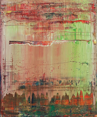
My husband and I just visited the Hess Collection in Napa, again, and
saw “S.D.I. 1986” (painted in 1993, 126” x 157 ½”):

“S.D.I.” is
really made up of many paintings: on the left lower border is a soft, smooth
abstract (of the sort I was being taught to paint in the early 70’s, “no visible
brushstrokes, uniform color, please”) where Richter has placed black, grey and
red angles against a gentle blue. Then there are the layers, moving left to
right, rough strata, scraped, with the interaction of paints and new
combinations of colors, each new formation captured as it dried. The horizontal
lines mark the artist’s movement, while the vertical red and yellow columns,
holding their own, seem to refute it.
Smooth agreement or jagged layers: Richter’s critical
reception also splits just this way, neatly into two. One camp, the smooth-agreement people, simply review the
film, positively, offering a paragraph or so of amiable enthusiasm. The best remarks from this group are
true observations, and were written by Kenneth Baker (The San Francisco Chronicle sfgate.com, posted May 3, 2012) and
Alissa Simon (Variety, posted online 9/19/11). Baker says that “the film’s second
portrait subject is Richter’s studio … immense …. The viewer finally
experiences it the way the painter must: as playroom, as production site, as
hideout and as prison.” Perfect.
The huge, clean, white, silent studio is filmed with Richter moving
through it (mostly immaculate himself, in creased slacks) with the occasional
presence of the two assistants or a gentle question from the director, Corinna
Belz. And it is clear that Richter
alternately has fun, works very hard, looks for calm or isolation in the studio,
or feels trapped by a painting that will not work. Alissa Simon notes that the film is “intelligently
assembled,” and is an “intelligent pic,” (she is
writing for Variety) with a “sparsely
modernist score” assisted by “birdsong from the garden.” The film disturbs the
process as little as possible: even the birdsong goes on despite the lights and
cameras. Here is a still from the film’s website:

But these brief critiques of the film offer little insight
into or discussion of Richter’s work. The second camp, critics who do write
about Richter’s paintings, all seem to offer us one point of view: jagged
layers. Richter’s painting is
dismissed as one thing after another, changeable, un-categorizeable. He is seen
as relentless, an unfeeling, forward-moving painting machine, emotion-less, merely
an “industry.” The fact that Richter rejects inclusion
and labels irritates people who like them. The lack of an attempt, on the part of the painter, to seduce
the critical world leads the critic to spurn the non-seduction with a nasty
review.
The most thorough essay on Richter’s work that I have seen
falls into this angry camp. In its defense, the essay is, at least, a real
attempt to sum up his legacy. T.J.
Clark gave us “Grey Panic” (The London
Review of Books, www.lrb.co.uk, posted
17 November 2011). It is ostensibly a review of the Richter retrospective,
“Panorama,” at the Tate Modern (last October through this January). This is a review that deserves
attention, because it appears to recognize Richter’s massive achievement and influence
(the Tate show is a “great event,” he assures us), but, really, Clark undercuts
Richter’s artistic efforts, first in a kind of code and then … openly.
Clark approaches the retrospective by first praising, at
some length, a concert he had attended two nights before: Boulez’s Pli Selon Pli , and his feeling that the
music he had heard that night represented the “last intransigence of modernism
on the wing.” Now, that description
sounds so lovely and seductive, but “intransigence” is … negative . Had Clark
written “the last obstinate note of modernism on the wing,” the intention
behind this juxtaposition of Boulez and Richter would have been a bit less
poetic. That “thud” we hear, the clash of the end of modernism with Richter’s
body of work, should set us up nicely to read on.
The “Grey Panic” of the review’s title refers, in Clark’s
view, to Richter’s work of the 1960’s, the “mostly monochrome oils done from
photographs.” Clark feels that
Richter’s softened and neutered palette here is not any kind of definitive
answer to the problem of painting vs. photography [oh, were we looking for
that?], and that, in fact, “the drawing away of chroma is a figure for a
general lapsing out of spatial (and therefore social) relationship.” Clark goes on to say that Richter has a
“fundamental, and persistent, sense of his own time” [which sounds like a good
thing] but goes on to say that painting is, for Richter, “essentially a way of
keeping that sense from overwhelming him.” I think, first, that “drawing away of chroma” isn’t really
the way to describe Richter’s grey work.
Perhaps Clark does not know that grey paint is mixed by combining
opposing colors on the wheel: red and green, or yellow and purple, or blue and
orange -- the opposite, then, of “drawing away of chroma.” And, next, Richter told an interviewer (Irmiline
Lebeer) that “space in painting …. doesn’t exist. It’s a false problem” (Gerhard Richter Writings 1961-2007,
d.a.p. press, 2009, p. 81). Two
dimensions, whatever they might offer, are never three -- I thought that was a
modernist tenet? Perhaps we have not heard the death knell of modernism just yet.
Richter is not worried about space. But I do believe that he is worried about
“his own time” and the “society” he lives in; he is hardly “lapsing out.” Look
at Richter’s “Miland: Dom” (Milan Cathedral) from 1964 (from the artist's website; this may not have been
in the Tate show, but it is representative of the “grey” 1960’s work):

This is still a kind of extension of modernism, I think. One
feels that the “Grey Panic” is not Richter’s, but Clark’s. “Grey does the work of mourning,” Clark
says. “It and the blur stand for
dirty, but also sterilized, secrets.”
Clark continues: “the big colored abstracts [that] emerge in
the following decade … make no sense unless they are seen against this
background of grey panic.” Clark
ends the review in a kind of unlovely series of personal reactions to the work:
the paintings offer only “heavy impenetrability” and “parody.” Any kind of
“vividness for Richter, if it comes, will have to have falsity written deep
within it” and Clark says of one of the works of the 18 October 1977 series
that it “brings on (in me) a feeling of utter impotence and incomprehension”
and that this “nihilism” is “too Olympian.” [The series -- 18 October 1977 -- was based on photographs
of the German Baader-Meinhof Group, who kidnapped and killed their targets;
three of the four were captured and later found dead in their cells. It was
never made clear whether their deaths were caused by suicide or murder.] Here
is a painting from that series, from MOMA’s collection:

I don’t know; this does not seem at all “too Olympian” to
me. And maybe “utter impotence and
incomprehension” in response to paintings about Baader-Meinhof is really
appropriate. I don’t see “deep
falsity” here; I see a very human face, presented for scrutiny. Richter said in 1981 that that “I want
pictorial content without sentiment, but I want it as human as possible” (GRW, 119).
Can the film do anything to change the minds of people like
Clark, who believe that Richter has broken modernism through “parody” and
“Olympian” indifference??
I think it can.
This artist is no parodist. “Gerhard Richter Painting” shows us that he
keeps just five or six postcard-size reproductions above his work table. One is a chipped statue of a nude
woman, seen from two angles: “The scarring is brutal,” he says. Another picture shows a tree painted by
Courbet, which I think might be this, “The Oak at Flagey”:

He keeps these works, he said, as a kind of motivation; they
are works that have moved him. Another of the pieces was a drawing by Picasso,
a woman’s head, that looked something like this “Head of a Woman” from 1933:

Richter carefully traces the “deformed, squashed” features,
tracing them and marveling at the imperfections. The one documentary photograph on his wall is a picture of
Nazi soldiers at a concentration camp, behind a pile of naked dead bodies and
wafting smoke from a fire. The
bodies will all be burned, it is clear, and Richter points to the men smoking
and talking in their long dress coats: it looks “so normal,” he says.
Perhaps Clark is right: Richter does have a “sense of his
own time,” of his own country’s history, and perhaps his paintings are a way of “keeping that sense from
overwhelming him.” He tells the
film’s director that the 18 October 1977 series was “very difficult,” but that
“doing it makes you feel good.”
The “doing” of painting is what this film is, in essence,
about. The noise of the squeegee
he uses to scrape paint across canvas seems enormous; the sound of the artist’s
movements in his studio has been amplified. The first shots of Richter at work show him straining with
the big squeegee, but then stopping, looking, and going over minute details
with a delicate paintbrush. “They do what they want,” he says of the primarily
neutral-colored paintings in these first shots. “I planned something very
different … very colorful.” Here
is a still from the film’s site, showing the massive squeegee:

The film shows Richter preparing for a show at the Marian Goodman
Gallery in New York; Goodman comes to visit during the filming to discuss the
hanging of the show. We see tiny,
perfect models of each work hanging on tiny perfect walls. The film also brings
in some older photos and films; one movie dates from 1966, and in that film
Richter says that “Painting is another form of thinking.” Yes. And Richter does all the thinking. His two assistants do not paint. They mix paint, clean up, and worry. For these larger
abstract works, the paint has to be “clean” so that the only “grooves” come
from deliberate movements by Richter, so the assistants stir the paint -- only
white, back, red, ultramarine and yellow, no earth tones, they say -- with an
electric stirrer and strain it through … cheesecloth? (They mention that the photo-based realistic works merely
needed tube paint). We see Richter working on several
canvases. Sometimes the squeegee
is dragged with great force, completely crossing the canvas, and other times
the artist uses only a small, light gesture.
He shows us disappointments; “I don’t know what to do next,”
he says, of a painting that he dislikes.
If they make it past the point where he thinks they might be finished (“When
I feel it’s right, then I stop”), then, he explains, still, paintings sometimes
only look good for a couple of hours, or perhaps a day or two. If they last longer than that, they are
hanged on white walls in a portion of the studio that looks like a gallery; if
they make it there, they can make it anywhere, he must reason. But my son was stunned when Richter
approached a painting that seemed to our audience perfect, and pulled a
canvas-high squeegee across the length of it. Gone.
He obviously was concerned about painting before a camera:
“Painting is a secretive business,” he says, “between being caught and being
seen, something you do in secret and then reveal in public.” But we get to know a lot about him,
through this film, and it’s clear that, as he says in GRW to an interviewer, that art is “the highest form of hope”
(488). I will leave you with an abstract from 2009, taken from
Richter’s site, from 2009, the time of the filming:
I personally never liked Richter's abstracts until I saw them in person at his exhibition last year in the Tate Modern. I couldn't see any compositional value, they just looked like blended paint. After seeing them in the flesh, I appreciated the sheer power of the work. The colours often verge on becoming mud, despite showing the entire spectrum so close together, the textured too are amazing, to I now approach them in the same way I would a sculpture as I don't feel seeing images on the internet or even in books do them justice. Thank you very much for this brilliant post :)
ReplyDeleteDear Fred,
ReplyDeleteYou are making a really important point. So many times, all we have access to is a reproduction, but as you say, the colors and textures get lost in print and on screen. I am glad you liked the post... loved your newest work on your blog! Very lively, deep colors (and someday my husband and I will come and see it in person).
Thank you for visiting my blog. I like your Donne quote and your thoughtful posts.
ReplyDeleteThank you Jackie! Good luck with your lovely book....
ReplyDelete