Wednesday, August 15, 2012

"Anything is a Mirror": "Vexed Endings" at Green on Red Gallery, Dublin, Ireland


We have moved to Dublin, Ireland, for three months of visiting (our daughter and her boyfriend live here) and to find a new perspective on art-making and viewing.

A compelling show to start: an exhibition of six artists called “Vexed Endings” at The Green On Red Gallery (a beautiful, bright loft space at 26-28 Lombard Street East, Dublin 2, through August 25th). The title implies that works are incomplete until … perhaps now, when the viewer sees them, or perhaps not entirely, ever: the gallery statement says that the works here “tend toward a material condition or conceptual state that is unstable, open-ended, and incomplete …. [the] process is not concluded and very much alive or ongoing …. The room for the viewer is ample and central.”

“Unstable, open-ended, and incomplete” like light through a window … it isn’t all the available light, we know that, but it’s the light we can see … and then it shifts.  The collected works of “Vexed Endings” change with the light and with the position of the viewer. They seem to me all about reflected light, which we don’t always notice.  It reminds me of the way light works in this Vermeer, “Woman Writing a Letter, with Her Maid,” which we saw at the National Gallery of Ireland (permission pending; see www.national gallery.ie for their photograph).

We can see the source of the light, the window, and the women’s bodies it touches; we can sense that the maid would far rather be out in the world (where she is looking) and that the woman writing seems totally caught up in her letter. Then we can see a folded and discarded letter, lit by that same sun, on the floor; perhaps that is the letter the woman is answering so intently. The upper half of the window appears to hold clearer glass, and the sun is high enough in the sky to concentrate mostly on that higher pane. Looking again, we see that the green drapes at the left margin are lit, too, so there is another window lighting them (probably the window depicted in Vermeer’s “Music Lesson”).  The light here is shown as a single moment and we can almost trace the line from the source of that light to the forms it lights.

The works in “Vexed Endings” intensify that line because they show it shifting; for these works, it isn’t just a single moment. The line changes for as long as the viewer is in the gallery.

A photograph, “Reflecting 1 (6th Generation)” by Philomene Pirecki illustrates this shift in light; the work isn’t framed, and hangs loose on the wall, leading me to photograph it from two different angles, front (where I am the black form at left) and the side:


This is an abstract print (50.8 x 40.5 cm) that shifts, as you can see from these two pictures, depending on where we are in relation to it and to the light.  A second print of the same size, “Reflecting 3 (4th Generation)” appears to offer a little more certainty:


The artist’s studio, we think.  But each time we look, that line between the source of light and the object moves, and we are no longer certain what we are seeing.  This is, it seems to me, the essence of abstract work, that it forces us to see what we cannot actually know.  Pirecki is showing two paintings as well, but I was most intrigued by another work, “Equivalence (Copper, 3)” set on the floor that I photographed from above:


The thing itself, and its portrait. The lines of the floorboards are clearly reflected in the copper, and somewhat less clearly in the print; here, and not-here.

Dennis McNulty trained as an engineer and is a musician; his “Circuits”trails an electric wire across the floor to a digital reading that almost, but never quite, spells out the character for infinity:


The base of the piece is stacked concrete and the top, draped soft plastic, catches reflective light as it tries to create its own meaning, lit from within.  Another McNulty installation reflects light from the gallery windows and visitors and changes as we circle it. Here is my photograph of  “The time inside (the spoil)”:


The title seems to suggest the deliberate imperfections of the piece: the film twists away from the glass, as if trapped by heat or light.  I liked the way this piece brings the “outside” in.

My favorite two pieces from this show are the pair of etchings, “For Now 1” and “For Now 2,” by John Graham:


The lines have been slowly and carefully crossed, then printed, black lines against a white surface (referring back to Agnes Martin) and as we look we can see the gallery reflected:


 Or the viewer:


The lines weave in and out, gaining volume, almost becoming three-dimensional fabric.  The two prints are very similar, but the artist stresses that they are not the same; there are delicate lines across the top of the horizontal and vertical patterns so that the light is not caught in quite the same way in each form.  I kept coming back to these two; they have a calm and contented presence.

It’s John Graham’s fault that I am reminded of Agnes Martin, who wrote “Anything is a mirror…. There are two endless directions. In and out.” 

Thanks to Jerome O Drisceoil for his help! Go and see the show if you are in Dublin (there are many more fine works that I didn't get to here) and see for yourself the “In and out.”


Friday, July 27, 2012

San Francisco: The “Angular Invariability” of Day or “Groping in the Darkness” of Night?


I don’t mean when artists work. I mean… how.  I would like to propose two categories, ways of thinking about the way art is made: DAY or NIGHT.  (I like the way these seem like opposites, but as Keith Richards wrote in his song “Slipping Away,” it’s “First the sun and then the moon. One of them will be around soon….”)

Day
This morning there was a clear silver-blue cloudy light over the Bay, the basic white light that alerts us all: it’s time to get to work. Some artists work best in this bright light of day and find stability, continuity, a kind of plotline managed through repetition, a plan approaching a blueprint.

SFMOMA has been exhibiting the notes (and lots of other things, but it is the notes that got me) of Buckminster Fuller.  He wrote a brief definition of STABILITY on an index card:  “A necklace is unstable. The lengths of the beads in a necklace do not change. Only the angles between them change. Stability refers only to angular invariability.” Surrounding this quote were endless cards with formulas and diagrams. We could probably find other ways to define stability, but stay with this idea, this single idea, just for a moment. And then think about painters who have chosen to work with “angular invariability.”  The bright light of day and of persistence, image(s) seen in the mind, a sketch in full bloom, played large on canvas. Ellsworth Kelly, for example, in this painting, “Il Cerf Volant,” looked for a particular “fit” of image and space:


Kelly said of his work that “I have worked to free shape from its ground, and then to work the shape so that it has a definite relationship to the space around it; so that it has a clarity and a measure within itself of its parts (angles, curves, edges and mass); and so that, with color and tonality, the shape finds its own space …” I hear a formal declaration here. As a painter, I see this as Kelly describing a path, a path followed in painting after painting. Agnes Martin, even more clearly, insisted that she did not begin a painting until she saw it first, entire, in her mind; here is her “Friendship,” from 1963:


Daylight, the repeated gesture, each line a familiar presence, but each its own presence.  Martin said that her works were really about “innocence,” and there is a kind of innocence in her following each gesture with another just like it until the work is completed. You can trace her progress; we can see the time she took.  

As we visited galleries in San Francisco, I found several artists who follow this architectural structure as they paint. One artist, who marks over graph paper, Indira Martina Morre, says she uses the images she sees on computer screens:  “Dots, circles, lines, crosses, arrows, … networks … departing onto canvas where it all disintegrates to become a psychological map, to become a hand-made document of a presence in time, to become a mark” (artist’s statement, http://indiramorre.com).  Here is one of her works representative of those we saw at K. Imperial Fine Art, this image from her site:


The characters Morre chooses are carefully delineated; the soft paint around them diminishes the contrast between each mark and the “screen” or background here…. The fading towards the bottom gives you a sense of perspective from across the room.  Morre says: “Rendering perfect, utilitarian, and timeless signs by hand is a consequence of my desire to access an imperfect, contradictory, time-bound being on the other side of a screen” (artist’s statement on her site).  This “rendering” takes considerable forethought and time, just as Agnes Martin’s did.  Another artist whose marks add up is Teo Gonzalez at Brian Gross Fine Art; here is his “Untitled #618” from 2012 (the photograph is from http://www.briangrossfineart.com/artists/tgonzalez:


We can see calm and perfection here; time, the time taken to create the work, slows and passes.  From a distance Gonzalez’s work, like Morre’s, takes on a softness, but, also like Morre’s paintings, Gonzalez’s paintings change subtly when viewed close-up: we can see the surface bristle and shimmer with each little mark, as we can see here in my "detail" photo:

Judith Foosaner, also at Brian Gross, repeats motifs, here by stopping and starting with forms that seem torn and re-grouped from a precision die-cutter. Here is my photograph of “Breaking and Entering #17,"  36” x 72” collage and acrylic on canvas:


This seems to me to echo Picasso’s “Guernica,” in its majesty and its carefully-blocked spaces. Here is a detail:


There is a steady movement here, a planned progress, that has then been deliberately undercut in the tough light of day.

A different kind of daylight comes about in Patrick Wilson’s “Slow Motion Action Painting” at Marx & Zavattero.  Here is his 17” x 17” painting “La Estrella,” photographed by Alanna Yu:


If the painted surfaces appear to be coming at you online, wait till you see them in person.  We first thought the work was painted on layered supports and pieces of angled mirrors, but they are not; the works are simple layers of paint, glass-smooth and softly-graded color across some parts of a piece, rough and bumpy in other sections.  Here is another, “Mixed Greens,” (30” x 72,” my photograph):


This is a light-of-day, blueprint painting. Here is what Wilson says about his process: “I am a painting junkie. I am a slow motion action painter, trusting my gut and my eyes. My paintings are intuitive, built one shape, one color, one line at a time. They are meant to be experienced at a leisurely pace. I am in pursuit of beauty, but well aware that pleasure is the more likely outcome. Pleasure is good too”  (from the gallery website, http://www.marxzav.com/artist.php?id=10).  He says his work is intuitive, which would lend it spontaneity, and perhaps that’s the way it seems to him – but to me, this looks as though no brushstroke could move out of its planned space.

“Pleasure is good.” And with that thought in mind, let’s move to the next group of artists.

Night

I have been reading the new edition of A Farewell to Arms, which includes drafts and several endings Hemingway considered for the novel; here is an excerpt from the novel (that remained): “I know that the night is not the same as the day; that the things of the night cannot be explained in the day because they do not exist…”  (p. 216, Scribner Edition, 2012).

We tell ourselves stories about these “things of the night.”  They go bump. Sometimes we paint or write these “things.”  Rauschenberg wrote that he “always felt a little strange about the fixedness of a painting” and if you look, you might perhaps see what we can call the night-time of his works: the shifts, the shadows, the objects, the sweep of the brush, the partial print of a photograph all conspire to suggest working in the moment, without the help of a blueprint. Here is Rauschenberg’s “Prize,” a lithograph from 1964:


The work is filled with chances taken, with creating in the moment.  Alberto Giacometti said that "When I make my drawings ... the path traced by my pencil on the sheet of paper is, to some extend, analogous to the gesture of a man groping his way in the darkness." Here is Giacometti’s portrait of Jean Genet:


The portrait “cannot be explained” logically but has its power because of its freedom.  I found three artists whose work is on show in San Francisco whose lines and paints are not coming from the precise light of day, but of this un-fixed night.  Marilyn Levin at Toomey Tourell dazzles with “Morning Offerings” (my photo):


The dripping gold, both banner and airy light -- that gold wouldn’t have its power if not for the layers beneath it and the power of chance, of accident. The way the gold paint has congealed in spots, remained soft and unlined in the round line of “tassels” at the bottom, the way Levin has managed to conjure the feeling of night receding, it’s all gorgeously tumbled together.  The power that stems from these layers does not seem like the result of a clear plan to me.  This power comes from experimentation, taking chances, working with the materials, but letting the hyper-self-critical faculties of day go on vacation for a few hours. This is the gesture or footprint that falls and is not taken back….

Lora Fosberg’s work is at Jack Fischer. She has a series of paintings in gouache, collage and wax on panel called “The Miracle of the Actual.”  These are humorous, ironic, skilled (“she has a fine way with line,” says the gallery owner) and yet the works I want to talk about somewhat different. Fosberg has taken a large, heavy German world atlas from the early twentieth century as her canvas, and sketched in many of the pages (175 drawings, roughly), and these works collectively are called “The Way of the World.” Here is the cover, from the gallery’s website:


This studied collage is in the mode of “careful,” and would fit nicely with the “day” works above. But not so once we page through the book.  There we can see Fosberg’s inventive and knowing hand pulling together threads that, as I see it, she isn’t sure of until they land on the paper. These seem to be freer, looser, drawings that show her hand leading her brain.  One drawing shows logging trucks pulling across an index, sandwiched under “INHALT” and above “Sud Und WestEuropa.”  My favorite is the four Eiffel’d power-towers apparently installed at (the) “Nordpol”; here is that double page, again from the gallery website:


Visit the gallery and leaf through the book with the owner. These are delightful innovations, and make great use of the contrast between the maps and labels and Fossberg’s inked overlays. The Jack Fischer gallery also has a promising show coming up in August by the artist Lauren Dicioccio (see her “cross stitch into found book”: http://www.jackfischergallery.com/artists/lauren_dicioccio/index.htm). (Probably a “day” artist).

One last “night” person; here is Reed Anderson at the Gregory Lind Gallery, “To All a Good Looking Stranger” (66” x 72,” acrylic, block cut and collage on cut paper, taking up most of a wall; this photo is from  http://gregorylindgallery.com/artists/anderson):


And, smaller, but very similar, “Lady Faces,” acrylic on cut paper, 29” x 27,” (photo also from the gallery site):


What I love about these works is that Anderson has given us precision and spontaneity, certainty and the unknown, clean cuts and awkward drips. He has cut the scallop shapes cleanly and created these mapped planes, yet they are against a border of un-carefully-muddied thick paper…. These are good images to end with, because they combine the planning of the first group of painters with considerable devil-may-care, a kind of Hemingway bravado… who else would cut paper and lay in geometric shapes and create something that looks as though it ought to be set carefully on a side-table in a drawing room, and then allow drips and footprints and coffee stains around the perimeter, doilies and warts all in one? Anderson neatly pulls together both categories of day and night.
“First the sun and then the moon, one of them will be around soon…”


Tuesday, July 3, 2012

"Too Olympian"? or, Use Your Words, Dammit: What is the Effect of "Gerhard Richter Painting"?


I recently saw the film “Gerhard Richter Painting” with my son and his fiancée in Los Angeles; it is still showing through the summer in some cities. I urge you to see it or, failing that, find and go to see his newer work, the big abstractions.  My husband and I just visited the Hess Collection in Napa, again, and saw “S.D.I. 1986” (painted in 1993, 126” x 157 ½”):


“S.D.I.”  is really made up of many paintings: on the left lower border is a soft, smooth abstract (of the sort I was being taught to paint in the early 70’s, “no visible brushstrokes, uniform color, please”) where Richter has placed black, grey and red angles against a gentle blue. Then there are the layers, moving left to right, rough strata, scraped, with the interaction of paints and new combinations of colors, each new formation captured as it dried. The horizontal lines mark the artist’s movement, while the vertical red and yellow columns, holding their own, seem to refute it.

Smooth agreement or jagged layers: Richter’s critical reception also splits just this way, neatly into two.  One camp, the smooth-agreement people, simply review the film, positively, offering a paragraph or so of amiable enthusiasm.  The best remarks from this group are true observations, and were written by Kenneth Baker (The San Francisco Chronicle sfgate.com, posted May 3, 2012) and Alissa Simon (Variety, posted online 9/19/11).  Baker says that “the film’s second portrait subject is Richter’s studio … immense …. The viewer finally experiences it the way the painter must: as playroom, as production site, as hideout and as prison.” Perfect.  The huge, clean, white, silent studio is filmed with Richter moving through it (mostly immaculate himself, in creased slacks) with the occasional presence of the two assistants or a gentle question from the director, Corinna Belz.  And it is clear that Richter alternately has fun, works very hard, looks for calm or isolation in the studio, or feels trapped by a painting that will not work.  Alissa Simon notes that the film is “intelligently assembled,” and is an “intelligent pic,” (she is writing for Variety) with a “sparsely modernist score” assisted by “birdsong from the garden.” The film disturbs the process as little as possible: even the birdsong goes on despite the lights and cameras. Here is a still from the film’s website:


But these brief critiques of the film offer little insight into or discussion of Richter’s work.  The second camp, critics who do write about Richter’s paintings, all seem to offer us one point of view: jagged layers.  Richter’s painting is dismissed as one thing after another, changeable, un-categorizeable. He is seen as relentless, an unfeeling, forward-moving painting machine, emotion-less, merely an “industry.”   The fact that Richter rejects inclusion and labels irritates people who like them.  The lack of an attempt, on the part of the painter, to seduce the critical world leads the critic to spurn the non-seduction with a nasty review.

The most thorough essay on Richter’s work that I have seen falls into this angry camp. In its defense, the essay is, at least, a real attempt to sum up his legacy.  T.J. Clark gave us “Grey Panic” (The London Review of Books, www.lrb.co.uk, posted 17 November 2011). It is ostensibly a review of the Richter retrospective, “Panorama,” at the Tate Modern (last October through this January).  This is a review that deserves attention, because it appears to recognize Richter’s massive achievement and influence (the Tate show is a “great event,” he assures us), but, really, Clark undercuts Richter’s artistic efforts, first in a kind of code and then … openly.

Clark approaches the retrospective by first praising, at some length, a concert he had attended two nights before: Boulez’s Pli Selon Pli , and his feeling that the music he had heard that night represented the “last intransigence of modernism on the wing.”  Now, that description sounds so lovely and seductive, but “intransigence” is … negative . Had Clark written “the last obstinate note of modernism on the wing,” the intention behind this juxtaposition of Boulez and Richter would have been a bit less poetic. That “thud” we hear, the clash of the end of modernism with Richter’s body of work, should set us up nicely to read on.  

The “Grey Panic” of the review’s title refers, in Clark’s view, to Richter’s work of the 1960’s, the “mostly monochrome oils done from photographs.”  Clark feels that Richter’s softened and neutered palette here is not any kind of definitive answer to the problem of painting vs. photography [oh, were we looking for that?], and that, in fact, “the drawing away of chroma is a figure for a general lapsing out of spatial (and therefore social) relationship.”  Clark goes on to say that Richter has a “fundamental, and persistent, sense of his own time” [which sounds like a good thing] but goes on to say that painting is, for Richter, “essentially a way of keeping that sense from overwhelming him.”  I think, first, that “drawing away of chroma” isn’t really the way to describe Richter’s grey work.  Perhaps Clark does not know that grey paint is mixed by combining opposing colors on the wheel: red and green, or yellow and purple, or blue and orange -- the opposite, then, of “drawing away of chroma.”  And, next, Richter told an interviewer (Irmiline Lebeer) that “space in painting …. doesn’t exist. It’s a false problem” (Gerhard Richter Writings 1961-2007, d.a.p. press, 2009, p. 81).  Two dimensions, whatever they might offer, are never three -- I thought that was a modernist tenet? Perhaps we have not heard the death knell of modernism just yet. Richter is not worried about space. But I do believe that he is worried about “his own time” and the “society” he lives in; he is hardly “lapsing out.” Look at Richter’s “Miland: Dom” (Milan Cathedral) from 1964 (from the artist's website; this may not have been in the Tate show, but it is representative of the “grey” 1960’s work):


This is still a kind of extension of modernism, I think. One feels that the “Grey Panic” is not Richter’s, but Clark’s.  “Grey does the work of mourning,” Clark says.  “It and the blur stand for dirty, but also sterilized, secrets.”

Clark continues: “the big colored abstracts [that] emerge in the following decade … make no sense unless they are seen against this background of grey panic.”  Clark ends the review in a kind of unlovely series of personal reactions to the work: the paintings offer only “heavy impenetrability” and “parody.” Any kind of “vividness for Richter, if it comes, will have to have falsity written deep within it” and Clark says of one of the works of the 18 October 1977 series that it “brings on (in me) a feeling of utter impotence and incomprehension” and that this “nihilism” is “too Olympian.”  [The series -- 18 October 1977 -- was based on photographs of the German Baader-Meinhof Group, who kidnapped and killed their targets; three of the four were captured and later found dead in their cells. It was never made clear whether their deaths were caused by suicide or murder.] Here is a painting from that series, from MOMA’s collection:


I don’t know; this does not seem at all “too Olympian” to me.  And maybe “utter impotence and incomprehension” in response to paintings about Baader-Meinhof is really appropriate.  I don’t see “deep falsity” here; I see a very human face, presented for scrutiny.  Richter said in 1981 that that “I want pictorial content without sentiment, but I want it as human as possible” (GRW, 119).

Can the film do anything to change the minds of people like Clark, who believe that Richter has broken modernism through “parody” and “Olympian” indifference??

I think it can.  This artist is no parodist. “Gerhard Richter Painting” shows us that he keeps just five or six postcard-size reproductions above his work table.  One is a chipped statue of a nude woman, seen from two angles: “The scarring is brutal,” he says.  Another picture shows a tree painted by Courbet, which I think might be this, “The Oak at Flagey”:


He keeps these works, he said, as a kind of motivation; they are works that have moved him. Another of the pieces was a drawing by Picasso, a woman’s head, that looked something like this “Head of a Woman” from 1933:


Richter carefully traces the “deformed, squashed” features, tracing them and marveling at the imperfections.  The one documentary photograph on his wall is a picture of Nazi soldiers at a concentration camp, behind a pile of naked dead bodies and wafting smoke from a fire.  The bodies will all be burned, it is clear, and Richter points to the men smoking and talking in their long dress coats: it looks “so normal,” he says. 

Perhaps Clark is right: Richter does have a “sense of his own time,” of his own country’s history, and perhaps his paintings are a way of “keeping that sense from overwhelming him.”  He tells the film’s director that the 18 October 1977 series was “very difficult,” but that “doing it makes you feel good.”

The “doing” of painting is what this film is, in essence, about.  The noise of the squeegee he uses to scrape paint across canvas seems enormous; the sound of the artist’s movements in his studio has been amplified.  The first shots of Richter at work show him straining with the big squeegee, but then stopping, looking, and going over minute details with a delicate paintbrush. “They do what they want,” he says of the primarily neutral-colored paintings in these first shots. “I planned something very different … very colorful.”  Here is a still from the film’s site, showing the massive squeegee:


The film shows Richter preparing for a show at the Marian Goodman Gallery in New York; Goodman comes to visit during the filming to discuss the hanging of the show.  We see tiny, perfect models of each work hanging on tiny perfect walls. The film also brings in some older photos and films; one movie dates from 1966, and in that film Richter says that “Painting is another form of thinking.”  Yes.  And Richter does all the thinking.  His two assistants do not paint.  They mix paint, clean up, and worry. For these larger abstract works, the paint has to be “clean” so that the only “grooves” come from deliberate movements by Richter, so the assistants stir the paint -- only white, back, red, ultramarine and yellow, no earth tones, they say -- with an electric stirrer and strain it through … cheesecloth?  (They mention that the photo-based realistic works merely needed tube paint).   We see Richter working on several canvases.  Sometimes the squeegee is dragged with great force, completely crossing the canvas, and other times the artist uses only a small, light gesture.

He shows us disappointments; “I don’t know what to do next,” he says, of a painting that he dislikes.  If they make it past the point where he thinks they might be finished (“When I feel it’s right, then I stop”), then, he explains, still, paintings sometimes only look good for a couple of hours, or perhaps a day or two.  If they last longer than that, they are hanged on white walls in a portion of the studio that looks like a gallery; if they make it there, they can make it anywhere, he must reason.  But my son was stunned when Richter approached a painting that seemed to our audience perfect, and pulled a canvas-high squeegee across the length of it.  Gone.

He obviously was concerned about painting before a camera: “Painting is a secretive business,” he says, “between being caught and being seen, something you do in secret and then reveal in public.”  But we get to know a lot about him, through this film, and it’s clear that, as he says in GRW to an interviewer, that art is “the highest form of hope” (488).   I will leave you with an abstract from 2009, taken from Richter’s site, from 2009, the time of the filming:


Friday, June 15, 2012

"THE PAINTED WORD": "like gold to aery thinness BEAT"


Our two souls therefore, which are one,
          Though I must go, endure not yet
A breach, but an expansion,
          Like gold to aery thinness beat ….

Thy firmness makes my circle just,
          And makes me end where I begun.
                        From “A Valediction Forbidding Mourning” by John Donne


The Meridian Gallery in San Francisco (see my previous post  -- 2/17/12 -- about their wonderful Patrick Graham exhibition) is presenting a show, now extended through July 14th, called “The Painted Word,” co-curated by Peter Selz and Sue Kubly.   I will focus here on seven participants:  William Saroyan, Lawrence Ferlinghetti, Kenneth Rexroth, Jack Hirschman, Robert Duncan, Henry Miller, and Kenneth Patchen.

Audiences have become used to painters inserting words, phrases or poems in their work, as in Abstract Expressionist Robert Motherwell’s “Je t’aime (I love you)” below):


But we are not used to thinking about poets attempting, and succeeding at, painted poetry. Only the drawn and hand-printed plates of William Blake’s “The Marriage of Heaven and Hell” (completed in 
1793) come to mind:


 And then? Most of us cannot imagine any successors to Blake. This show changed all that for me. Poets paint. There was a movement, loosely grouped, endlessly defined, that co-existed with Abstract Expressionism: the Beat generation.  I should say, up front, that not every writer in this show is included in various lists of Beat poets (William Saroyan paints, but does not “Beat” in any list, for example), and that not all poets who came of age in the 1940’s and 1950’s painted their works on canvas (Allen Ginsberg among them).  But they don’t know what they missed -- this show is that compelling.

To better understand these writers and their era, I have been reading The Typewriter is Holy: The Complete, Uncensored History of the Beat Generation, by Bill Morgan, recommended to me by the staff of City Lights Bookstore (which, along with the Meridian Gallery, deserves a visit).  Morgan makes a claim up front for the differences among these writers:  “Friendship held these writers together, more than style or ideology” (xvii).  Allen Ginsberg is central to Morgan’s research, the figure around whom, the author says, the Beats moved. Ginsberg was not a painter, but he did set Blake’s poems to his own musical compositions (p.228) And so it seems that almost all of these writers considered working in another medium, or even with another medium. Here is proof; the show includes a poster of a Kenneth Patchen reading, accompanied by André Previn’s jazz, in Oakland (all images from here on are courtesy of The Meridian Gallery):


Breaking boundaries. This show at Meridian pulls together writer/artists working from the mid-1940’s to the 2010’s and makes us SEE the fullness of what the arts are and, specifically, what painting and poetry might BE if we can only see them, combined.

One of the seminal poets whose paintings are represented in this show is Lawrence Ferlinghetti. His book, A Coney Island of the Mind, is still in print, and is one of the best known books of poetry from this period, so Ferlinghetti can help introduce us to this way of thinking and feeling. A stanza follows:

Constantly risking absurdity
and death
whenever he performs
above the heads
of his audience
the poet like an acrobat
climbs on rime
to a high wire of his own making.

It is critical, that stress on “absurdity /and death.”  Coney Island poems were different from Shakespeare and W.H. Auden; they felt irreverent, immediate, and a little scary.  I found an article, last week, that was first published in The New York Times Magazine on November 16, 1952, called “This is the Beat Generation,” by John Clellan Holmes (www.litkicks.com/Texts/This isBeatGen.html).  He writes that there are two main reactions to post-WWII America: people became conformists (what he calls “the young Republicans”) or Beats (what he calls the1950’s “hipsters”).  Holmes writes:

“More than mere weariness, [Beat] implies the feeling of having been
used, of being raw. It involves a sort of nakedness of mind, and,
ultimately, of soul; a feeling of being reduced to a bedrock of
consciousness. In short, it means being undramatically pushed up
against the wall of oneself …. [This generation had seen war and, much
as they are unwilling to go back into that void] they have never been
able to keep the world out of their dreams …. They had intimate experience
with the nadir and the zenith of human conduct …. [their experiences]
led to black markets, bebop, narcotics, sexual promiscuity, hucksterism, and
Jean-Paul Sartre. The beatness set in later …. Their excursions into drugs or
promiscuity come out of curiosity, not disillusionment …. How to live
seems to them much more crucial than why ….  The valueless abyss of
modern life is unbearable …. [And yet]  beneath the excess [of the Beats]
and the conformity [of the young Republicans] there is something other
than detachment. There are the stirrings of a quest.”

And isn’t that the point, really, that all of us, and all writers and artists, face the question of How to live? That life, and art, involve a kind of realization of the “nakedness of mind,” a “curiosity,” and “the stirrings of a quest”? The unease we sometimes feel, the restlessness and eagerness to find ourselves, and even the fear of what we will find, isn’t that central to our age, even now?

That is why this exhibition is so important, because it connects us, through works we are unlikely to see together ever again, to a larger world of art that helps us see that “abyss” and re-work it into something we can   -- perhaps -- confront through paint and words.  And it is their knowing that the “perhaps” is always there that leads these writers to jump into the paint with such abandon and apparent joy.

The first set of works I would like to mention seem to me to be all about a kind of wild exuberance. Just look at Henry Miller’s “Untitled” (in a corner he has written “1954”):


It is free, and happy; this painting bears no resemblance to the art of the Abstract Expressionists, with its European roots.  This is a fully local, American art, with a couple, a church, a house as if seen in a dream, lush colors, a fully-realized life.  Miller is not someone we think of as a Beat.  And yet there is a connection:  in The Holy Typewriter, Bill Morgan notes that because of the positive outcome of the  1957 censorship trial of Lawrence Ferlinghetti (who had published Allen Ginsberg's Howl and Other Poems)  Grove Press would later be able to publish Miller’s Tropic of Cancer (p. 129).  And Miller would appear at an international writers’ conference in 1962 in Edinburgh with William Burroughs and Mary McCarthy and Norman Mailer, a conference where Burroughs was championed by McCarthy, one of the endorsements that would make him famous (Morgan, p. 195).

William Burrough’s Naked Lunch  (see an excellent short introduction to him here: http://www.npr.org/templates/story/story.php?storyId=113610846) would suffer its own censorship trial, but survive, like Howl, to sell and inspire well beyond anything he might have imagined.  Morgan’s book details Burrough’s rough life, from addiction, to murder, to writing influential books with the intense support of his friends.  But Burrough’s visual art can be gestural, luminous, layered, and filled with color, as here in the very large “Piece for City People,” from 1993:


I love these pinks, rusts and purples, and the combination of the sweeping brushstroke and the smaller circles. 

The third in this “exuberant” series of works, one of the striking pieces on the first floor of the show, is “Dipthong,” from 2010, by Jack Hirschman:


We can see drips, a possible figure or animal, writing-not-quite-writing, and kind of brash use of color and shape. There’s a famous story about Hirschman; he sent work to Ernest Hemingway, who replied: "I can't help you, kid. You write better than I did when I was 19. But the hell of it is, you write like me. That is no sin. But you won't get anywhere with it."  Hirschman lives in San Francisco, was its poet laureate, and is an activist, poet and painter. Here are a few lines of his from “Who Cares” (printed in Left Curve no.21):

…. he said, speaking of
the future some thirty odd
years ago, of this visual
listening to light
just below the surface of things,
this planetary All in you, constructed
of holocausts and ecstasies, the snail's inch
and the worker's steel, demonstrations and
monotonies, golem and robot, opens to receive
most stumblingly, hungrily, desolately, authentically
sounds from deep within the wilding stillness
and there, when five small human bones tug
at your sleeve of skin, the question-mark
falls away and you know who cares.

There is a continuity here between the poetry and painting, lines in each one that keep moving, verbs that jump, colors that jump, waking you up.

The fourth set of paintings that seems to me to be completed in this bouncy, buoyant mode comes from Lawrence Ferlinghetti.  His book of poems, Coney Island,  had helped create his reputation, and Ferlinghetti would help others as he published their work through his City Lights Press. In January 1967, Gary Snyder, Allen Ginsberg, Timothy Leary, Michael McClure and Lawrence Ferlinghetti were all on the stage at the San Francisco Human Be-In, an event billed as A Gathering of Tribes which “marked the start of what became known as “the Summer of Love” (Holy Typewriter, p. 223).  His poems are known for their easy, hip, cool, accessible language, language that offers more each time the reader returns to it. Here is a bit of “4,” from the painterly book Pictures of a Gone World:

 And in the poet’s plangent dream I saw
no Lorelei upon the Rhone
                               nor angels debarked at Marseilles
but couples going nude into the sad water
                                 in the profound lasciviousness of spring
   in an algebra of lyricism
                                 which I am still deciphering

Ferlinghetti’s paintings, shown at Meridian, are sometimes political (“Mother Russia”) or historical (“Freud”) or amusing (“Bagno di seni,” a man in a bathtub filled with breasts) but they are all like a single line of a poem: one thought, selected carefully, then writ or painted large. Here is a center detail of the wall-sized homage to Picasso, "Pablo" from 1991. The painter is surrounded by his creations:


The painter seems to be behind a glass wall, in his own world, unapproachable, but captured, with his women and what seem to be forms from Guernica floating all around him. “Pablo” is painted in primary colors, an interesting choice for a painter who preferred grays and browns.  “If he were here with us,” Ferlinghetti seems to be saying ….

I found, on thinking about the show after I saw it, that a second set of works seemed to present themselves. These are the quieter, more contemplative pieces that gave this post its title, the “gold to aery thinness beat.”  I felt as though these paintings, with their acknowledgement of all that has passed, still found the beauty and the feeling in what remains, just as Donne’s narrator does in his poem :”Valediction.” It is not “A breach, but an expansion.”

“I think of myself as someone who has used the medium of painting in an attempt to extend," said Kenneth Patchen (who also read poems to jazz accompaniment and wrote a play with John Cage).  Patchen would be one of the first poets published by Ferlinghetti’s City Lights Press.  He had attended the University of Wisconsin, and knew T.S. Eliot and William Carlos Williams, yet had to work as a migrant and was confined to bed for his final 13 years, years when he wrote and painted some of his best work.  Patchen played with the poetic tradition:

Sunday, April 8th (168
With this rose, I thee world. Fashioned in Love, its color the
color of heart’sblood! See, though its leaves do wilt and fall, yet
is it rose; and never any mean or sullied thing. Wonder it!

Meridian has, for sale, a portfolio of delicate silkscreened poems on handmade paper by Patchen; they must be handled with gloves, but they are very beautiful, sometimes funny, always playing with whether colors or words are foremost.  Here is a painting from the show, a kind of “valediction,” called “#160 Untitled,” from the 1960’s:


“Shape-shifting was the essence of his art,” wrote the critic Jonathan Clark (in Kenneth Patchen: A Centennial Selection, Kelly’s Cove Press, p. 9. This book is also at Meridian, and gives you a good idea of how linked drawing and poetry were for Patchen).  The painting here shape-shifts on its own.  Roses? Snakes?  Planted fields with gold shot through the air?  Patchen also writes prose; here is a bit of  “A Pasturized Scene” (all crazed spellings are his):

“A little roly poly Giant Sloth chanced to be picking an bouquet of dryish blue skullcaps, when, without any warning whatever, an impetuous Cow dashed from a doorway hung with swinging bags and began at once to make wild threats against his continued safety. Much enamoured as he was by their vague, barny smell and puffy sponge-veined lips, he made in turn ….”

In addition to Shakespearean and Hefnerian sexual innuendoes (which I haven’t quoted here) the Beats had a more than a streak of Edward Lear….

Kenneth Rexroth was also one of the first writers published by City Lights and helped fight for Ferlinghetti’s Howl to be published (Holy Typewriter, pp. 127-8).  Here is the conclusion to the poem “Gic to Har” (from www.poets.org):

I remember a sycamore in front of a ruined farmhouse,
And instantly and clearly the revelation
Of a song of incredible purity and joy,
My first rose-breasted grosbeak,
Facing the low sun, his body Suffused with light.
I was motionless and cold in the hot evening
Until he flew away, and I went on knowing
In my twelfth year one of the great things
Of my life had happened.
Thirty factories empty their refuse in the creek.
On the parched lawns are starlings, alien and aggressive.
And I am on the other side of the continent
Ten years in an unfriendly city.

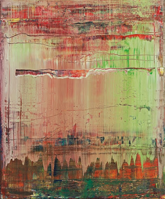
You can see here a lyricism, disrupted, and mourned for. Rexroth’s painting “San Marco” from 1956 has the same mournful, profound beauty:


I stood before this for quite awhile. The layers are really moving.

Along with Patchen and Rexroth, Robert Duncan’s paintings lend themselves to a long, hard, meditative look.  Here is “Flower Design,” from 1950:


It is a Vuillard, a Matisse, but goes all over, right to the edges, as if to say the dance continues… Duncan’s poems have an edge that he does not pull into his paintings.  See these few lines from the prose poem “Structure of Rime XX,” from his Selected Poems:

                  ….You keep the unknown bird hidden in your hands as if to carry sight into
the house. But the sightless ones have opend the windows and listen to the songs outside. Absence, the Mother of Blindness tells them, rimes among the feathers of birds that exist only in sight. The songs you hear fall from their flight light like the shadows stars cast among you.

                  You must learn to lose your heart. Let the beat of your heart go. Missing the beat. And from the care of your folded hands unfold a feeling in the room of an empty space….

And then there is this fabulous work, “Untitled,” which you must imagine as large (and then go and see it):


It is as if Duncan wanted a light, free, and easy touch in the allover paintings that he could not place in his poetry. For him, but not for the other poets, there was a difference between the painted and the written work.

The last of the writer-painters in this “quieter” group is William Saroyan, best known as a playwright, novelist and short-story writer.  One of his works is suspended from the gallery ceiling.  He once told a younger writer "Try to learn to breathe deeply; really to taste food when you eat, and when you sleep really to sleep. Try as much as possible to be wholly alive with all your might, and when you laugh, laugh like hell." In this, he is a Beat, although he isn’t mentioned in The Typewriter is Holy.  Saroyan, like Duncan, paints all-over lines (that would later be “discovered’ anew by Brice Marden in his “Cold Mountain” series). Here is Saroyan’s wonderfully-titled “Paris Grass and Other Stuff (June 9, 1961)”:


Grass looks just like that, doesn’t it? Especially in Paris.  And here is my favorite painting by him, called “Orange on Top of Typed Sheet” from 1973:


This seems a fitting piece with which to end this review.  It’s a typescript that has been painted over, and yet we can still read bits of the type, and where we can’t, the artist has transcribed (illegibly!) some of the blotted-out words. Paint, ink, type, paper … it doesn’t get more basic than that. The show is up until July 14. Go and see it for yourself. And let me know what you think!