I have been looking at the “image vs. text” question (see posts from January 20, 25, 31 and February 8). I find that what is lying just underneath what I have said, is this: “text” over-determines matters in the art world. And it is empowered in this way because we do not trust “image” without its accompanying (nemesis) “text.” When we see the image -- alone -- we have no way to determine whether or not we should care about the painting in front of us. Without text, we are down to the old joke, “I know what I like.” Without text, it’s all up for grabs.
Text shows us the way to paint, where to attend art school, who our mentors and influences should be, who ought to be shown and sold in a premiere gallery, what to acquire for our museums, what interests collectors, even what we might be saying when we are in front of a work of art. Without text, it’s all totally arbitrary, floating, unfixed. Text gives us authority and a fixed, mostly scrutable art world. But what nobody says, out loud, is that text is flawed. The world, as the term ukiyo-e would tell you, is floating. Consider the case of the art forgery.
There are four ways to authenticate a painting: provenance; scientific testing of the materials; fitting the work in question into the artist’s oeuvre; and “a connoisseur’s eye” (Patricia Cohen, “An Art Trove’s Authenticity Goes to Court,” The New York Times online, February 12, 2012). A court case has surfaced over paintings “by” Motherwell, Clyfford Still, Jackson Pollock, Giacometti, and Barnett Newman. Over a period of ten years, a Long Island dealer brought first one, then two, then more paintings to the Knoedler Gallery; none of the art came with the usual papers, but that didn’t seem to matter. Over time, the gallery and the Daedalus Foundation and the National Gallery of Art (and even the artist Frank Stella) examined the lot and pronounced them to be genuine. But, soon, the Motherwell pieces, titled as if they belonged to his “Elegy to the Spanish Civil War” series, came under scrutiny for problems with “signatures and styles,” and the Daedalus Foundation shifted its opinion: these were now deemed forgeries, and all the paintings acquired from the little-known Long Island dealer were called into question. The Knoedler Gallery has closed; they say the closure is not due to this case (see the article and photographs: http://www.nytimes.com/interactive/2012/02/22/arts/design/20120222-fake-paintings-compared.html?ref=arts ). As paintings become more and more valuable -- Christie’s has recently, across three separate auctions, sold three Motherwell Elegies, at prices ranging from $2,144,000 to $2,919,500 – artists, auctioneers and galleries find that the desire to forge works and the resulting need to authenticate has created a little fear and trembling. The Pollock-Krasner Authentication Board dissolved in 1996. The Andy Warhol Art Authentication Board, faced with lawsuits, is no longer accepting new pieces to either include in the catalogue raisonné or to (literally) stamp with DENIED.
But the four methods of authentication all deal with text and not image. The provenance is all text: first, the labels from the back of the canvas indicate the date the work was painted, or where it was exhibited, and then the papers, testifying to the original acquisition, past ownership and sale prices, previous dealers’ evaluations, perhaps a note from the artist or the biographer. None of the pieces at Knoedler came with any of this. The collector had acquired the pieces directly from the artist, it was said, or from the artist’s own dealer; they had been in storage. It was said. When the pigments were tested, the researchers found paints not yet in use at the time the work was created. Not a problem, the dealer said, the artists were given the newest sample pigments to try; it happens all the time (Cohen). More text. Then, the third method of authority, fitting the work into the artist’s other series: simple. Works are uneven, but each series, each new piece, will share characteristics with previous or concurrent work; the titles would take care of any doubts. And, last, the connoisseur’s eye; we now know what happened there -- every eye was fooled.
It was Plato who said that if we knew what we were looking for, we would be all the more able to see it [“Suppose that a short-sighted person had been asked by some one to read small letters from a distance; and it occurred to some one else that they might be found in another place which was larger and in which the letters were larger --if they were the same and he could read the larger letters first, and then proceed to the lesser --this would have been thought a rare piece of good fortune” The Republic, Book I]. If we are looking for and expect authenticity, because authenticity excites us, we will find it.
If, on the other hand, a painting called “Untitled, 1950: After Jackson Pollock” appeared at your local coffeeshop, hanging between the comfy chairs, looking just like a Pollock, but the artist’s name was, say, mine, and the sale price was listed as $650, there wouldn’t be a problem. If you liked it, and you had the $650, fine. But if you were paying $300,000, as the gallery did, or $3,000,000, as a collector did, for an “undiscovered” Pollock with the simpler name “Untitled, 1950,” then you’d want the Jackson Pollock signature -- and the provenance. You’d want the text. And mine wouldn’t have any text … in fact, worse, it would be trading on Pollock’s lifetime of text.
And everyone in the art world trades on text, because text creates “value” for a painting. It is the only way we know to create value. It is also the only way to create the canon of artworks, the chosen few that we love, and teach, and discuss, and visit in museums. There are no objective criteria that guarantee that the beauty, or ugliness, or power, or authenticity that we see in a painting is … “real.”
But it is still beauty, or ugliness, or power, or authenticity, isn’t it, if we see it? I have walked through painting studios at a college and seen a fabulous thing, in progress, by a twenty-year-old; but she doesn’t have any text yet. Intrinsically, the work is beautiful, to me; I like the application of the paint, the subject matter, or lack of it, the figure-ground blending … but extrinsically, outside of itself, out there in the world, the painting has no value at all. If she ships it through the mail to her great-aunt in Brixton, she can only insure it for the value of the materials.
Outside of the monetary value, is there any other reason to go straight to text? I could argue that when I am standing in front of Picasso’s portrait of Gertrude Stein, I like to think of her walking from 27, Rue de Fleurus to Picasso’s studio in the Bateau Lavoir in Montmartre. I like to think of the painter and his subject speaking in broken French over eighty or ninety sittings, and wonder about the influence they exerted on one another during the time it took to make the painting. I would like to see how many faces of Stein there were before Picasso crossed out the last one and replaced it with a mask. Part of a painting’s value is its history, the fact that the text confirms that this is, in fact, the painting based on an Ingres, the painting where we can just see Picasso’s brushstrokes at the edges of the chair, this is the painting that was wrapped up in Paris and driven by Stein and Toklas over to the Ain for safe-keeping during World War II. Text can ensure a kind of romance.
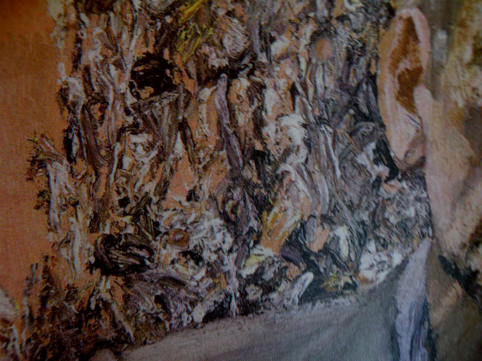
But. Is there any way, at all, that we can establish a way of SEEING that is based on ... SEEING? We can try. Look at the two paintings below. One was painted by someone with an acre of text, the other with, perhaps, a window-box full of text. Draw up some criteria to judge them. See which one engages you, but be prepared to explain why. On my next visit, I will talk about some ideas of my own for discussing image and tell you which painting … is which.