Showing posts with label abstract painting. Show all posts

Friday, April 24, 2020

The Changing Face of a Painting

In early February,  Gallery One Ct was expecting to hang an exhibition at The Guilford Art Center beginning in mid-May, 2020. My husband and I had just returned from visiting our son in Los Angeles, and my head was filled with our talks with him about Gilles Deleuze. I knew him mostly from his book on Francis Bacon. But there is so much more... one piece: we watched Deleuze on film, with English subtitles, talking through "What is the Creative Act," (on YouTube, dating from 1987). And I gathered notes from that and began to see Deleuze's statements as a way to dig in & start a new series.

I get asked, a lot, about my work. Some people feel that abstract art is over; it died with Jasper Johns and Roy Lichtenstein. Other people don't "get" abstracts; they think it's a closed circle, something that needs an MFA to understand, or something their six-year old can do. Perhaps Deleuze could help me frame some ideas. Then I also read a 2018 interview with the filmmaker Diana Thater, (in "Los Angeles Studio Conversations: Sixteen Women Talk about their Art," Ed. Stephanie Buhmann, purchased at Book Soup in LA-- should be required reading for artists). Thater says "I am always in my work as is my crew" and uses multiple screens because she wants to reveal "the whole construct and setup of the film." And I wondered, can I do that in paint? 

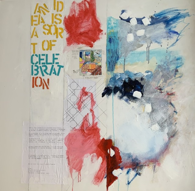
I started by dividing the canvas up, to show how I think and work. The left side was left blank, to portray the (daunting) empty canvas. Then the next vertical "stripe" was for the articulation of the idea: words, quick sketches... then the first attempt, then the finished "piece" far left. I found that the last two morphed into one another, so the first paintings had just three compartments. 

Then... the thing happened that always happens... the paintings began, as they should, to take on their own lives. And the first painting, the one I thought would be the base, the thing to then aspire to in the next paintings, began to tell me it was unhappy with its state .... so, the top version, the first "finished" version, became the second version, the one below. Other things changed too. The "idea," or first muse-quote, changed space from its vertical presentation to be across the top and the vertical lines just did not seem as important. Here's a new painting:


I still love the text. Diana Thater and Gilles Deleuze are still in there. See what you think.

Friday, November 25, 2016

Matisse/Diebenkorn: Paint It Black


The Baltimore Museum of Art (BMA) is set in its own majestic portico’d place, augmented with a sweeping addition. It seems very far away from the city, and to travel there is to be (somehow) in art. BMA presents the “Matisse-Diebenkorn” through January 29, 2017 and then, after a re-hanging, the show opens again at SFMOMA in the spring.

What would these two artists say to one another across time? We know that Matisse went all the way to the edge of abstraction and just peered over with great delicacy, (with “View of Notre Dame” in 1914, for example):


and then retreated a few inches.  Diebenkorn set up shop just past his predecessor, but would make use of Matisse’s floral grillwork for safety’s sake.  You’ll see.

Pretty much everyone can picture a Matisse. Close your eyes. Okay? Got one?

This is my Matisse, “Red Room (Harmony in Red)” from 1908:


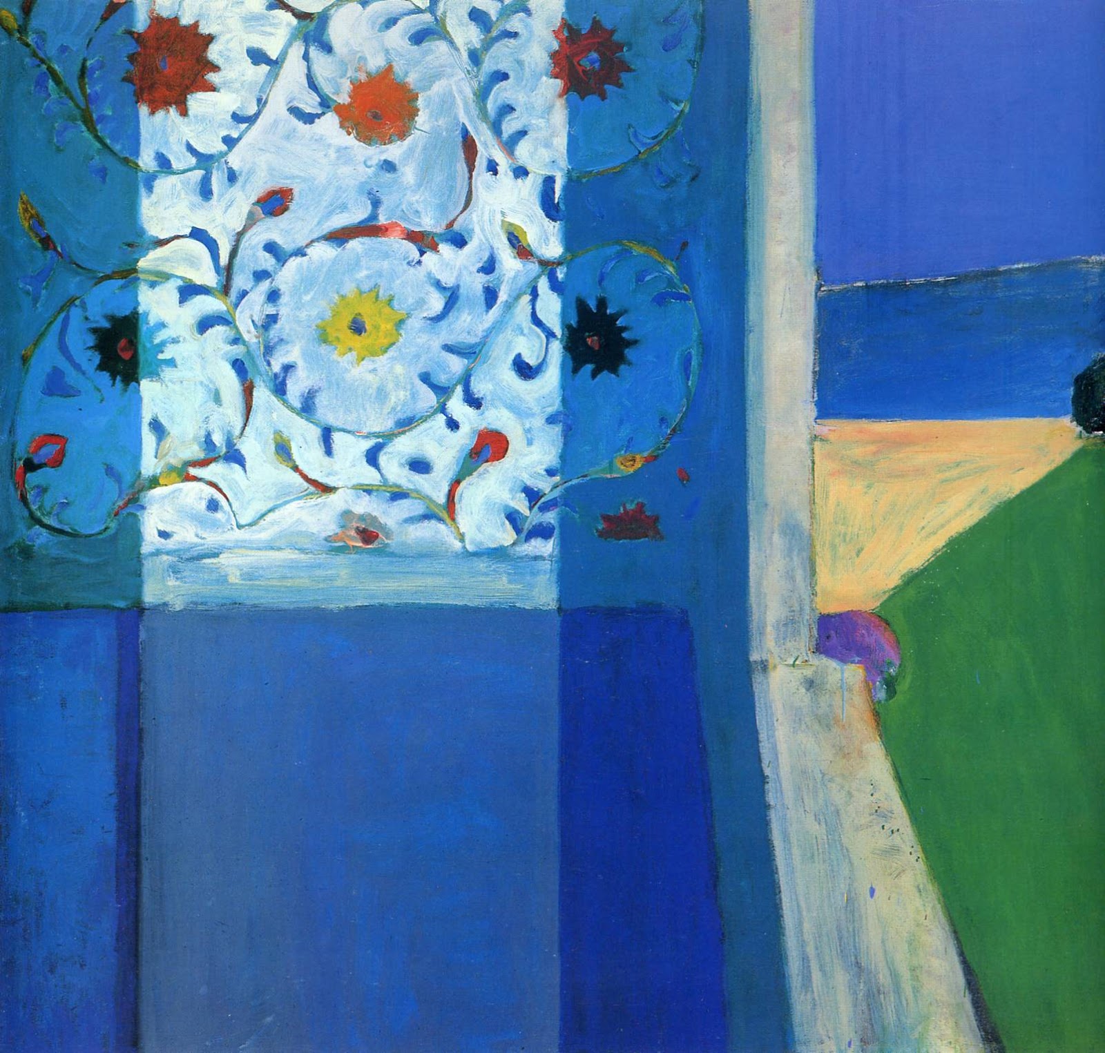
But not everyone can pull a Richard Diebenkorn image out of thin air.  And if you could, what period would you choose? Abstract? Figurative? or Ocean Park? Maybe, after seeing the show at BMA or SFMOMA, it would be this one, “Recollections of a Visit to Leningrad,” 1965, which is Matissean but also Diebenkornish:


To Begin with Diebenkorn
Let’s start by thinking about the “new” guy. I had seen a massive Diebenkorn exhibition at the Royal Academy (RA) in London in the spring of 2015.*  The Royal Academy offered generous texts on their walls and a thorough introduction to the artist on their site. Here is an example:

To weigh Diebenkorn’s reception in England, so Paul Carey-Kent, a financial policy analyst and art critic, brought 6  “well-established painters” to the RA’s Diebenkorn show, and recorded their comments along with his own. Carey-Kent started with the assumption that Diebenkorn is “a painter’s painter.” Half of his guests were pleased with the art on view, half were not. The painters are: Katrina Blamin, Claudia Carr, Christina Niederberger, Michael Stubbs, D.J. Simpson and Dolly Tompsett ; see the article for details (www.artcritical.com/2015/05/04/paul-carey-kent-richard-diebenkorn).

In the article, Michael Stubbs observes that Diebenkorn’s abstract work of the 1950’s was “typical of the early ‘50’s, in developing a Cubist space into more fluid forms which value spontaneous gestures, and which simultaneously construct and contradict the space.” YES. Diebenkorn faced into everything, right up through Cubism and Abstract Expressionism, and found his own voice. This is what makes him a “painter’s painter”: we can see him struggle, almost watch him think. Diebenkorn reveals everything beautiful and unsightly, brushstrokes that lesser artists would worry about exposing. Here is a detail from “Ocean Park 43” (Royal Academy of Arts exhibition catalogue, 14 March-17 June, 2015, p. 140):


Look at the escaped blue squiggle, up against a deliberate long dripped line. Now take another look at the gray line that anchors the blue triangle: there is another shape partly visible inside that. There are no straight lines on either top or bottom of the purple stripe; the artist didn’t auto-correct. The green drip slams into an orange line that then veers off to nothing, allowing the green to re-appear. This is not the work of a minute. This apparent spontaneity is earned through time and incredible patience on the part of the artist.  Marking, erasure, marking, stopping.

Another of the artists brought to the RA exhibition, D.J. Simpson, uses an electric router to mark/draw onto his wood support, and then paints in the backgrounds to make his art (his art is “fetishising,” says the artist and critic John Chilver). Simpson thinks that Diebenkorn knew exactly “when there was enough push and not enough pull.”  I think that, by “push” Simpson means the sustained agitation in the painting, flowing and just a bit untethered. Here is the question... Does Simpson mean that Diebenkorn would then add in the “pull” to lock in the work? Or does he mean that Diebenkorn would allow the painting to remain un-resolved, that this state of flux was the goal?

Matisse and Diebenkorn
The RA ‘s Diebenkorn show was big and beautiful. But it was a show that crested with the Ocean Park series, as if all the previous work was only preparatory.  The hanging was rather convincing as a yellow brick road, and it left me very little room to breathe. In this context, I saw the 1950’s work as flawed, and left feeling odd. I should have liked it; Diebenkorn is a painter’s painter, and, even more, an abstract painter’s painter.

So I was really eager to see the Matisse-Diebenkorn show.  Would Diebenkorn flounder in the face of the older man’s work? I had expected, because I have always loved him, to gravitate to the Matisses.  A brief aside: here is a lovely Matisse, (not at the show at BMA), called “Entrance to the Casbah,” (1912/3):

Years ago, I had gone to a Matisse show** and loved many paintings with this intense blue-dominated palette and come home immersed in what I thought of “Matisse blue.”  Bonnard said of a Matisse on his walls that

By day it is the blue that takes the lead. What an intense life the colors have, and how they vary with the light!  (1946)

On impulse, I added the color to every canvas then on my studio walls. It ruined them all, of course, because the paintings hadn’t called for that kind of interference.  What kind of interference would Matisse cause Diebenkorn? I thought blue might be involved.

But I was wrong. It was black, deep and abiding black. (Black is so important that one artist has recently claimed exclusive rights to the newest, strongest black mixture, Vantablack  (http://hyperallergic.com/279243/anish-kapoor-gets-exclusive-rights-to-the-worlds-darkest-pigment).  
But I get ahead of myself.  I should start with the observation that the wall texts and the essays for this show are entirely convincing. The research is solid, the relationship clear. Diebenkorn studied Matisse beginning with his days at Stanford. He saw Matisse’s paintings in the home of Sarah Stein. He visited MOMA in New York and the Pompidou in Paris. Diebenkorn owned forty-one books on Matisse, even loaning one to MOMA’s curator John Elderfield in 1983 to help with an upcoming exhibition. Diebenkorn saw little-known Matisse paintings as a guest of the Soviet Artists’ Union (Matisse/Diebenkorn catalogue, eds. Janet Bishop and Katherine Rothkopf, BMA and SFMOMA, 2016).

Near the show’s entrance, I found myself moving back and forth, looking at Matisse’s “Studio, Quai Saint-Michel”:


And his “Goldfish and Palette”:


And then, with those two firmly in mind, I took in “Urbana 2”


And “Urbana 6”:


 And basically didn’t want to move on. (So I will basically stay here for this writing, but know that there are many, many more works in the show and go see it!). The irony of the day was that the two Diebenkorn paintings had both been in the RA show, but I obviously hadn’t SEEN them.  I saw them now. And they blew me away. I remember thinking about each one, “is it a room? a landscape? a state of mind?”  The “Urbana” series was all that abstract paintings are meant to be. They were open, un-resolvable, but there might be a key, if I stood there long enough, maybe... I wanted to stay in front of them forever. And what held me in was the black pigment. Look back at “Urbana 6” and imagine just the black in outline as I drew it in my sketchbook:

The shapes are powerful, even in outline, but here they are again in black:

The black paint won’t give it up.  It hangs there, receding and coming forward as if it were actually moving. Curator Janet Bishop writes about “Studio, Quai Saint-Michel” and “Urbana #4” that

... the young painter appears to have repurposed the blocks of color that make up the Parisian studio interior to create a composition seemingly devoid of familiar points of reference (catalogue, p. 23)

This is the goal. The “pull,” Mr. Simpson, is left up to the viewer. 

It is as if Matisse lived long enough to move a little closer to that abstract edge; Diebenkorn completes Matisse’s line of thought, taking the loose shutter of  “French Window at Collioure” (which, curator Katherine Rothkopf writes, was changed by Matisse to cover over  ‘a balcony and a landscape in the distance” were covered over by “a wash of black paint” [!!] (catalogue, p. 123) :


 And fastening it down (the “shutter” in Ocean Park #105):


*My husband, Charles Tarlton, wrote a series of ekphrastic tanka prose about the Ocean Park paintings, based on our visit; see artistinanaframe.blogspot.com, the entry on Diebenkorn from 11/21/16; there is a drama in prose & poetry on the relationship of Matisse and Picasso printed there as well.

**”M

Friday, February 17, 2012

Repeatedly Painting Closed Worlds, or Inventing Open Worlds: What is Abstract Art For?


“An original author always invents an original world …. There is no such thing as real life for an author of genius: he must create it himself and then create the consequences.”
 --Vladimir Nabokov on Jane Austen’s Mansfield Park

Nabokov’s observation about one of Austen’s more controversial novels applies to artists as well.  No artist, no author, wishes to produce a work that has already been written or painted; “make it new.” I want to talk for a bit about what this means for abstract artists. For the purposes of playing with “original worlds,” I am going to pare down all the possibilities inherent in abstract art for a moment. I will divide the practice of creating abstract art into a choice of painting either closed or open worlds. Bear with me.

Representational paintings present the viewer with a battle, or a nymph and satyr, or encourage us to linger over the breakfast coffee cups or the delicate pinks of a rose, but the abstract artist is not re-presenting. Abstracts offer forms and colors to us … for the first time. This is the attraction of what I am calling the closed method: these painters draw geometric shapes, straight lines and repeated verticals and horizontals, not coffee cups, not armor, and not even their contours, in order to propose a different space to their audience.  A new space.  Josef Albers said that he felt that “abstraction is real, probably more real than nature. I prefer to see with closed eyes.”  Here is an Albers painting, “Homage to the Square: Terra Caliente”:


 There is no organic shape or line here, no delicate shading, and we could even call into question one of the most basic ideas of painting, figure against ground. While there are no straight lines in nature, Gertrude Stein (reputedly) said, Albers has given us several.  The squares reverberate; their colors move. Albers painted many “Homage to the Square” works, always adjusting the color and the squared forms. The titles alone call into question what we think we know; a homage is to …a person, isn’t it?  Agnes Martin said, in “The Untroubled Mind,” in her Writings, that

Then I drew all those rectangles
All the people were like those rectangles
they are just like grass
That’s the way to freedom ….
These paintings are about freedom from the cares of this world
from wordliness ….
Art re-stimulates inspirations and awakens sensibilities
that’s the function of art  (p. 39)

We are to be re-moved, waked up, re-imagined by this art.  Here is a Martin, from 1961, called “The Islands”:


 Paintings by Agnes Martin do not reproduce well in photographs. It isn’t possible, here, to see the careful pencil lines or to trace the slow movement of a brush from the beginning of a line to its end.  Seen in person, close, paintings by Martin are not only about different space, but about time, the time it takes to paint them, the time it takes to take them in. Because the works are so plain, so repetitive, so apparently “easy,” a roomful of Martins is very calming. Agnes Martin had begun her painting life in New York, in the full glare of the Abstract Expressionists. Early works of hers, now mostly destroyed, show her finding her way, but very much in the wake of others. Martin even stopped painting for a long period of time, until she arrived at this new way of painting, a way of working that is hers alone (just as Gertrude Stein’s Tender Buttons belong only to her, or e.e. cummings’ treatment of the poetic line will never, it seems likely, find an heir).  

It isn’t the “shock of the new,” but the “seduction of the new” that pulls painters in. More recently, the Damien Hirst spot paintings -- completed largely by his studio assistants -- are introduced by Hirst this way: “When I first painted them it was this brand new thing and I felt immortal in a way. The time was right. We were fucking dancing on the tables, changing the rules, nothing could stop us …. The spot paintings were definitely conceptual art. There’s an optimism to them which is amazing” (interview with Anthony Haden-Guest, January 10, 2012, www.galleristny.com). Here is a Hirst, “DL-P Chlorophenylalanine Methyl Ester,” 1998:


New … like the dots of Georges Seurat, these dots push and pull.  Hirst’s assistants had been making color and placement choices, “anything not to make a decision,” Hirst says (in the interview with Haden-Guest) but he did eventually take those rights back and planned the works, for maximum impact, one assumes.

The reason that I am describing these works by Albers, Martin and Hirst as “closed” is that there is no more to be done.  Every square is complete and framed, every line is finished, every dot is painted.  There isn’t any erasure, or softening of effect. It’s all there, planned, complete, conceptually perfect.  And there’s a good deal to be said for that -- I like Martin’s work, in particular – but there is a small problem with working this way now.

Rosalind Krauss wrote, in The Originality of the Avant-Gard and Other Modernist Myths, that “Perhaps it is because of this sense of a beginning, a fresh start, a ground zero, that artist after artist has taken up the grid as the medium within which to work, always taking it up as though he were just discovering it as though the origin he has found by peeling back layer after layer of representation to come at last to this schematized reduction … were his origin, and his finding it an act of originality. [And yet] …. The modernist grid is, like the Rodin casts, logically multiple: a system of reproductions without an original” (pp. 160, 162).  So these works are not … new.

What of the other category I have mentioned, the “open” painting? Here, I won’t give you several examples, just one, of a really powerful artist from Ireland: Patrick Graham.  (His solo show is now in San Francisco, at the Meridian Gallery, through April 14, 2012, and then moves to American University in Washington D.C. and will be shown in the fall at the Saint Louis University campus).  We saw the paintings and drawings (installed in the three stories of a beautiful Victorian mansion near Union Square) last week.

I should mention that Graham does -- often -- employ at least one straight line in his work. As a child, “I had a sense of being rooted” in Monaghanstown Bog in County Westmeath, Graham says. “I would look up at the sky with the larks hanging there, and then back down to earth in a great circular sweep …. I used to strip off and lie on the bog, feeling a sensual belonging to it. That meeting of earth and sky -- that horizon appears in all my paintings, locking everything together” (catalogue, p. 15).  Here is my husband’s favorite work from the show, “Deposition: Study 7,” from 2010 (all images are courtesy of The Meridian Gallery, San Francisco):


 There isn’t a straight line here, exactly, just the lining-up of the three central forms and the stretched-out figure of a man creating the sense of line among them.  The space is mostly white, with delicate tracings of pencilled-in forms (a pyramid or roof, something that looks like a table, lines and some scratches that are indeterminate) and phrases, bits of meaning, in two places on the painted board.  In an essay focusing on Graham’s iconography, Jarrett Earnest says that he sees these “tiny graphite specks” as “creating an ominous sense of pestilence or a dense invisible presence, like a ghost” (catalogue, p. 72).  Well, that “ominous sense” is certainly possible, although I did not see this work as prefiguring death or despair. There may be a ghostly presence, as I was certain that I saw a painting underneath, something painted out; this “Deposition” leaves you wondering.  The title is ambiguous, as well; is someone giving evidence (for himself? or against someone?) or is something simply being laid down … to rest? To think?

One of the characteristics of an “open” painting like this is its indeterminacy; interpretations will vary.  Samuel Beckett, in speaking of his novel How It Is,
said that meaning is “a rumour transmissible ad infinitum in either direction.”  And rumour, like meaning, can be rather unreliable -- particularly when it might run in two directions at once.  Earnest has reviewed statements by Graham, and notes that “Graham stresses that all his work is strategically unfinished, that it is left open.  Openness -- to receive, to listen -- is an unfixed state of transition” (catalogue p. 56).  The openness means that the works seem to be “in transit.” They have not arrived at their final stages; we get the feeling that nothing is pre-determined. Unlike the paintings we looked at above, based on the grid, where movement comes from color placement, which tricks the eye, so that a dot of a certain color seems to leap past another, here, the movement must be contemplative. The movement, the sustained interest, must be supplied by the viewer.

“Open” also means imperfect. Graham has stated that he found himself, at a young age, accomplished, “a self-conscious possessor of gifts that focused a kind of attention on me that I simply didn’t know how to deal with” (catalogue, p.80).  He needed to begin again in a world of sturdy shapes; like Matisse, Graham isn’t delicate. His bodies are flattened and not entirely in the frame. Look at  “The Artist, the Woman,” from 1983-4, a painting that is 72 ½ “ square:


The dedication is to David Bomberg, the British painter whose early work was geometric, Cubist, Futurist, but whose time in World War I trenches changed his work completely to expressionist figures and landscapes.   The figures dominate only the upper half of the painting with torso and head and blue veils or clouds; the lower half, here, is the more “open” half.  Why this dedication, here? Why the energetic brushstrokes and bubbles? Is this earth or water? The interesting thing here is that we don’t need to know.  We can simply see the arrested face of the woman, the cancelled-out face of the artist (looking rather like a Francis Bacon).  The horizontal and vertical lines here seem to be holding the figures in, so they don’t simply fly off into space.  Intriguing, and totally open to interpretation.

My favorite of all the works on show is the painting (the title says drawing, but it seems … more than that implies) here, called “The Lark In the Morning: Reworked Drawing, 1994,” and it is 31 7/8 x 44 1/8 inches. This is one of two works with the same title, but this is the one I really love:


 The rose-colored (male? female?) nude on the right seems to be in a calm, quiet space, where the nude (male? female?) on the left is in the midst of scribbling, re-painting, lines, marks (including two x’s) and cliffs or smokestacks… a riot of disparate images.  Or perhaps it is the person on the right who is bereft, and the one on the left in the midst of happy energy. What’s wonderful about this kind of art-making is that it’s still open, like a landscape.

Patrick Graham said: “the landscape has influenced my work right up to the present, particularly the low horizon; and that great vista where you can encounter space, and figures in it, in all kinds of ways….  Silences. No conversations. A looking-in, rather than a lived experience. That ‘looking-in on things’ has stayed with me: a self-contained art” (catalogue p. 44). What Graham has done is to create his own “original world” and the “consequences,” for us, are that we have a new -- truly new – landscape to lose ourselves in.  And we are very grateful.
Friday, February 3, 2012

For Eduard Manet, for Helen Frankenthaler: on Renewing a Painting Passion

I read an article called "What Paint Does," by Robin Greenwood, in Abstract Critical (16 January 2012).  Greenwood argues for a new awareness of abstract art; we must look at the artists we love with some purpose, or else risk simply "re-inventing" everything that abstraction has already accomplished, both successes and failures. Greenwood writes: "If ... perish the thought ... I were to offer advice to an abstract painter starting out today, I would suggest they copy the artist they most admired until they got somewhere near to competing with them, and then move on to someone better; and so on, till there was no-one left and they themselves were the best of all (I'm an idealist)."

Well, I was looking to start again... the odalisques in abstract landscapes are a complete series on their own, now, and ... what's new?  And I thought about all the artists I most admire. I have consciously worked from the starting point of David Hockney, in a series of landscapes in 2003, and I un-consciously have leaned on Joan Mitchell, Willem de Kooning, and Kandinsky.  But I had never tried to look at Helen Frankenthaler's work from the perspective of how it was really feasible, in part because I thought she would be, like Gertrude Stein or e.e. cummings, an act impossible to follow. But I really thought that Greenwood had made a wonderful suggestion, and so I looked at a catalogue of Frankenthaler's work that I have, called East and Beyond. In his essay, John Yau shows us, at one point, that Frankenthaler took an Édouard Manet painting, "Fish (Still Life)," (which is 28 7/8" x 36 1/4") from 1864 as a starting point:


Here is Frankenthaler's, painting, completed in acrylic on canvas, 71" x 115," in 1981:


We can see the spaces and light that both paintings share. John Yau writes the essay for this catalogue and he says "a point-to-point comparison ... would ultimately miss"  Frankenthaler's pursuit here, which he says is "the desire to grasp that which remains elusive," memory, the fact that "the world is constantly appearing and vanishing" (24).  That may be true; but artists, when pressed, are unwilling to say too much about the point of their work.  I looked at these two paintings and thought that this would be a way in to Greenwood's prescription.  So I started, with two 30" x 30" wood panels. I took photographs after each stage of the painting I was making; I won't give you all of them, but here are a few on the way to my "somewhere near to competing with" the Frankenthaler:


This was the first shot over the bow -- it was really fun for me -- burnt umber with burgundy and yellow ochre, acrylic paint thinned down with water and glazing liquid and spread with bits of an old pillowcase. It became an effort of my full body, walking around the painting, with each additional layer, pursuing the Frankenthaler pursuing the Manet, which was a photograph in an open book in a corner of the studio floor:

Black and purple wash over the top to get at some of Frankenthaler's and Manet's fabulous blacks, then, skipping forward a few sessions:

More yellow ochre, then white, permanent green middle and pthalo green and white, then thalo green and glaze.  More blacks to right. Then, two steps later:


Cerulean blue hue, more green, more whites, yellow ochre with raw sienna and burgundy. Now, for the final picture, which I got to stages later, after throwing white paint, adding yellows and oranges and details of red, green, browns, pouring, and scraping and pouring the whites:


Now, this isn't precisely the same as the Frankenthaler. And yet it was so luminous, and so balanced, and so much fun.  Now, I decided, I had to try and make the painting my own. "Seize the glimpse," Robert Motherwell said, and then "the ethic lies in erasing that glimpse." So here I go, erasing, scraping away with sandpaper, and adding some white and lighter hues:


Then, layers of more paints, more scraping:


One of the things that is emerging is three horizontal spaces, which I did not want to encourage. So I went into the painting with brushes and scrapers and splashes. Another idea that emerged from looking was that there were no straight lines or geometric shapes here, as there aren't, generally, in Frankenthalers, but I wanted them, and so I added a triangle in the lower right:


Now I am liking the light here, but there needs to be more surface and we need some pencil and drawing here, too. We had gone for a walk along the Alameda shoreline, and the boats, balconies, rocks and scattered birds gave me the last few images here:


I think this is to Frankenthaler as she was to Manet; I am calling it "E.M. and H.F. Walk on the Beach in Alameda."