Showing posts with label artistic influence. Show all posts

Friday, November 25, 2016

Matisse/Diebenkorn: Paint It Black


The Baltimore Museum of Art (BMA) is set in its own majestic portico’d place, augmented with a sweeping addition. It seems very far away from the city, and to travel there is to be (somehow) in art. BMA presents the “Matisse-Diebenkorn” through January 29, 2017 and then, after a re-hanging, the show opens again at SFMOMA in the spring.

What would these two artists say to one another across time? We know that Matisse went all the way to the edge of abstraction and just peered over with great delicacy, (with “View of Notre Dame” in 1914, for example):


and then retreated a few inches.  Diebenkorn set up shop just past his predecessor, but would make use of Matisse’s floral grillwork for safety’s sake.  You’ll see.

Pretty much everyone can picture a Matisse. Close your eyes. Okay? Got one?

This is my Matisse, “Red Room (Harmony in Red)” from 1908:


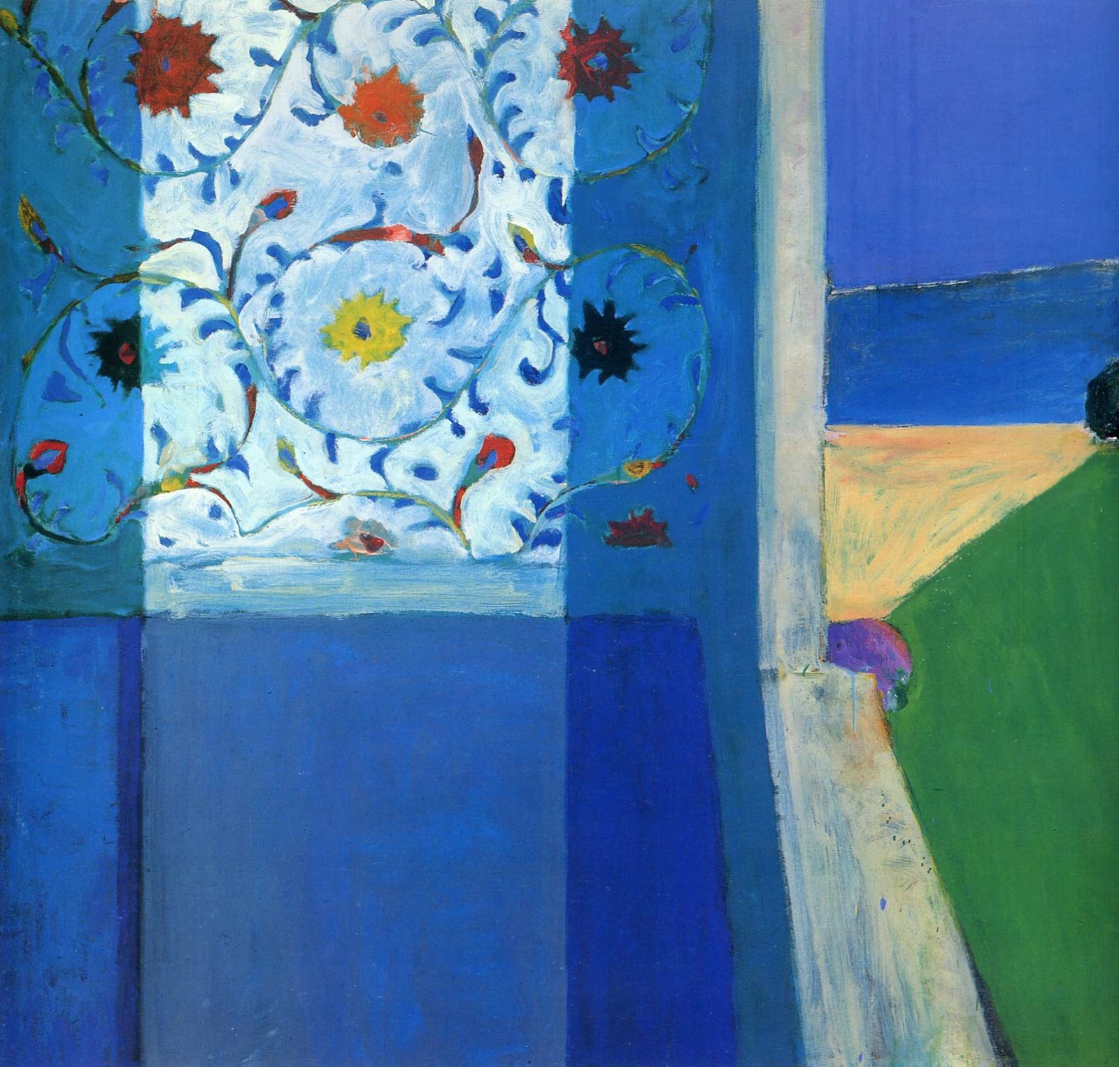
But not everyone can pull a Richard Diebenkorn image out of thin air.  And if you could, what period would you choose? Abstract? Figurative? or Ocean Park? Maybe, after seeing the show at BMA or SFMOMA, it would be this one, “Recollections of a Visit to Leningrad,” 1965, which is Matissean but also Diebenkornish:


To Begin with Diebenkorn
Let’s start by thinking about the “new” guy. I had seen a massive Diebenkorn exhibition at the Royal Academy (RA) in London in the spring of 2015.*  The Royal Academy offered generous texts on their walls and a thorough introduction to the artist on their site. Here is an example:

To weigh Diebenkorn’s reception in England, so Paul Carey-Kent, a financial policy analyst and art critic, brought 6  “well-established painters” to the RA’s Diebenkorn show, and recorded their comments along with his own. Carey-Kent started with the assumption that Diebenkorn is “a painter’s painter.” Half of his guests were pleased with the art on view, half were not. The painters are: Katrina Blamin, Claudia Carr, Christina Niederberger, Michael Stubbs, D.J. Simpson and Dolly Tompsett ; see the article for details (www.artcritical.com/2015/05/04/paul-carey-kent-richard-diebenkorn).

In the article, Michael Stubbs observes that Diebenkorn’s abstract work of the 1950’s was “typical of the early ‘50’s, in developing a Cubist space into more fluid forms which value spontaneous gestures, and which simultaneously construct and contradict the space.” YES. Diebenkorn faced into everything, right up through Cubism and Abstract Expressionism, and found his own voice. This is what makes him a “painter’s painter”: we can see him struggle, almost watch him think. Diebenkorn reveals everything beautiful and unsightly, brushstrokes that lesser artists would worry about exposing. Here is a detail from “Ocean Park 43” (Royal Academy of Arts exhibition catalogue, 14 March-17 June, 2015, p. 140):


Look at the escaped blue squiggle, up against a deliberate long dripped line. Now take another look at the gray line that anchors the blue triangle: there is another shape partly visible inside that. There are no straight lines on either top or bottom of the purple stripe; the artist didn’t auto-correct. The green drip slams into an orange line that then veers off to nothing, allowing the green to re-appear. This is not the work of a minute. This apparent spontaneity is earned through time and incredible patience on the part of the artist.  Marking, erasure, marking, stopping.

Another of the artists brought to the RA exhibition, D.J. Simpson, uses an electric router to mark/draw onto his wood support, and then paints in the backgrounds to make his art (his art is “fetishising,” says the artist and critic John Chilver). Simpson thinks that Diebenkorn knew exactly “when there was enough push and not enough pull.”  I think that, by “push” Simpson means the sustained agitation in the painting, flowing and just a bit untethered. Here is the question... Does Simpson mean that Diebenkorn would then add in the “pull” to lock in the work? Or does he mean that Diebenkorn would allow the painting to remain un-resolved, that this state of flux was the goal?

Matisse and Diebenkorn
The RA ‘s Diebenkorn show was big and beautiful. But it was a show that crested with the Ocean Park series, as if all the previous work was only preparatory.  The hanging was rather convincing as a yellow brick road, and it left me very little room to breathe. In this context, I saw the 1950’s work as flawed, and left feeling odd. I should have liked it; Diebenkorn is a painter’s painter, and, even more, an abstract painter’s painter.

So I was really eager to see the Matisse-Diebenkorn show.  Would Diebenkorn flounder in the face of the older man’s work? I had expected, because I have always loved him, to gravitate to the Matisses.  A brief aside: here is a lovely Matisse, (not at the show at BMA), called “Entrance to the Casbah,” (1912/3):

Years ago, I had gone to a Matisse show** and loved many paintings with this intense blue-dominated palette and come home immersed in what I thought of “Matisse blue.”  Bonnard said of a Matisse on his walls that

By day it is the blue that takes the lead. What an intense life the colors have, and how they vary with the light!  (1946)

On impulse, I added the color to every canvas then on my studio walls. It ruined them all, of course, because the paintings hadn’t called for that kind of interference.  What kind of interference would Matisse cause Diebenkorn? I thought blue might be involved.

But I was wrong. It was black, deep and abiding black. (Black is so important that one artist has recently claimed exclusive rights to the newest, strongest black mixture, Vantablack  (http://hyperallergic.com/279243/anish-kapoor-gets-exclusive-rights-to-the-worlds-darkest-pigment).  
But I get ahead of myself.  I should start with the observation that the wall texts and the essays for this show are entirely convincing. The research is solid, the relationship clear. Diebenkorn studied Matisse beginning with his days at Stanford. He saw Matisse’s paintings in the home of Sarah Stein. He visited MOMA in New York and the Pompidou in Paris. Diebenkorn owned forty-one books on Matisse, even loaning one to MOMA’s curator John Elderfield in 1983 to help with an upcoming exhibition. Diebenkorn saw little-known Matisse paintings as a guest of the Soviet Artists’ Union (Matisse/Diebenkorn catalogue, eds. Janet Bishop and Katherine Rothkopf, BMA and SFMOMA, 2016).

Near the show’s entrance, I found myself moving back and forth, looking at Matisse’s “Studio, Quai Saint-Michel”:


And his “Goldfish and Palette”:


And then, with those two firmly in mind, I took in “Urbana 2”


And “Urbana 6”:


 And basically didn’t want to move on. (So I will basically stay here for this writing, but know that there are many, many more works in the show and go see it!). The irony of the day was that the two Diebenkorn paintings had both been in the RA show, but I obviously hadn’t SEEN them.  I saw them now. And they blew me away. I remember thinking about each one, “is it a room? a landscape? a state of mind?”  The “Urbana” series was all that abstract paintings are meant to be. They were open, un-resolvable, but there might be a key, if I stood there long enough, maybe... I wanted to stay in front of them forever. And what held me in was the black pigment. Look back at “Urbana 6” and imagine just the black in outline as I drew it in my sketchbook:

The shapes are powerful, even in outline, but here they are again in black:

The black paint won’t give it up.  It hangs there, receding and coming forward as if it were actually moving. Curator Janet Bishop writes about “Studio, Quai Saint-Michel” and “Urbana #4” that

... the young painter appears to have repurposed the blocks of color that make up the Parisian studio interior to create a composition seemingly devoid of familiar points of reference (catalogue, p. 23)

This is the goal. The “pull,” Mr. Simpson, is left up to the viewer. 

It is as if Matisse lived long enough to move a little closer to that abstract edge; Diebenkorn completes Matisse’s line of thought, taking the loose shutter of  “French Window at Collioure” (which, curator Katherine Rothkopf writes, was changed by Matisse to cover over  ‘a balcony and a landscape in the distance” were covered over by “a wash of black paint” [!!] (catalogue, p. 123) :


 And fastening it down (the “shutter” in Ocean Park #105):


*My husband, Charles Tarlton, wrote a series of ekphrastic tanka prose about the Ocean Park paintings, based on our visit; see artistinanaframe.blogspot.com, the entry on Diebenkorn from 11/21/16; there is a drama in prose & poetry on the relationship of Matisse and Picasso printed there as well.

**”M

Friday, February 3, 2012

For Eduard Manet, for Helen Frankenthaler: on Renewing a Painting Passion

I read an article called "What Paint Does," by Robin Greenwood, in Abstract Critical (16 January 2012).  Greenwood argues for a new awareness of abstract art; we must look at the artists we love with some purpose, or else risk simply "re-inventing" everything that abstraction has already accomplished, both successes and failures. Greenwood writes: "If ... perish the thought ... I were to offer advice to an abstract painter starting out today, I would suggest they copy the artist they most admired until they got somewhere near to competing with them, and then move on to someone better; and so on, till there was no-one left and they themselves were the best of all (I'm an idealist)."

Well, I was looking to start again... the odalisques in abstract landscapes are a complete series on their own, now, and ... what's new?  And I thought about all the artists I most admire. I have consciously worked from the starting point of David Hockney, in a series of landscapes in 2003, and I un-consciously have leaned on Joan Mitchell, Willem de Kooning, and Kandinsky.  But I had never tried to look at Helen Frankenthaler's work from the perspective of how it was really feasible, in part because I thought she would be, like Gertrude Stein or e.e. cummings, an act impossible to follow. But I really thought that Greenwood had made a wonderful suggestion, and so I looked at a catalogue of Frankenthaler's work that I have, called East and Beyond. In his essay, John Yau shows us, at one point, that Frankenthaler took an Édouard Manet painting, "Fish (Still Life)," (which is 28 7/8" x 36 1/4") from 1864 as a starting point:


Here is Frankenthaler's, painting, completed in acrylic on canvas, 71" x 115," in 1981:


We can see the spaces and light that both paintings share. John Yau writes the essay for this catalogue and he says "a point-to-point comparison ... would ultimately miss"  Frankenthaler's pursuit here, which he says is "the desire to grasp that which remains elusive," memory, the fact that "the world is constantly appearing and vanishing" (24).  That may be true; but artists, when pressed, are unwilling to say too much about the point of their work.  I looked at these two paintings and thought that this would be a way in to Greenwood's prescription.  So I started, with two 30" x 30" wood panels. I took photographs after each stage of the painting I was making; I won't give you all of them, but here are a few on the way to my "somewhere near to competing with" the Frankenthaler:


This was the first shot over the bow -- it was really fun for me -- burnt umber with burgundy and yellow ochre, acrylic paint thinned down with water and glazing liquid and spread with bits of an old pillowcase. It became an effort of my full body, walking around the painting, with each additional layer, pursuing the Frankenthaler pursuing the Manet, which was a photograph in an open book in a corner of the studio floor:

Black and purple wash over the top to get at some of Frankenthaler's and Manet's fabulous blacks, then, skipping forward a few sessions:

More yellow ochre, then white, permanent green middle and pthalo green and white, then thalo green and glaze.  More blacks to right. Then, two steps later:


Cerulean blue hue, more green, more whites, yellow ochre with raw sienna and burgundy. Now, for the final picture, which I got to stages later, after throwing white paint, adding yellows and oranges and details of red, green, browns, pouring, and scraping and pouring the whites:


Now, this isn't precisely the same as the Frankenthaler. And yet it was so luminous, and so balanced, and so much fun.  Now, I decided, I had to try and make the painting my own. "Seize the glimpse," Robert Motherwell said, and then "the ethic lies in erasing that glimpse." So here I go, erasing, scraping away with sandpaper, and adding some white and lighter hues:


Then, layers of more paints, more scraping:


One of the things that is emerging is three horizontal spaces, which I did not want to encourage. So I went into the painting with brushes and scrapers and splashes. Another idea that emerged from looking was that there were no straight lines or geometric shapes here, as there aren't, generally, in Frankenthalers, but I wanted them, and so I added a triangle in the lower right:


Now I am liking the light here, but there needs to be more surface and we need some pencil and drawing here, too. We had gone for a walk along the Alameda shoreline, and the boats, balconies, rocks and scattered birds gave me the last few images here:


I think this is to Frankenthaler as she was to Manet; I am calling it "E.M. and H.F. Walk on the Beach in Alameda."

Thursday, October 27, 2011

Nudely Naked: The Through-Line from Degas to Van Gogh to Matisse

"Look out my window, look at the way things are
Just wonder how, how did things ever get this far ...
Vince Taylor used to live here, nobody's heard of him,
(Ain't that a shame), just who he was, just where he fits in."
                                     lyrics from "Goin' Down Geneva" by Van Morrison

Last Friday, October 21, The New York Times published an article by Karen Rosenberg called "An Unblushing Career of Undressing Women," about an exhibition called "Degas and The Nude" (which she says, only half joking, should have been called "Degas and the Naked") at Boston's Museum of Fine Arts (p. C25).  It got me to thinking, with Van Morrison echoing in my mind, "just where he fits in."

There's a distinction familiar to art students and their teachers, a distinction between "nude" and "naked." The nude in art history is often Venus, Diana, Susannah (and the elders), an odalisque in an inaccessible harem, mythological, fantastical, glorious, nearly air-brushed, and not anything you'd see in your own world. Here is a lovely, smooth-skinned example from Ingres, the master of the nude, called "The Bather of Valpincon" from 1808:


She is perfect. (I should add that David Hockney has traced this perfection to its -- very likely -- source. There was an article in The New Yorker, "The Looking Glass," by Lawrence Weschler on January 31, 2000, which traced the beginnings of Hockney's theory that painters including Ingres, Caravaggio, Vermeer, Hals, Chardin, and Vélazquez all must have employed lenses or some form of camera obscura to achieve their photographic images. This article was then followed in 2001 by the book Secret Knowledge. In both, Hockney tells us that he suspects that Ingres must have used lenses ... how else would he be able to have such an assured line with no preparatory drawings, why else would the drawings be so small, and, I would add, how else could he reproduce that back over and over again, here and in the "Turkish Bath"?). Ingres draws fantabulous nudes. But Degas's women are naked. (And after enough time has passed, Hockney argues, with Cezanne, the lenses are discarded for a new kind of art and, as Weschler reports, then "[deliberate] awkwardness returns to European painting, for the first time, really, since Giotto," and continues on through Cubism). And awkwardness = nakedness, no?. In her article on the Boston MFA's Degas show, Rosenberg writes that the museum unflinchingly presents "the raunchiest of his 'brothel monotypes' alongside the the more genteel voyeurism of his women at their toilette ... His working girls are plump and slovenly, with tufts of dark hair between their thighs. (Even Manet never went that far) ... [but] In Degas naturalism cancels out voyeurism."  So, to finish the explanation between "nude" and "naked," Degas's women are naked. And we can see that, exactly, here, in The Tub," from 1886:


This does look like someone, anyone, that we might know .... And I began to see something. I have been looking at Van Gogh's nudes (there are not very many, and the ones I love come from his time in Paris, in 1886 and 1887).  And I began to wonder if Van Gogh might have seen Degas's women in Paris then. And then the new biography, Van Gogh: The Life arrived (by Steven Naifeh and Gregory White Smith, New York: Random House, 2011). And yes, Van Gogh saw the Impressionists in 1886, but was not impressed with them as a group: "one is bitterly, bitterly disappointed, and thinks them slovenly, ugly, badly painted, badly drawn, bad in color, everything that's miserable" and he says, as opposed to most of the painters in the group, "I have faith in color" (519).  And yet, and yet, the biography notes that Van Gogh "commented favorably only on a suite of nude women, in pastel, by Degas (520).  Yes! he did. Here is Van Gogh's "Study for Reclining Female Nude" from 1887 in Paris; it's difficult not to see Degas in this:

There is no idealized goddess to be found here. This woman is naked, formed from rough pencil strokes. Her skin is wrinkled, her breasts are not perfectly-formed oranges, she is a bit uncomfortable and awkward. This is a body, not a dream.

So then, I wondered, because I have been doing this series of nudes with some references back to Henri Matisse, whether he refers to Degas and Van Gogh.  Degas, one feels, would have been inescapable, given Matisse's contacts and Degas's reputation. But Van Gogh was relatively unknown.  In 1899, Matisse bought a Van Gogh drawing from Vollard. Years later, in 1945, Matisse would say that "Van Gogh and Gauguin were ignored. A wall had to be knocked down in order to get through" (p. 158, Matisse on Art, edited by Jack Flam (revised edition, Berkeley: University of California, 1995).  See for yourself; is this "Seated Nude" from 1906 (she's looking pretty naked!) knocking down that wall?