Showing posts with label abstract art. Show all posts

Friday, April 24, 2020

The Changing Face of a Painting

In early February,  Gallery One Ct was expecting to hang an exhibition at The Guilford Art Center beginning in mid-May, 2020. My husband and I had just returned from visiting our son in Los Angeles, and my head was filled with our talks with him about Gilles Deleuze. I knew him mostly from his book on Francis Bacon. But there is so much more... one piece: we watched Deleuze on film, with English subtitles, talking through "What is the Creative Act," (on YouTube, dating from 1987). And I gathered notes from that and began to see Deleuze's statements as a way to dig in & start a new series.

I get asked, a lot, about my work. Some people feel that abstract art is over; it died with Jasper Johns and Roy Lichtenstein. Other people don't "get" abstracts; they think it's a closed circle, something that needs an MFA to understand, or something their six-year old can do. Perhaps Deleuze could help me frame some ideas. Then I also read a 2018 interview with the filmmaker Diana Thater, (in "Los Angeles Studio Conversations: Sixteen Women Talk about their Art," Ed. Stephanie Buhmann, purchased at Book Soup in LA-- should be required reading for artists). Thater says "I am always in my work as is my crew" and uses multiple screens because she wants to reveal "the whole construct and setup of the film." And I wondered, can I do that in paint? 

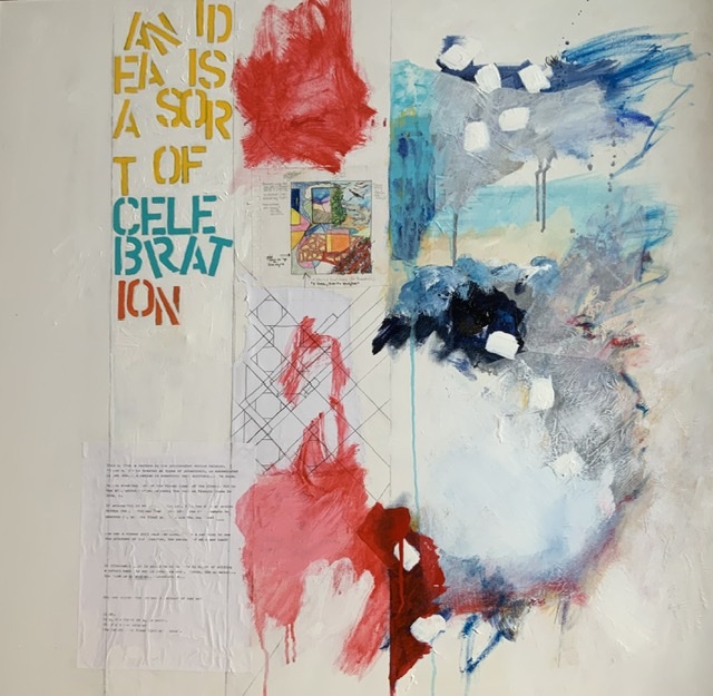
I started by dividing the canvas up, to show how I think and work. The left side was left blank, to portray the (daunting) empty canvas. Then the next vertical "stripe" was for the articulation of the idea: words, quick sketches... then the first attempt, then the finished "piece" far left. I found that the last two morphed into one another, so the first paintings had just three compartments. 

Then... the thing happened that always happens... the paintings began, as they should, to take on their own lives. And the first painting, the one I thought would be the base, the thing to then aspire to in the next paintings, began to tell me it was unhappy with its state .... so, the top version, the first "finished" version, became the second version, the one below. Other things changed too. The "idea," or first muse-quote, changed space from its vertical presentation to be across the top and the vertical lines just did not seem as important. Here's a new painting:


I still love the text. Diana Thater and Gilles Deleuze are still in there. See what you think.

Saturday, January 12, 2019

Artist Statements in 4" x 6"

We drove south on backroads on a whim; we needed to see art, but saw two disappointing sets of artworks and felt defeated. One more try, we thought. We stopped for the first time at the Chester Gallery (in Chester, Connecticut, one of the most beautiful small villages in New England).

Chester Gallery is hosting this year's Holiday Postcard Show; everything is 4" x 6" or smaller. There are many of these kinds of small works shows, designed to make art affordable and give-able, and this is the best one I have seen. Its final day is today--and maybe tomorrow, Sunday the 13th of January 2019.

On the way down in the car, I was reading various artist statements aloud to my husband. Mostly, they seemed forced. It is very difficult to write about the thing your hand and imagination put together without sounding... odd. If you can write about it, after all, why paint it? [I wrote several posts on the artist statement on this blog back in 2011]. I never stop trying to figure out how best to discuss my own and other people's art.

There will be some reflected light on these pieces; I apologize! as the photographs are all mine. Do go and see these in person. Here is the first little cluster I loved:


Because of scale, these paintings sit quite a bit closer to one another than is usually possible. This allows for a good deal of cross-fertilization: the way the blues in the two left-hand paintings glide into each other, or the way the gray in the lower left is echoed and deepened by the deep blacks in the lower-right painting, where the orange is brought out more fully by the rust-orange in the work above it. Some of this interplay happens in any show, but, for some reason, it happened a lot more in this gallery than usual. Serendipitous hanging, probably, but also really good art.

Okay, so why are these pieces appealing to me? Let me try and figure that out with you. Here is "Day's End," a monotype by Kathleen DeMeo:


On her website, this artist publishes what may be the shortest and sweetest artist statement ever:

"I paint with a brayer and press
A color lover with monochrome moods
Hard-edged geometry or melted lines
Depends on the day"

This monotype (the least expensive, at $45, of any of these works, so an amazing bargain) falls into the middle of DeMeo's statement. It isn't monochrome, though the black lines lend the piece structure. The colors are so subtle, but there is something about the shades of that ochre-yellow that pulls us in. Instead of shadows around the tree, we see rings of a kind of grounded halo (those "melted lines"?).  I can almost feel the weight of air around the tree. DeMeo's artist statement is perfect, as it discusses her method, allows her leeway, and doesn't try to say too much.

The next piece I liked was by Claudia Van Nes, who opened Maple and Main, then, recently, closed the gallery and now works in a group called River Valley Artists.  My favorite part of her biography is her true starting point as a child, where she "spent drawing elaborate homes and villages for rabbits." I bet she almost didn't include that, but it makes perfect sense, because look at the detail in this watercolor, "Oranges on a Dish," where the scale (think of these orange slices up against DeMeo's tree) is so interesting:


Just as rabbit villages cannot be realistic, these oranges are not nudging into photographic realism. They are something seen out of the corner of your eye, an overlooked artistic moment in a day filled with far more important things. But isn't that what art can do, is give us those glimpses that we can hold onto?

Nearby sits "Snow at Devil's Hopyard," by Katherine Clarkson:


I like this primarily because I am often drawn to art that is on the edge of realism and abstraction. If it were not for the tree trunks in the background, this would be a far more conceptual piece. But we see the trees, then that leads us to the boulders, then the water, and the snow of the title. I could not find Katherine Clarkson's statement about her work, so here I go... Robert Motherwell said something like "start with the full picture and pare it down to the essence." The view, here, gets to put in all the detail that Clarkson didn't need: the deeper grays and veins in the rocks, the green-grays running through the water, the footprints and fallen leaves in the snow... It's all there, but she gives it to you to fill back in. Abstract art can be a gift to the viewer: "here, look at this, and imagine yourself inside ..."

"Lines," two pieces by Moya Aiken, go full-out abstract.


She writes of her work that "Even the solid areas of my work consist of many varying lines forming a solid mass in which there are time lines of shadows, a result of the different depths of graphite." Pencils can be under-rated by painters, but not by Aiken. Her pieces here show the lines running off the paper to another unseen place. The negative space here is substantial... and playful.  It looks as though the pencil began the lines and the paint or ink completed them... the lines seem to float.

Catherine Christiano says she "works from close observation of subjects... while also drawing from... art history when determining compositions." Here is an Irish street scene that could have been painted  in another time and place:


Christiano paints perfect forms and edges in her larger oils, but here her brushstrokes are looser, freer,  and the gray day is lit by the soft and misted lights of the storefront. She has given us flat shapes that indicate something more behind them-- a vase, a tray, a book. This is  a street, a painting, to wander in. It reminds us of places we have walked along but, as Christiano's statement says, it also reminds us of streets we have seen in galleries and museums portraying other times.

This show will be coming down, but the gallery owner, Nancy Pinney, can talk to you about any of these artists. Chester Gallery has shows coming, and here are two large paintings that were hanging in the back room to give you an idea of what kinds of things might be in store. The landscape is by Nancy Pinney and the still life with cat by Sheila Barbone:


Thursday, December 21, 2017

Small is Beautiful, Right?


After a two-person exhibition, “Shaking Loose,” with the artist Rhys Davies at Hope and Feathers (Amherst, Massachusetts), I am back to small works...

Why? I had been working, steadily, slowly, towards abstract works that shimmer with color and stay largely clear of line and image, clear of outlined foreground and background. Here are a couple of examples from the Hope and Feathers show. The first is called “Friday Noon,” and the second “Tuesday Morning, 10:30.”


I love these paintings. I do.  But they are, I have discovered, their own end-point.  If I look through all of my paintings (www.annknickerbocker.com), I can see the work change over time, and I can see what lead to these paintings... but I can’t take this work any farther. No lines, no discernible shapes... what could come next? I could, I suppose, by painting, say, an all-blue canvas.  So where can I go?

I looked online, pulling up “abstract” and “zombie formalism” and the names of various strong abstract artists. I saw too many paintings that shared sensibilities, colors, and brushwork with mine. We constitute a small country, us abstractionists, and it became difficult for me to sort my work out from anyone else’s. The art critics are tired of it, and the woman who comes into the gallery from the cold doesn't feel it. 

So I am working small, with digital means (adobe sketch)


 or inktense blocks and gouache and watercolor and the occasional flourish of acrylic. 


The sizes are 14” x 17” and 11” x 14” for now... I may be able to blow these up to billboard size at some point. But for now, I am going back in to places and moments and drawing lines and text and the slightly wonky images that I see when I think with closed eyes.


Tuesday, May 10, 2016

Judith Barbour Osborne: "Synchronized with ... head and heart"


“A really good picture looks as if it’s happened at once. It’s an immediate image ... one really beautiful wrist motion that is synchronized with your head and heart, and you have it, and therefore it looks as if it were born in a minute.”
                                                                                                            Helen Frankenthaler

“Really good” pictures tend not to happen “at once,” though, as Frankenthaler knew better than anyone.  Her “Madame Butterfly” woodcut, below, is composed of 102 colors, from 46 woodblocks, and measures 2 meters (6 ½ feet) wide (www.nga.gov.au/exhibition/Frankenthaler). The print is far wider than one wrist motion, and took a bit longer to put together than one minute. And yet, when we look:


 ... this woodcut doesn’t make us feel anything that isn’t in this moment, right now. All we see is that Frankenthaler had a way of making paint and inks float away from their supports, whether she poured or printed.   And somehow you don’t want to solve the mystery of those floating images. You fall in with them, as you would any compelling natural landscape. 

Her work is sometimes critiqued as “just too pretty,” a damning phrase designed to undercut the work and its maker, yet artist Amy Sillman says there’s no “just” about it:

Frankenthaler’s taste and grace are tough, like ballerina grace: those women aren’t sugarplum fairies but muscular athletes, with machinelike, disciplined bodies. Frankenthaler is in an incredible athletic decision-making process while working... It’s an experiment with the alchemic and extreme reliance on color as material and as optics...
                                    “House of Frankenthaler,” printed in The heroine Paint,  p. 267

Sometimes, it takes another artist to see the underpinnings of a work, along with the artist’s consciousness and experience that remain (almost) invisible.  When I see work this strong, I want to know that some artist, somewhere, has seen the work and is willing to try and take on its challenges.                                                                                                                                                                                               
Judith Barbour Osborne is a likely suspect.  She has several shows on at the moment in Connecticut galleries.  I have just come from her Exit Gallery show at the Essex Art Association (an opportunity given as an award, the highest the gallery offers), and then I visited more work in a show at the Guilford Art Center. 

Osborne has worked with poets and musicians...  She works with words as well as paints, choosing to bring meaning into the light, to make “aspects of non-visual reality visible, as if staining the wind” (JBO artist statement).  Judith  Barbour Osborne’s compact show in Essex, “Staining the Wind,” is a master class in making an intimate space feel immense. She works in smaller spaces than Frankenthaler, yet she manages to create huge effects with her close studies. I think she has found the very next level after Frankenthaler, and pushed it to its very limits. Here is her “Revelation # 4”:


 It has a calming presence, for me, although Osborne says that she generally hears people talk about the energy in her work.  It may be that calm and energy come from the same core place, in us, the place that relaxes by the sea or in the mountain air. In the artwork before us we find words, too, embedded in the paint and inks, just barely there, like a whisper or the strain of a song being sung far away. Osborne says this is an integral part of her work: “My artwork is text-based and utilizes elements of chance and intention. I abstractly write text with tools ranging from small hand-made brushes to mops and brooms, from syringes to batiking tools”  (see the site where she has worked together with a poet on an artist’s book: www.vampandtramp.com/finepress/o/judith-b-osborne.html).

Here is
“Revelation # 3,” also at the Essex Art Association:


 and a detail:


All the marks Osborne makes seem interconnected, indivisible from one another. As we stand before them, we see that there is no looking at one mark, or one place in the painting. The eye moves over the whole surface, the whole “landscape.”  She has made a whole world, here.

Osborne is not only connected back to painters like Frankenthaler, though. She is thinking forward, so she is also the director of a group of ten artists, Gallery One (http://www.galleryonect.com) and they are exhibiting work at the Mill Gallery of the Guilford Art Center (through May 15, 2016). They support and encourage one another, a gallery without walls. The works as a whole make a very strong showing. Here is one of the pieces,  Osborne’s “Revelations # 1”:


and a detail:


This is a painting created with transparent inks, brushstrokes, and splattered marks, and it is luminous.  It was a rainy and gray day outside, so we lingered indoors as long as we could, staying with the art. The courage it takes to leave all that “blank” space in an artwork... fierce.  The words and the strokes from the artist’s hand somehow turn us inward, crawl inside some empty space we must have been leaving there, a space exactly as big as art.


Wednesday, February 29, 2012

Criteria for Abstract Art: Image vs. Text, Part IV


Can we discuss abstract art without resorting to text? Is there a way to see a painting without being blinded by the artist’s biography or the work’s appraised (monetary) value? Are we able to make a fair judgment, based only on the image before us, and come to a determination about a painting’s artistic worth? 

We need to avoid some rather familiar descriptive terms; I use them, too, words like “energy” or “intrigue” or “artistic intention” or “finesse.”  But these are not objective terms, are they? One person’s “energy” is another’s “confused mess.” How can we escape the emotional and often divisive nature of subjective terminology?

There aren’t too many truths that we could all agree upon, but here are some terms that might help us avoid our tendency to become arbitrary. Let’s think about: color, line, surface texture, form(s), composition, process and method, space, symmetry (presence or absence), and, when relevant, historical context or influence (Cubism, for example, or Op Art). 

Now take the two paintings I presented you with, here, on February 26th, and we can work with each of the two, using these terms to try and investigate the work on its own terms.

First,


 Color: prevalent, from bright yellows in the background to red, green and blue overlays. There is a softly painted, not-quite-“squared” grid painted in black, echoed by thin marker lines. Some forms have black edges. The final layer seems to be drips of color, mostly deep blues and pure white. Color is a big part of this painting.

Line: broad, soft strokes for a grid, and smaller grids in thin marker lines echo the bigger grid from center to lower right. The dripping paint forms a line with its color. Two forms upper right are outlined in black marker.  There is a kind of script or faux signature at lower left.  Except for the broad grid, line seems less important than color here.

Surface texture:  the paint seems in places to have soaked into the canvas, and there is a bit of bare canvas at bottom right.  The paint layers are thin, with the only build-up coming from a collaged typed square near the center and the poured or dripped paint lines, which appear to have been the final layer.

Forms: At top right, the grid comes over the bottom yellow layer; some thin grids follow in lower right.  There is one white triangle center left, but all the other forms (except two that are outlined, top right) are organic, rounded, with no clear outline and no apparent reference to known objects.  Or: there may be one green feather coming up from the lower left. The splatters create forms, too.  The meeting of the grid and these organic forms seems to provide most of the focus for the painting.

Composition:  this category overlaps with Forms, above, but the composition also seems to be centered in the painting’s upper two-thirds. The lower part of the painting is spare, nearly a blank canvas.  This forces the eye upwards to the yellow colored ground.

Process and Method: (see Surface Texture, above) Actual brushstrokes are not obvious, except for the soft grid. Soaking and dripping seem to dominate otherwise.

Space: (see Composition, above) Despite the heavy paint application, there is enough blank canvas and enough yellow to offer plenty of room here for the eye to move.

Symmetry (or its absence):  Generally not; the composition is off-center, the bulk of the painting moves towards the top of the work.

Historical Context or Influence: Mixed: this is a post-Pollock, post-Frankenthaler work, but seems to be in a world of its own.

Now, let’s look at the second painting:


Color:  Subtle browns and grays, with shadings of black and whites; outlining and over-lining in blacks and whites.  Color does not seem to be a major preoccupation here.

Line: Line seems dominant in this work.  Almost all of the lines curve, with only two short vertical straight lines in the right half, and many of the lines are outlines, either for painted figures or for figures not otherwise made visible.

Surface Texture: Uniform, with no apparent paint build-up or collage.

Forms: Organic, mostly, with forms that look like test tubes or glasses and bottles, and there is one possible breast and one possible bottom.  The forms overlap, and seem more in this painting than in the first to refer to real objects, but those objects have been rendered unclear and ambiguous.

Composition:  All-over. There is no concentration of images in one spot rather than another; the paint and lines are applied equally across the space. Attention is paid here (more than in the first painting) to edges; the forms here begin to fade all around the edges of the work.

Process and method: As with the first painting, the brushstrokes are not obvious here. The lines dominate.  It would appear that the colors of grays and browns were set down first, perhaps from a sketch, and then the black and white lines were applied.

Space: The forms as outlined overlap and leave very little un-painted, un-accounted for space.  The painting fills the canvas almost completely.

Symmetry:  The artist seems to be working with symmetrical forms; some of the curves echo one another or invert one another. There is almost an upper-lower, left-right symmetry, but it is just off, which means it calls attention to itself as a composition.

Historical Context or Influences:  This is a more important category for this painting than for the first. The work seems very tied to the colors and overlapping shapes of Cubism, and may also refer to the dream-like forms of Surrealism.

Overall, while these two paintings are very different, it is not possible to raise one over the other, for me, simply by concentrating on the paintings themselves.  One does not seem, even after study, to be “better than” the other. If we were to stand before the two in a gallery, questions of scale and application of paint and true color, none of which we can refer to here, might sway the balance.  But I think it is a very interesting question. I would like to know what you think. The first painting is mine, from the mid-1990’s, and the second is an early (1945) Mark Rothko, titled “The Rites of Lilith,” and it is now owned by his daughter. 

Image vs. Text. Let me know.


Sunday, February 26, 2012

Image vs. Text, Part Three: In Which We Try to Establish Some Criteria for Abstract Art

I have been looking at the “image vs. text” question (see posts from January 20, 25, 31 and February 8). I find that what is lying just underneath what I have said, is this: “text” over-determines matters in the art world. And it is empowered in this way because we do not trust “image” without its accompanying (nemesis) “text.” When we see the image -- alone -- we have no way to determine whether or not we should care about the painting in front of us.  Without text, we are down to the old joke, “I know what I like.”  Without text, it’s all up for grabs. 

Text shows us the way to paint, where to attend art school, who our mentors and influences should be, who ought to be shown and sold in a premiere gallery, what to acquire for our museums, what interests collectors, even what we might be saying when we are in front of a work of art.  Without text, it’s all totally arbitrary, floating, unfixed.  Text gives us authority and a fixed, mostly scrutable art world.  But what nobody says, out loud, is that text is flawed. The world, as the term ukiyo-e would tell you, is floating. Consider the case of the art forgery.

There are four ways to authenticate a painting: provenance; scientific testing of the materials; fitting the work in question into the artist’s oeuvre; and “a connoisseur’s eye” (Patricia Cohen, “An Art Trove’s Authenticity Goes to Court,” The New York Times online, February 12, 2012).  A court case has surfaced over paintings “by” Motherwell, Clyfford Still, Jackson Pollock, Giacometti, and Barnett Newman.  Over a period of ten years, a Long Island dealer brought first one, then two, then more paintings to the Knoedler Gallery; none of the art came with the usual papers, but that didn’t seem to matter. Over time, the gallery and the Daedalus Foundation and the National Gallery of Art (and even the artist Frank Stella) examined the lot and pronounced them to be genuine. But, soon, the Motherwell pieces, titled as if they belonged to his “Elegy to the Spanish Civil War” series, came under scrutiny for problems with “signatures and styles,” and the Daedalus Foundation shifted its opinion: these were now deemed forgeries, and all the paintings acquired from the little-known Long Island dealer were called into question. The Knoedler Gallery has closed; they say the closure is not due to this case (see the article and photographs: http://www.nytimes.com/interactive/2012/02/22/arts/design/20120222-fake-paintings-compared.html?ref=arts ).  As paintings become more and more valuable -- Christie’s has recently, across three separate auctions, sold three Motherwell Elegies, at prices ranging from $2,144,000 to $2,919,500 – artists, auctioneers and galleries find that the desire to forge works and the resulting need to authenticate has created a little fear and trembling. The Pollock-Krasner Authentication Board dissolved in 1996. The Andy Warhol Art Authentication Board, faced with lawsuits, is no longer accepting new pieces to either include in the catalogue raisonné or to (literally) stamp with DENIED.

But the four methods of authentication all deal with text and not image. The provenance is all text: first, the labels from the back of the canvas indicate the date the work was painted, or where it was exhibited, and then the papers, testifying to the original acquisition, past ownership and sale prices, previous dealers’ evaluations, perhaps a note from the artist or the biographer.  None of the pieces at Knoedler came with any of this.  The collector had acquired the pieces directly from the artist, it was said, or from the artist’s own dealer; they had been in storage.  It was said.  When the pigments were tested, the researchers found paints not yet in use at the time the work was created. Not a problem, the dealer said, the artists were given the newest sample pigments to try; it happens all the time (Cohen). More text. Then, the third method of authority, fitting the work into the artist’s other series: simple. Works are uneven, but each series, each new piece, will share characteristics with previous or concurrent work; the titles would take care of any doubts.  And, last, the connoisseur’s eye; we now know what happened there -- every eye was fooled.  

It was Plato who said that if we knew what we were looking for, we would be all the more able to see it [“Suppose that a short-sighted person had been asked by some one to read small letters from a distance; and it occurred to some one else that they might be found in another place which was larger and in which the letters were larger --if they were the same and he could read the larger letters first, and then proceed to the lesser --this would have been thought a rare piece of good fortune” The Republic, Book I].  If we are looking for and expect authenticity, because authenticity excites us, we will find it.

If, on the other hand, a painting called “Untitled, 1950: After Jackson Pollock” appeared at your local coffeeshop, hanging between the comfy chairs, looking just like a Pollock, but the artist’s name was, say, mine, and the sale price was listed as $650, there wouldn’t be a problem.  If you liked it, and you had the $650, fine. But if you were paying $300,000, as the gallery did, or $3,000,000, as a collector did, for an “undiscovered” Pollock with the simpler name “Untitled, 1950,” then you’d want the Jackson Pollock signature -- and the provenance. You’d want the text.  And mine wouldn’t have any text … in fact, worse, it would be trading on Pollock’s lifetime of text.

And everyone in the art world trades on text, because text creates “value” for a painting.  It is the only way we know to create value. It is also the only way to create the canon of artworks, the chosen few that we love, and teach, and discuss, and visit in museums. There are no objective criteria that guarantee that the beauty, or ugliness, or power, or authenticity that we see in a painting is … “real.” 

But it is still beauty, or ugliness, or power, or authenticity, isn’t it, if we see it?  I have walked through painting studios at a college and seen a fabulous thing, in progress, by a twenty-year-old; but she doesn’t have any text yet.  Intrinsically, the work is beautiful, to me; I like the application of the paint, the subject matter, or lack of it, the figure-ground blending … but extrinsically, outside of itself, out there in the world, the painting has no value at all.  If she ships it through the mail to her great-aunt in Brixton, she can only insure it for the value of the materials.

Outside of the monetary value, is there any other reason to go straight to text? I could argue that when I am standing in front of Picasso’s portrait of Gertrude Stein, I like to think of her walking from 27, Rue de Fleurus to Picasso’s studio in the Bateau Lavoir in Montmartre.  I like to think of the painter and his subject speaking in broken French over eighty or ninety sittings, and wonder about the influence they exerted on one another during the time it took to make the painting. I would like to see how many faces of Stein there were before Picasso crossed out the last one and replaced it with a mask.  Part of a painting’s value is its history, the fact that the text confirms that this is, in fact, the painting based on an Ingres, the painting where we can just see Picasso’s brushstrokes at the edges of the chair, this is the painting that was wrapped up in Paris and driven by Stein and Toklas over to the Ain for safe-keeping during World War II.  Text can ensure a kind of romance.

But.  Is there any way, at all, that we can establish a way of SEEING that is based on ... SEEING? We can try. Look at the two paintings below. One was painted by someone with an acre of text, the other with, perhaps, a window-box full of text.  Draw up some criteria to judge them.  See which one engages you, but be prepared to explain why. On my next visit, I will talk about some ideas of my own for discussing image and tell you which painting … is which.