Tuesday, January 31, 2012

Tintoretto's "Susanna and the Elders": Image vs. Text, Part II


Figure and Ground
We saw this painting at the De Young’s “Masters of Venice” show a few days ago; at 57” x 76 ¼,” it takes up most of one wall and is absolutely luminous.  It is the second of Tintoretto’s known versions of the story (the first is in the Louvre) but this is the one that … well, everyone swoons over. The Biblical story behind “Susanna and the Elders” begins with a habit: she frequents her husband’s gated orchard at the same time each day. The “elders” of the title know this, and arrive as she is deciding to take a bath; Tintoretto captures the moment before they see her and before she sees them. Susanna refuses their advances, for which they punish her by accusing her of adultery with an (unknown) young man; at the trial, their lies are discovered and the elders are killed.  Many painters give us the moment when Susanna becomes aware that the elders see her; Tintoretto shows the elders just getting into position.

Despite the many stories we could follow here -- Susanna’s chastity (in these times, faithfulness after marriage was just as important as virginity before, and the Susanna of this painting was often used as a model to follow), or the idea that “the truth will out”  -- but I would like to follow a line of argument about figure and ground, to see if we can’t tie it back to -- text.

Here is the painting with some lines I have added to trace the peculiarities of the ground:

Take a look at the whole picture, with these outlines; you can see that the painting does not really hang together. To begin with the farthest-away portion, framed in yellow: a beautiful, pastoral garden, with deer to the left, ducks floating in water to the right. This clearly suggests Eden, innocence, perhaps to give us the idea that nature empathizes with our heroine; the eye doesn’t linger there, however, because it moves on to the title characters, who, oddly, are really part of the ground and not figures in their own right. The elders, outlined in red, bookend the hedge. The elder to the right of the hedge is tucked into the dead center of the upper portion of the painting, something that escapes us at first, because he is mirrored by a statue to the right of the archway that leads back to yet another level of paradise.  He, and the un-articulated statue, are, essentially columns, supporting the arch.  Perhaps Tintoretto has done this to let us know that this elder will not present any real problems in the long run.  The second elder is curled into a space behind the hedge. If his robes were green, they would be a grassy hill. He cannot see Susanna yet, and as a non-actor, seems more ground than figure: he is given no shoulder-space and no real second arm, so he is, like the other elder, compromised, already.

Now look at the tree trunks behind Susanna, outlined in green; she could not possibly be leaning against them -- where are the roots?  What is the relation between the bath, a squared edge filled with water (not outlined) and the trees?  Another bit of ground is the vertical hedge: why does it appear to be wrapped in burlap, like a canvas in transit (did Tintoretto paint what was in the studio)? Why are the roses so evenly spaced? Why are there no breaks in the hedge, no pieces of light?

The strangest part, though, seems to me the ground that I have framed in blue, which is divided into at least two separate perspectival planes.  First, along the hedge, the ground rises in a triangle back to the elder and the pastoral distance; and the source of that perspective would be the elder at front left, if he were in position to see Susanna -- but he cannot see Susanna, and we can.  The ground inside my blue line is very difficult to read or reconstruct. It doesn’t make sense as real terra firma.  Even the ground that surrounds Susanna’s clothes and borders the pool in the front is dark and vague.  This makes no sense. Grass is easy to paint. Susanna is solid, but the ground she rests on is not. She is not sitting on dirt, or lovely little grasses and flowers, or a tree-root. Even the elder in the top center of the painting seems to be looking down, trying to find his footing… where can he step?  The ground cannot be visually understood, mapped, or defined. It comes at us, as if we were overhead, in an apparent anticipation of Cézanne’s tipped-up table (see below, from 1890-4, “Still Life with Apples”):


So the ground is tilted, almost as if we were standing over Susanna, or standing in front of her. Oh, that’s right – we are. There is a second carefully-constructed perspective that gives the audience a role. We are supposed to see Susanna nearly head-on.  David Rosand, in Titian, Tintoretto, Veronese: Rivals in Renaissance Venice, notes that, in this painting, the viewer is “a voyeur, but with even more privileged, and aesthetically sanctioned, access to the bathing body. Pictorial desire and sensual desire are conflated” (p. 181).  So, whether we “desire” to be or not, we are the elders, except, of course, that we are not in a position to harm Susanna, to save her, or even to breathe Susanna’s air. She is, for us, like the figures on Keats’s Grecian urn, frozen in time: “For ever wilt thou love, and she be fair!”  But the question remains, as Robert Hahn notes: “If the painting could make me feel I shouldn’t be looking at all, why was it painted, and why in this particular way?” (“Caught in the Act: Looking at Tintoretto’s Susanna,” Massachusetts Review, Vol. 45, No. 4, Winter 2004-5, p. 635).

So, perhaps there are answers in the last bit of un-articulated ground, the mirror.  Why have we not seen more than a bit of satin and an hair-ornament reflected there?  Why is the mirror there at all? What sort of woman carries her comb, her powders, and her vanity-table mirror with her into an orchard?  She is not using it to apply make-up. Why is it there? I think the mirror is there so that Susanna has somewhere to look besides out at us.  She looks happily at her own reflection, a female Narcissus.  We are thus meant to be -- just like the elders -- voyeurs.  (It is worth noting that in the earlier version of “Susanna and the Elders,” Tintoretto shows her looking out  -- “as frankly as Manet’s Olympia,” Hahn says, p. 637).  Here, I think there is meant to be more innocence -- on her part -- and more guilt, on ours.

So is there anything in the figure that relates to, or is in marked contrast with, this uncertain ground?  Susanna, to begin with, is one solid piece of work.  I wrote in an earlier blog piece (11/30/2011) that “she is all we see.”  Sometimes, as would happen later with Rembrandt’s Saskia or Manet’s Victorine Meurent, an artist paints the same model in several different pictures. But Susanna is unique. Nude artists’ models were not readily available in sixteenth-century Venice, so Tintoretto often sketched from wax figures that he created, and he also drew “male nudes” and translated them later into “female figures” (Claus Virch, “A Study of Tintoretto After Michelangelo,” Department of Painting, Metropolitan Museum of Art). Susanna seems to have been modeled on a pretty hefty, almost manly, scale. Her arms and legs are muscular, and the one visible breast seems more male than female. Susanna’s strength and almost surreal calm make her seem sexually powerful, self-contained, as if she doesn’t need anyone else (rather like Matisse’s “Blue Nude – Souvenir de Biskra”).   The ground is terribly ambiguous, the main figure, a rock. Why?

Because of … Text
I think it all returns to text.  The ground is uncertain because it is an afterthought. The figure is certain because it obeyed the rules: all the naked ladies painted in Tintoretto’s time brought their texts with them, and so were guaranteed safe passage. They were goddesses or mythological or Biblical women.  They were not Venetians.  Griselda Pollock, in Differencing the Canon, writes that in this era, the genre of “the erotic female nude … was emerging … shifting the connotations of the female nude from its traditional iconographic association with truth towards its modern significance of (masculine) desire and its privileged visuality” (p. 105).  So Tintoretto has done well to choose Susanna -- for his viewers.   But what about the precise moment that he chooses?  She looks at her reflection in the mirror with apparent pleasure.  The elders are not yet completely on their marks.We look at her looking (as in this photo, below, from a New York Times review of an earlier Tintoretto show):


Why not choose another, later moment, as Anthony Van Dyck did, in 1621?


I think we can see why Tintoretto rejected this idea. Van Dyck’s Susanna is not calm, not a study in nude perfection, but a terrified young woman, confined in a small space with two men and three very large hands.  (His aim is very different, of course -- he is a devout Catholic and an emotional painter of religious works).  Van Dyck’s painting resembles a document: “Exhibit A.”  Tintoretto’s vision, in contrast, is so painterly, so light-filled, that it leaves us with just enough room to mock the elders.

Tintoretto wanted achievement: “il disegno di Michelangelo ed i colori di Tiziano” (the drawing of Michelangelo and the color of Titian) was written on the wall of his studio.  The shape, precise outlines, the delineation of the ground in this painting was unimportant to him. “Susanna” was painted in 1555-6, when he was 38, which would be young for an artist now, but in his time… he needed to get going.  “Tintoretto took up either techniques or subjects utilized by the older, more established artists in order both to challenge himself and present his talent” notes Dan Clanton (in The Good, The Bold, and The Beautiful, p. 123). Tintoretto wanted to set off that body. He wanted it to be the first and last thing anyone saw.  Robert Hahn asks, in all seriousness, a question he doesn’t exactly answer: “Is Susanna just another hot babe employed to strip for the bozos?” (p. 645).  And the answer is, in pursuit of text, just … maybe.

Wednesday, January 25, 2012

Subjective? Objective? How Critical is the Weight of Text? And who made those paintings, anyway?

Let's look at these two paintings one more time, and see if we can evaluate them in some objective way, before I reveal their origins (and... text).  This first painting:


The first thing that we would notice, objectively, is color. The blues and greens of the right-hand side of the painting are softened, made warmer, as they merge into the oranges and yellows of the central diagonal line.  There are some obvious brushstrokes, but most of the surface is soaked in color. The obvious application of paint comes with the dots in the upper right and some streaks of gestural paint in the crossed lines. The painting is layered; the crossed lines show traces of several layers of paint, as does the circular shape at bottom.  The collaged elements at center left could be embossed or simply wrinkled paper; from this photograph, it is hard to tell. They also provide layers, by themselves, but also because whatever these collaged papers might have depicted is wiped out entirely by added paint in varied colors.  The eye is drawn around the painting's surface by the color and the two crossed lines. Objectively, I think that is as much as we should say.

Now, for the second work under discussion:


This painting, too, is suffused with color, most of it warm reds and yellows. Here the complication is not added by large crossed lines, or blues and greens, but by a floating gray mass, a figure, of sorts, attached by the yellow lines that function as straps at its bottom. It stops the flow of color and this mass is what forces the eye around the painting; we find ourselves looking for the colors around it. There are three thin directional lines of paint, two in black (moving off the painting's edges) and one red (it follows the yellow "strap"). There are some brushstrokes here, in the red areas at top center and left, and in the black figure submerged under the gray mass, but the colors in this painting are mostly applied in broad, rough swathes.  The painting is layered, with the gray and black and gold figures at the center, and with the blue at top right, which is soft and soaked into the surface. Again, I think that's as much as we should say.

Now, just for your own pleasure, look at them each one more time. Which one do you like, subjectively? Both? Neither?

Here's the answer (spoiler alert!). The first painting above is mine, from about 1995. It is 9" x 12" and was painted in acrylic, with collaged magazine pages.  The second painting is a Gerhard Richter, called "Georg," from 1981, and it measures 78 3/4" square.  For the record, because the paintings are so similar, I had not seen a Richter until well after I painted the work at the top. Interesting, no?

Friday, January 20, 2012

Hanging (on) the Ineffable: Is "Text" the Difference Between 'Fine Art" and "Stuff"?


André Malraux invented le musée imaginaire, where works could be seen “without walls,” pulled away from their art-historical categories and their countries (and, I am assuming, the world of money).  It is now possible to create that musée imaginaire in our thoughts and … online … and the musée we create keeps us alive.

But artists and their audiences still need to see art, really see it, the brushstrokes and nail holes and scrapings and chisel marks, to stand close to the canvas, to walk across the room, to see the scale of the work and see what the artist saw as the work was progressing.  

We began a visit through the quiet rooms of a series of art galleries in San Francisco. About five galleries into the day, happy, we stepped into a small space and saw a solo show with drawings, paintings, and tapestries.  I had some questions, as I found the art rather uneven and its reach overly ambitious: the drawings tended towards kitsch (many, however, were sold!), the monumental paintings were perfectly cold and accomplished, but the tapestries –-carefully done and brimming with color-- were gorgeous. (I did not write down the price at the time, but on another gallery’s website, a tapestry by this same artist, a wide brush on a variegated field, is selling for $9,800). The assistant drifted away, and the owner materialized.  The tapestries were contracted out to Belgian weavers, he said; the artist made preparatory drawings in some detail, and he began to elaborate.  My husband moved, as he often does, to clarify who we were; an artist, a poet, and not people who are buying.  The owner said “yes, but artists must support other artists.” We said that we were looking for inspiration; coming to galleries is a kind of support, something we can do, particularly where the prices given are in thousands of dollars.  “I have heat bills, light bills, just like you,” the owner said, bristling.

But his door had been open; the ability to look at art was -- without engraved invitation -- still on offer.  My husband said “We don’t have this kind of money … so we don’t buy art … we hang her stuff.”  That hung in the air for just a minute. And then, not really having listened, not really seeing us anymore, still apparently arguing for a sale, the owner said “this,” waving his arm at the pieces on the wall, “this is fine art … your work” he said, looking at me for the first time, “is just … stuff.” 

Now, maybe he was just using my husband’s term -- “her stuff”  -- and hadn’t just thrown out an insult.  (He hasn’t seen my “stuff,” after all, so how could he judge it?). Or, maybe, he meant it.  There it was, and couldn’t be un-said: my “stuff” vs. “fine art.” I can guess that he is enmeshed in a musée imaginaire of his own, not a nice musée, either, but a museum for the initiates only, a place where text and the explanation trump the actual art.  What he claimed for his art would “brand” it as “fine,” worthy of investment. Perhaps he would have been happier if he could display four bare walls -- and could claim that only a special coterie could see the brilliance of the works on show, a kind of gallery version of the emperor’s new clothes, “hanging,” as my husband said, “the ineffable.”

Is there such a thing as “fine art”?  The definitions run from the most inclusive (all the arts, such as dance and architecture), to a simple mention of the visual arts, to, most precisely, a painting that is “pure of discipline.”  Importantly, “fine art” generates money; if we look up the largest amounts of money paid for paintings, we can collect a list of artists, (in varying order, depending on the most recent auction): Jackson Pollock, Gustav Klimt, Willem de Kooning, Pablo Picasso, and Vincent Van Gogh (and even, in one list, Leonardo da Vinci’s “Mona Lisa,” once she is adjusted for inflation).  

We can try a discussion of contemporary “fine art,” then, to escape historical certainties: how can we distinguish, in the art of our own times, the “fine art” from the “stuff”?

A critical work, Picture Theory, by W.J.T. Mitchell, on image vs. text in the visual arts, claimed that “the text is an intrusion on the image …. the wall labels in museums take more of the spectator’s time than the image” (209). I think it may be that text is the problem.  We hear text from the gallery owners, pronouncing work as “collectible,” “unique” or (really, once): “world class.”  We read dozens of artist’s statements, that day in the galleries, and many, many résumés.  We hear “experts” like the gallery owner pronounce work “collectible” in (spoken) text. The more generous the text, it seemed, the higher the prices, the “finer” the art.  

Each résumé posted in the galleries that day offered sections delineating “Solo” or “Group” shows. Every added line meant, the artist must have thought, added future revenue.  (I was solicited recently via e-mail by a man from a small picturesque Italian town, to apply to be shown in his gallery; it seemed my response would guarantee my being shown. The “entry” fee was 200 euro -- about $256 at today’s exchange rate. It turns out that he does indeed show the work that artists ship to him, at their own expense, and at their own risk of the art’s being stopped at customs.  In truth, his is a tiny gallery -- looking a bit like a former one-bedroom apartment -- in a tiny town, and it was unclear just what advantage this might bring his artists.  People ship work to him … probably in pursuit of that additional résumé line … of text).  Each line of an artist’s bio is proof that someone, somewhere, has chosen this art as “fine.”  Fine, finer, finest, as the text piles up.

Artists do talk about “when” to stop entering juried shows (competitions where a juror, or panel, selects the work); there is a discussion online now about this dilemma.  A juried show is better than an open show, everyone agrees, but not as fine, of course, as a solo show.  “Fine art” rears its ugly little head again here, I think. Even given their comparative lack of text-clout, I find juried shows invigorating -- I am delighted when my work (oops, “stuff”) is accepted.  What if Jasper Johns or Julie Mehretu entered a juried show?  Wouldn’t that be fabulous?  But they don’t need the text.; they have solo shows, retrospectives, which are, of course, the ultimate “text.”

An artist’s text on a résumé also includes work and schooling. We recently saw the paintings of a young man who works with a famous Bay area painter; he sets up the big guy’s canvases and paints, answers his phone, replies to letters.  This assistant’s work was selling briskly at a “fine art” price. The young man’s paintings?  “Fine.” Exact replicas of his boss’s work.  The text was winning, for the moment.

Then there is the art-school portion of the bio. Every artist in the galleries in downtown San Francisco mentioned an MFA.  I think that the classes in fine arts can teach materials, set-up, drying times, archival processes … but then, by the time one is in graduate school, one knows all of that.  I think that, most importantly, graduate school in the visual arts provides contacts, a.k.a., text: more lines for jobs, more lines for prizes.

(Two small asides about text:  First, I found a reference to an artist named Housep Pushman (1877-1966) whose work was terribly successful in his time -- consistently sold-out shows -- and his work is lovely and careful (see, below, his “Pushman Book, Number 555”):


But he is all but forgotten, now, and his work sells for a fraction of that of his contemporaries.  Did someone erase his text? Second, on text and success: I read that the Oscar committee is getting so many documentary submissions that they have decided to exclude any documentary for 2013 that has not had a review in The New York Times or The Los Angeles Times.  Now that’s some serious -- mandated -- text).

Suppose we got rid of all the text. Suppose we were presented with just the thing itself.  Would we know “fine art” when we saw it? Would we be able to construct a musée imaginaire that is no fairy tale?

This is the big question, for me.  Is “fine art” any more than endless, but very articulate, text?  Imagine two paintings on a wall. One was painted by an artist without much text, the other by an artist with considerable text. But you are not told which one is which.  Here they are:


The problem we face involves the very definition of “text” as I am using it, i.e., fame, marketability, etc. We know in advance the text that attaches to the famous painter.  The question is, however, can we say whether one is “better” without resorting to merely intuitive judgments?  The vocabulary of the subjective judgment of art is well known—“balance, beauty, maturity, energy, etc.”  But, the question here is whether we can we determine “objective” characterizations of both paintings that will allow us to say with certainty that one is better/worse than the other?  Are there facts about either painting that go to the question of their quality as art, as fine art, as “finer” art?  Or is it all really only a question of text?

The judgment whether one piece of art is superior to another is always entirely subjective.  It doesn’t change anything, either, that that subjectivity be enshrined in a culture of judgment, such as art criticism, or whatever.  If we now construct a musée imaginaire,  which of these two works would we enshrine?  Which do you think carries the weight of heavy text behind it?  Tell me what you think … and I will let you know which is which ... in a couple of days.


Tuesday, January 10, 2012

"Faithful to the Process": A Review of Richard Serra Drawing


(The Retrospective has been at The Metropolitan Museum Of Art in New York, and is, for a few more days, at SFMOMA and will soon move to the Menil Collection in Houston)

You might feel you know Richard Serra’s work, having walked through two curving walls of one of his steel sculptures.  This is "Band," now at the Los Angeles County Museum of Art:


You may feel, too, that you know and understand the limits of drawing, a concept so basic that most artist’s dictionaries don’t bother to define it. My painter friend says “marks on paper, perhaps,” or “lines, generally in a single color by pen or pencil,” or “maybe a work on its own, or a study for something greater.” A drawing by Raphael is not so different in kind from a drawing by Jasper Johns (who, by the way, has collected Serra’s work; the “Gutter Corner Splash” lines of thrown-lead works in this show are a gift from Johns).  I think of a Nicolas de Stael show we saw years ago, a show of drawings that I thought re-energized the possibilities: a border around the central room of a New York gallery, abstract lines of varied colors on paper torn from notebooks.  

None of this will help you find an immediate kinship with Richard Serra’s work in this show, however: you will not want to wander into any of these rooms unaware. Serra attempts to do with drawing (using paintstick on paper or linen) what he once did with sculpture: to disconcert, to undermine, to bother, to change, to move the goalposts and remove the pedestal -- permanently.  The drawing is neither an architectural plan for sculpting nor a framed bit of abstract gesture. Because it is not anything you have seen before, it may, indeed, infuriate you. In an interview with Charlie Rose (charlierose.com, dated April 21, 2011), Serra says that the intention of these drawings is “to create a volume of space within the architectural volume of the space that is different in kind.”  So, the space inside each museum room is going to have to matter, because the drawings are meant, like the sculptures, to disrupt where we had been walking. As we move, we see a different light, a different angle on each room.  Serra wants to avoid drawing an object, to avoid representing: “I draw interval or I draw space.”  He isn’t using a Rapidograph or an HB pencil or a marker; “artists make up their own tools and make up their own procedures,” Serra tells Rose., and so he melted paintsticks together into bricks, creating a wall of drawing that will be difficult to crack.

The reviews I have read come mostly from the show’s installation at the Metropolitan, and the remarks are – generally – reverential.  Walter Robinson wrote, in “Richard Serra: The Met Goes Modern” (artnet.com), that “Serra is our most powerful formalist, as everyone knows.”  [If we need a gloss on the word “formalism,” we can go to the Tate Museum, where they tell us that the word means that “the most important aspect of a work is its form … the qualities of colour, form, line and composition” (tate.org.uk)].  Serra said (to Charlie Rose): “I don’t draw image.” If it is possible to do it, he seems to want to draw … form. And the critics seem pleased; they have their language at the ready. Robinson calls the drawings “elemental things” and says they “easily command their galleries.”  Jane Panetta, writing of the piece “Taraval Beach,” says that it “dominates and dramatically alters the gallery it inhabits …. [it] seems to become space” (Art in America, June 16, 2011).  David Hansen, writing in The London Review of Books (Vol. 33, No. 13,  30 June 2011), is a little more helpful, though he, too, rhapsodizes, bringing in Edmund Burke and Kant: “faced with the grandeur of the Sublime you can no longer think, let alone act, only be.”  How is that helpful? you may ask. But, wait, other notations of Hansen’s do help: he explains that some of the drawings are textured like “combed animal pelt, or a hairy tweed, or like the squeegee drag and blur found in Gerhard Richter’s abstract canvases …. [or] sugary black molasses with faint traces of bootprints … [or] maps, reptile skin, leaves.”  (At last, a description! This is what they look like – because, for some reason, photographers allowed to take pictures of these works only capture them head-on, where they look flat and black. Un-textured).  So we begin to see a little, perhaps, a little of what it might be like to stand in front of one of these pieces. But, overall, the reviews can feel far too distanced, a kind of unquestioning admiration for “our most powerful formalist.”  Only Roberta Smith, in an otherwise very positive review, acknowledge a weakness or two, such as: “the work can sometimes seem at once meager and histrionic” or “[it]can present empty echoes of traditional authoritative formats” (The New York Times, April 14, 2011).  So what of the work itself … what is it like to be THERE?

My reflections on Serra’s drawing break neatly into two segments (which correspond precisely to my two visits to this show at SFMOMA).  If I had to give a title to my first response, it might be Gertrude Stein’s “If the artist knows exactly what he is going to do and more importantly how it will be done and what it will become then there really is no use in doing it since there will be nothing new in it” (How to Write, xiv). This is the strain of thought I lapsed into after seeing the show for the first time.  I mainly saw -- and remembered -- only the huge black presences called “Abstract Slavery,” “Taraval Beach” (below),  “Pacific Judson Murphy,”  “Blank” and “Union.”   


My reaction to all these works was direct, visceral and angry. Why continue on past the first experiment?  One piece, I thought, would have been enough, a single exploration on this scale, a single try at covering a large surface with a tool that was originally designed to add notations on steel or highlight a line of painting with texture or color.  Once finished, move on: simple.

Two of these pieces,  “Blank” (from 1978, paintstick on Belgian linen) and “Union,” (from 2011, also paintstick) are installed as massive “walls” opposite one another. Two rooms, two sets of black drawings, two sets of white walls, each time.   The other three drawings are also wall-sized, but each is given its own space.  These five, their massive scale, came together for me only in terms of how much space they wasted. These works in particular seemed to repeat a single formula: rub, rub more, rub again, repeat, cover the surface entirely as if covering a schoolyard with asphalt, hang with staples.  The drawings did not seem, to me, to contain the power of Serra’s sculptures, nor did they live up to the elegiac language of many of their critics. Why were they there … except that they were signed “Serra.”

I should pause here and note that I always believed that abstract art revealed the truth of its making; I believed that I could tell when an artist was invested and when s/he was simply going through the motions. I felt supported in this because I had seen an interview with Robert Motherwell, who said (in my rough paraphrase), “I have made many paintings that are failures, but none that are lies.” I felt I could smell lies. And these five drawings, and perhaps one or two others, in this show, seemed to me … lies.  These were not sketches, revealing the coming sculpture; these were … simply … big.  And monotone.  And yet -- I love the erased de Kooning by Rauschenberg (now at SFMOMA; see the video explanation of that process here: http://www.youtube.com/watch?v=nGRNQER16Do&feature=related) and his all-white series. I have seen Ryman’s and Pousette-Dart’s white paintings.  I have read Yazmina Reza’s Art.  I like the fact that Agnes Martin traces horizontal lines across a five- or six-foot canvas, over and over again.  I like Gertrude Stein, who says, in “Portraits and Repetitions,” that “I continued to do what I was doing in Making of Americans.  I was doing what the cinema was doing, I was making a continuous succession of the statement of what that person was until I had not many things but one thing.”

What?  Many repetitions make one thing?  Wait, that’s … what’s happening here.  On Belgian linen.  Wait. Wait. I don’t like not liking something that seems so obviously, on the face of it, the art I should love: a departure from the art before it, a Herculean effort, a non-narrative but still thoughtful attempt at form and substance, “not many things but one thing.”   So I went back.

The title, if I had to give one, of this second visit to SFMOMA would come from Serra himself, from his interview with Rose: in discussing his “Untitled (14-part roller drawing),” made in 1973 at Gemini Press in Los Angeles, Serra created “a very serial proposition … [I was] just paying attention … I could care less about what it looks like. I’m just staying faithful to the process.”  Three things: first, the point of the work at SFMOMA is that it is “serial,” it is “process,” and the artist remains “faithful” to the initial proposition. These works are records of an encounter with scale and material. Serra clearly feels he is still working with these, a straight line from 1969 through to 2011.  I have no trouble with this claim at all. Second, he was “paying attention,” Serra says, and this would be, for me, the thing I needed to find visible, somewhere. Third: yes, “new work will seem ugly” to its first audience, Picasso said once, because it is working through something difficult; Cubism and the Demoiselles were ugly once (then, Picasso said, the imitators come along and make pretty versions).  The exhibition offers up ugly moments, certainly: the drawings can seem like discarded, well-worn rubber, the paper is stapled to the walls, and the oil from the paintsticks makes a yellow stain around the edges of some pieces.  The black paint sucks the air out of some rooms, and the unrelieved raised furrows seem endless and unrelenting in the larger pieces.  Pretty is not the point; the point is power.  Even Hansen, the critic who wrote about the Sublime in relation to this work, concludes his review with: “But don’t try to get too close. Make no mistake, Serra is a tough guy, a front-end-loader philosopher, a ‘don’t give a damn’ democrat. While he is happy to share his hard-labour, hard-nut ontological confidence, he doesn’t solicit your vote. Sublime indifference, that’s what it is.”  Besides making Serra into a combination of Sam Spade, Willem de Kooning and Nietzsche, Hansen makes a good point.  One characteristic of the work is that it stands alone, like death. It doesn’t care what you think.  But art, like death, needs a considered response.

So, what of my concern about whether or not Serra was “paying attention,” whether he was, in my old notions of measuring art, telling some kind of “truth”?  As I walked through the show this second time, I understood the serial, the process, the labour, the confidence, the ugly exposure of the oily edges, the staples, the rubbery surfaces.  But -- does it seem to be “real,” this work, in the way the sculptures are “real”? 

The five pieces I most disliked on my first visit grow a little more receptive on a second go-round.  Coming near to the surfaces of these massive pieces makes it possible to see all the textures that Hansen mentioned.  “Texture and illusion,” my husband said. There are moments of Richter, there is a kind of vertical parade of harsh markings, the light comes and goes into ridges and valleys just as it does over a hillside, and is trapped or reflected without reference to the viewer, unrelievedly. I still find these pieces difficult because they seem to simply begin and end (I would assume that is the point) without a focal point, any carved-out edge, without any relief at all from its “dark declivities” (a Yeatsian phrase from his poem “Parting”).  No relief is also the point.  Drawings, Serra said to Charlie Rose, are “the subtext of how an artist thinks.”  So, yes, we have that “subtext,” textualized in paint, here.  Perhaps I object to the perfection of the unforgiving, unrelenting surface.

Other works that this I found myself far more inclined to love, on second viewing, involve not the perfection of those first five pieces, but a kind of imperfection that comes from the spaces that Serra creates on the ground, the linens or papers. These spaces appear between or around the form or figure and provide some breathing room, a way for the audience to enter in (as Serra said he wants us to).  Barbara Rose writes “Serra is not interested in the mixing of light and shadow but in the absolute differentiation of the two” (exhibition catalogue, page 43). One of the earliest pieces where this “differentiation” occurs is “Untitled,” from 1972-3, a dark black horizontal triangle, with a smudged ground; this is more attuned to traditional figure-ground drawing, of course, and so it seems a bit friendlier. Here is a detail:


 There are three works from 1989, each composed of paintstick on two jointed pieces of paper; all of these appear to be responses to the removal and destruction of Serra’s “Tilted Arc” in that same year.  The titles are “The U.S. Government Destroys Art,” “The U.S. Courts are Partial to Government,” and “No Mandatory Patriotism.”  They are all in one large space, each displaying two black forms that collide with or incline towards one another, and they all make use of negative space and seem light, weightless, despite their layers of paint.  Another group that seem to me to be describing space through line and form, one of Serra’s aims, is the trio from 2001 and 2002, all on one wall, of “Vico,” “September” and, below, “Black Tracks” :


The works called “Solid 1,” “Solid 11” and  “Solid 13” contain an off-square central shape that reaches nearly to the edge of the (handmade) paper, and in that edge is, for me, the payoff: droplets, Pollock-ian lines, smudges, oily smears.  Where the work tapers off and the viewer can then see the body of the work more clearly, that edge, is what I love here.  “A Drawing in Five Parts” from 2005 is composed of five drawings, each with (sideways) arched lines, again with splashes and drips at the edges and thicker and thinner applications of paint.  These are the imperfect ones, the ones I have come to see are the record of the process, the artist’s hand, the true thing.

Serra may have said it best (he’s a pretty articulate Sam Spade):  “I think in order to see a work, it has to generate a sensation that engages you with what you’re looking at.  Otherwise, you’ll dismiss it. Otherwise it’s like other things.  There has to be some factor of engagement, some emotional connection – something has to get you to the point where you’re aware of your reaction, your emotion, where you analyze the content of your perception. Only then will you become conscious of what you’re looking at “ (catalogue, p. 77).  My old friend Kent Jacobson was right: never trust your first impression.  Always go back, look, repeat, think, look, repeat. And then you might get it, sublimely indifferent though it may be.

Friday, December 23, 2011

"Music is feeling, then, not sound ... " wrote Wallace Stevens

We had a small earthquake last night ... about a 2.7 on the Richter Scale ... and we were upstairs, where we could really hear the little "boom" and feel the earth -- uncertain earth -- for just a moment. And it seems to me, as we have now had a few of these, that earthquakes are "feeling, then," AND "sound." Both.  And so, to get myself away from worrying about earthquakes, I am thinking about Wallace Stevens and the poem where the line about "feeling" and "sound" shows up, "Peter Quince at the Clavier":

Music is feeling, then, not sound;
And thus it is that what I feel,
Here in this room, desiring you,

Thinking of your blue-shadowed silk,
Is music ....

Beauty is momentary in the mind --
The fitful tracing of a portal;
But in the flesh it is immortal ....

When I first read this poem, I wondered about that.  Thinking about a thing makes it "real" and permanent -- gives it a place in the mind. But memory shifts, often because we will it to shift:  Friedrich Nietzsche wrote "'I have done that,' says my memory. 'I cannot have done that,' says my pride, and remains adamant.  At last -- memory yields" (an aphorism, from Beyond Good & Evil).  So even a thought, a memory, disappears into another shape.  So the live thing, the one we can hold, or hear, or see, or feel, that is the "immortal" thing.  This may be why earthquakes, quite aside from the damage they can cause, are so scary -- because they can take up two senses at once, hearing and feeling.

So, in yet another attempt to escape these earthquakean ideas, I turn to paintings -- with  music as subject. Here is a smooth-surfaced Caravaggio, "The Lute Player," from 1590:


The painter may have used a lens here for help -- David Hockney argues, in Secret Knowledge, that Caravaggio did use lenses in the 1590's -- just look at the photographic shadows and lighting here.  Now, we skip ahead to a very different aesthetic, Dante Gabriel Rossetti, a detail from his "Christmas Carol" of 1867:


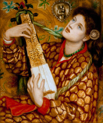
Is she playing?  The strings here are of far less interest than her fingers (and eyes) ...  Gustav Klimt was inspired by the final chorus of Beethoven's Ninth Symphony to paint this in 1902:

Here, the bodies and cloth and light is all reduced to beautiful patterns -- notes -- musical.  The last painting is Matisse's "Music," from 1939:


The most musical, to me ... the eye is as engaged as the ear.

Wednesday, December 21, 2011

The Flâneur: Pissarro, Grimshaw, Vuillard

The flâneur -- the person who strolls, gazes, looks through the city streets for the life, the sights, and the sounds that are worth noting in an increasingly complex world -- seems an interesting idea to look into.  I thought we could take a minute and think about the most revealing intersections, corners, windows, doors, outside spaces that I know, some I have been to and photographed


... like this enclosed garden that once belonged to Lawrence Durrell in a city somewhere in the South of France ... or this graffiti in (I think) Lyon:


But we can look farther out ... who looks at, and paints, outside scenes? Pissarro, for one, here a Paris Street/Montmartre scene, from 1877:


We can imagine walking in this rain, with the lights just coming on, people hurrying. I found a painting by John Atkinson Grimshaw, "Boar Lane, Leeds" from 1881:


Dusk, again, people heading out for drinks or home for dinner, and our flâneur just watching it all, detached, in no rush at all.  Last, a lovely Vuillard, "Place Vintimille," from 1908-10:


It has the lovely rounded feeling of a fine Japanese screen. Where have you been that you'd like to paint just as if you were our flâneur?

Tuesday, December 20, 2011

Winter Moon Morning, and a new twist on two paintings....

This morning, the sky was a soft blue-pink, and the moon was still visible:


Really a nice, clean sense to the air today... So, I had been looking at a painting from an exhibition from 2 years ago...


It just didn't seem as strong to me anymore, so I whited it out and painted a new nude in outline, which I then transferred to the "Brushes" app and then I played:
 

Then I worked on the painting, adding colors... but it just would not come together. So I began sanding it down, and came up with "Female Gaze Uncovered in a Vineyard in Sonoma":

Sunday, December 18, 2011

"Pure Painting": pictures following Roberta Smith's eye, from Howard Hodgkin back to J.M.W. Turner

In a short review of Howard Hodgkin's show now at the Gagosian Gallery, Roberta Smith says that the work is "surprising" and "risky" (The New York Times, December 16, 2011, "Art In Review" section).  But there is only a black-and-white photograph of one work -- not the one that interested me as I read the short essay by Smith. She mentions one work by Hodgkins in the show and proceeds to link it back to the "pure painting" of previous generations of painters. So I looked up the chain she mentions. Smith traces a line, first, from Hodgkin's "Breakfast" at the Gagosian:


back to an 1880 work by Manet. Manet had painted a bunch of asparagus for a collector and had expected 800 francs.  The collector sent him 1000 francs, and Manet, delighted, sent him back a small single painted asparagus, saying, "there was one missing from your bunch."  Here is "Asparagus":


Smith calls these examples of "pure painting" and gives us other names, like J.M.W. Turner. My choice for him is this "Snowstorm," from 1842:


I love Turner ... his landscapes, seas and clouds are filled with movement and allow us to perceive the world through abstract methods -- long before there was such a thing as abstract work.  Smith also mentions Vuillard, someone whose work I do not know very well, so it was really fun for me to look through his work and find one that seemed to fit this "pure painting" idea. It is "Album," from 1895:


The figures meld into the wallpaper, creating a figure-ground movement, back and forth between the two.  This makes it possible to gaze at the work for long periods of time -- this would be a likely way to define "pure painting," I would guess.  Last, Roberta Smith mentions the Abstract Expressionists in this category, and of the first-generation painters, I would choose Kline as my "pure"-brushstroke man. Here is his "Untitled," from 1957:


This lovely small work is in the Philips Collection.  People often think of Kline's work as only black and white, so I am deliberately picking this one to show you a work you might not have seen before.

That ends my tracing-through of Roberta Smith's examples; I have "illustrated" the article she wrote, just to see what all these paintings would look like together.  Only two of the works, the Hodgkin and the Kline, are by painters considered to be fully abstract; the Turner, Manet and Vuillard are "abstract" only if we look at the brush-work.  What links these five pieces as "pure paintings" is exactly that -- the tracings of movement by the artist's hand.  (I have written about this "hors-catégorie" linking of Jasper Johns back to his "tribe" here on November 28).

"Pure painting" here is demonstrably the brushstroke. It makes us want to "see," to look harder,  to touch the original (which, of course, we can't do!!) or at least trace the line of the brush a few inches away in the air.  Sometimes seeing a painting "live" for the first time is something of a shock.  I had seen Picassos, for example, here and there in museums, but when I first went to the Picasso Museum in Paris, in 1989, seeing room after room of his work, the thing that surprised me was the relative flatness of his work, the absence, in so many cases, of obvious brushstrokes, and the way the painting tended to fade out towards its edges.  I think that surprise was one of the origins for my "Odalisque" works -- imagining a more lively, brushed, colorful background for Picasso's 1907 "Demoiselles d'Avignon."  Here is my "Les Demoiselles d'Avignon Pick Wildflowers" from 2010, where I take them out of Picasso's studio and give them some air:


So, as I am working now on the next few paintings in the series, I will be thinking of "pure painting."

Friday, December 16, 2011

How Beautiful is the Surface of a Painting?: Jackson Pollock, Agnes Martin, Gerhard Richter

I am undergoing one of those struggles, whiting out the awkward, clumsy, thickly-uncertain brushstrokes in one of my paintings in the desire for smooth perfection.  As I paint, I understand, completely I think, how it is that Agnes Martin wanted ruled lines, Gerhard Richter scrapes pure intense color, and Jackson Pollock danced.  There is something perfect about melding geometric forms with "simple" color, as my circle does here:


Sometimes, I find myself wanting to know, "did that painter feel what I am feeling, painting? or was it only later that feeling entered in, looking at the finished work?"

So I decided to ask around. I started with Pollock, and "Number One," 1948:


So was this smoothness, this unity, always there in the making?  In a review of the catalogue that accompanied the 1998 Pollock exhibition at MOMA, Claude Cernuschi discusses the two central essays, by Kirk Varnedoe and Pepe Karmel.  Cernuschi says that Varnedoe calls for less theory, more "'close-order looking'" because " 'the whole story here is on the surface [and its] ... concrete, matter-of-fact presence' " (Archives of American Art Journal, Vol. 38, No. 3/4, 1998, p. 30).  Cernuschi says that it might not be so easy, just looking, because "perception can never be pure" (34).  I think, as much as I hate to admit it, that he is right: we are always coming to a painting with some pre-formed idea (ideal?) in our minds, some way of linking this work to our own knowledge, prejudices, experience.  We certainly can't capture intention.  Then, in Karmel's essay, Cernuschi tells us, Pollock is seen in a whole different light, not as a man of "surfaces" but as a painter interested in the "obfuscation-of-imagery," that there are outlines of figures under many of his works that he erases with his flowing lines, an argument corroborated by Lee Krasner.  Cernuschi decides to bring the viewpoints together by linking Pollock with nature, abstraction with figuration, movement and resulting line...(37-8).

But when he does quote Pollock, check out what the painter says of his work:  "it doesn't make much difference how the paint is put on as long as something has been said" (36).  I think the something here is surface... look back at "Number One."  The surface is undeniable ... even if we decide to bring in a few other observations, in my eyes, the surface trumps.

Then look at Agnes Martin. Her surfaces are utterly "plain" -- there are no hidden bodies here, certainly, and not paintings-over. She has said that she first saw each painting in her mind before she even started: "The struggle of existence is not my struggle .... Being outside that struggle I turn to perfection as I see it in my mind .... Although I do not represent it very well in my work, all seeing the work, being already familiar with the subject, are easily reminded of it" (Writings, p. 16).  We all know perfection. Surface. ("Those Greeks,"  Nietszche says, "always stopping at the perfection of the surface" --rough paraphrase, from memory -- but I digress...).  Here is Martin's "Wood 1" from 1963:


Perfect. Surface.

Then there's Gerhard Richter.  Roberta Smith wrote that Richter's "quasi-Photo Realist images" have "a peculiar abstracting fuzz to their surfaces, while his abstract paintings, seemingly gestural as they are, always hint at the photographic. There's a sharp depictive quality to their dramatic brush strokes ... plus a complex palette ... the combined effect constantly keeps us guessing" (The New York Times, March 13, 1987, "Arts" section).  Here is his "Courbet," from 1986:


I think it is those "combined effects" that makes us keep looking, even with all our baggage, at each of these painters, and, if I had to choose, I'd go for perfection.

Wednesday, December 14, 2011

Ukiyo-e: "pictures of the floating, fleeting world ..."

French artists first became familiar with Japanese art at the Exposition Universelle in Paris in 1867. The characteristic subjects, the differences of scale, the unfamiliar intensities of color, and the innovations in the nature of background in these Japanese works soon found their way onto easels and sketchpads in the West. Here, just to remind ourselves what it must have looked like, at first, is a lovely print, "Irises," by Hokusai:


Look at the sharp edges of the leaves and the insect, the way the bottom does not feel heavy, but rather reaches upwards, and the ivory of the iris blossoms, though close to the color of the white-gray sky, are softly outlined and distinct.

What started me thinking about Japonisme? I recently saw a picture of a Renoir painting. Generally I think we see Renoir as a painter of sensuous women or small children immersed in gardens. Yet, here was this painting, "Still Life with Bouquet," from 1871:


Rembrandt (the framed work on the wall), Impressionism (the bouquet wrapped in white), the books and tablecloth (generic!) but then we see that vase and that fan ... they float.  The influence is there. Then we look to Whistler, who has used Japanese styling in his landscapes and portraits ... but here is a beautiful little study, which appears to be called "The Blue and White Covered Urn" (really?):


Simple lines, elegant against the background, each mark with a slightly different shape, nothing repeated, all observed closely. Now to Van Gogh, who, again, is someone we know loved Japanese prints; here is his "Still Life with Japanese Vase with Roses and Anemones," from 1890:


Definitely not the still, calm world of the Whistler, and with a vase at an angle worthy of a Cézanne, here is energy -- tucked inside the Japanese envelope.  And now to the latest of the artists in this group, Matisse, and his "Still Life with Apples on Pink Tablecloth," from 1924:


Here, Matisse has complicated the background, pulling the wall into the foreground just a bit, and he is taking chances, too, with the colors pink and yellow, which often tend to fight one another. Here, they seem to have just enough interaction to keep the eye moving around the canvas... and the blues here come from the traditional vase patterns that Whistler was studying but here they are given to us with  a larger, freer brushstroke. Matisse would work in this mode pretty extensively ... but he seems to have been the only one of these artists to take the lessons of the Japanese print and apply them across his work.

And then I thought -- who else has looked at Hokusai and Horishige since the late nineteenth and early twentieth centuries? There have been people here and there -- Brice Marden's "Cold Mountain" series, inspired by Japanese calligraphy, would be one contender -- but no movement, as such. And why not?
While we think about that -- why the excitement stopped with Matisse -- I did think of one painter who is working through her Japanese influences: Helen Frankenthaler. In a show at Knoedler & Co last winter, "East and Beyond," Frankenthaler exhibited work in the ukiyo-e tradition that she began in the 1980's. Here is one of my favorite works by Frankenthaler from this show, "For Hiroshige," a painting from 1981:


And here is another work, a woodcut, "Weeping Crabapple," from 2009:


These demonstrate, I think, the possibilities ... we have come full circle, but without losing anyone's own artistic "voice."

Tuesday, December 13, 2011

Van Gogh, Anonymous Nude, and Surrounding Air... and Lucian Freud

I started with this rather astonishing portrait of a woman by Van Gogh, from his stay in Paris in 1887:


and drew the outline of his nude onto a canvas, imagining the model away from her cramped Paris apartment, on holiday in a field of bright wildflowers in the Alps.  Still, the body itself dominated the canvas, without anyone else there, and so I added two nudes from my own notebooks for company:


But now the painting seemed far too busy! So, I began to work through the painting, blanking out the added nudes and experimenting with my "brushes" app, so as not to disturb the actual painting too much:


Interesting, okay ... Now, back to thinking about the air around the women. The Van Gogh woman is powerful, but I want the surroundings, and the second nude, to carry their weight too. So here is a new version, so far:


I am thinking I still need to add "air" to the circle around the left nude ... today ... Lucian Freud also said that "the main point about painting is paint: that it is all about paint."

Monday, December 12, 2011

"Create a ZONE in which placed things (head) luminate!" Richard Foreman said

The playwright and director Richard Foreman has also written several sets of "manifestos" along with his plays. I suspect he does this partly to explain his methods to himself, but we can overhear the conversation!  My husband and I have seen his plays in New York, and we talk about his ideas all the time (I wrote about him here on November 30 and September 29-- and a few other times before that).  He is a powerful influence.  We both --often -- re-read a copy of a set of his writings, inter-woven with scenes from Foreman's plays, that was published originally in the journal Performance in 1972, called "HOTEL CHINA: Part 1 & Part 2."  Foreman believes, with Bertoldt Brecht and Gertrude Stein,  that art -- theater -- often puts audiences into a kind of comfortable trance, because they identify with the characters who are onstage and wait for the dilemma to be resolved.  Viewers should not be waiting, passively, for the linear progression of introduction-problem-resolution; they should be awake to "the new possibility ... a subtle insertion between logic and accident, which keeps the mind alive."  The play needs to be interrupted: "The field of the play is distorted by the objects within the play, so that each object distorts each other object and the mental pre-set is excluded" (p. 4).

In order to make this happen on his stages, Foreman has used all sorts of props and bizarre costumes; here is a scene from "What to Wear" in 2006:


There might be strings between the stage and the audience, or a plastic wall, characters might stop, mid-sentence, to wind up a huge crank or sing three bars of a song. The story? We are not watching for story. We are watching for movement, for surprise, for what is happening right this minute. Foreman wrote that the audience must "Be happy NOT knowing in condition of wanting to know. Be joyous in that tension" (p. 18).  He says, on page 5:

Art: not concerned with essence
    But with THING
               used in such a way
                  that it vanishes
                     & what is
      left is suspension:
    In life. -------> . thing is tool   --we get
    somewhere.
    In art. <---------> never get there
                        Suspended.
                  Why? Create a ZONE
                     in which placed
                  things (head) luminate!


Above, a shot from "Idiot Savant," 2009.  (You can see more by Foreman on his website, www.ontological.com). 

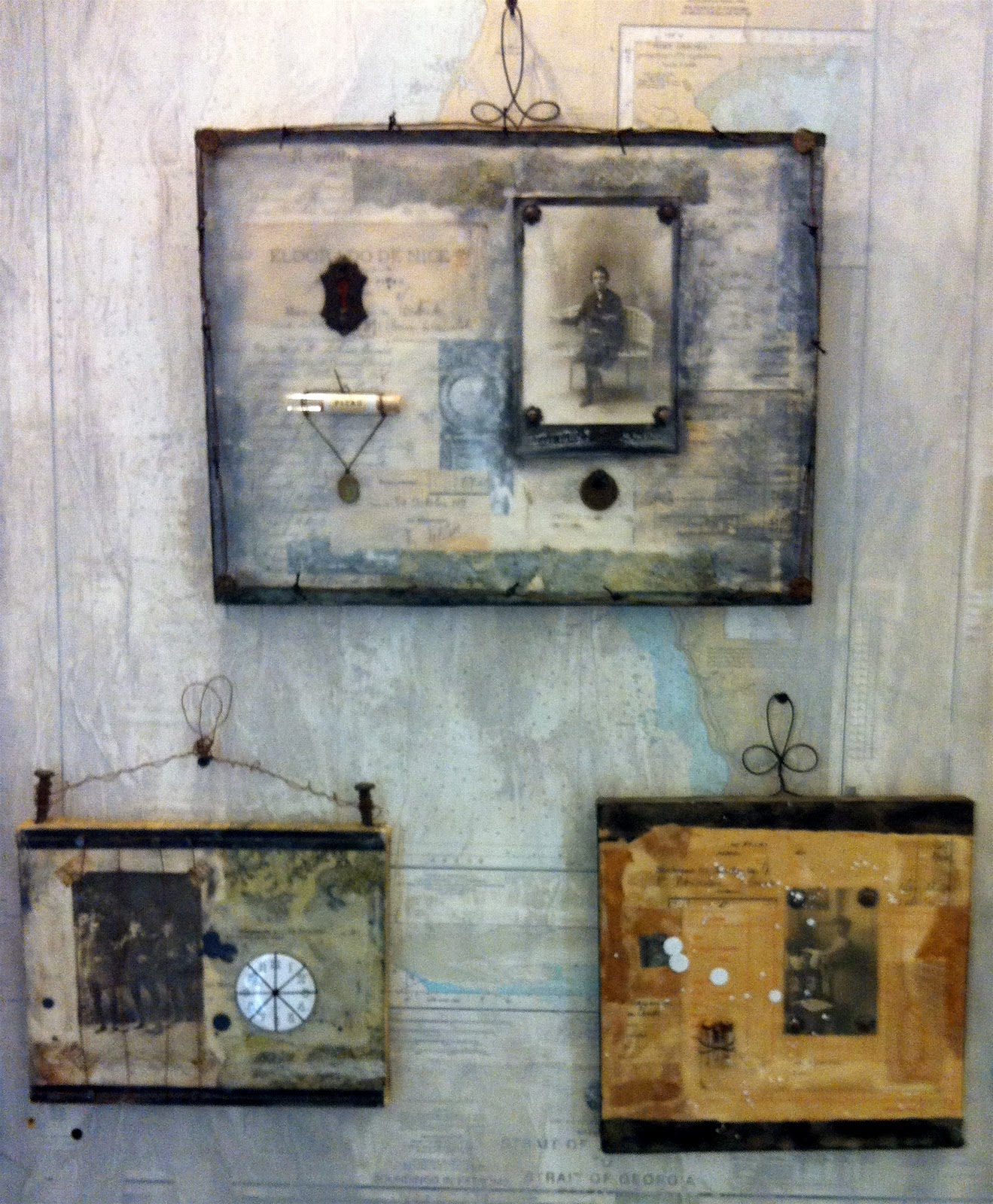
Why Foreman today, here, now?  We went to the Open Studios in the Arsenal in Benicia yesterday, and saw an artist there, Sharon Payne Bolton, whose work brings Richard Foreman's ideas to mind.  Her exhibition space is wallpapered with washed-over maps and fragments of French notebooks, and the art works (see the white-framed piece below) share shelf space with books, lasts for making shoes, lenses, glass bottles filled with vacuum radio tubes, rulers. The works themselves hold keys, or locks, or French papers from the 19th century (Bolton lived in France for a time) or small mechanical devices or waxed photographs:


We talked to Bolton about her similarities to Foreman, a writer she did not know, and about the ways her work can resonate with a viewer, because it is familiar, but not familiar, simultaneously. Her works are beautifully made (Bolton was a cabinetmaker, and her space is called "Cabinet of Curiosity"):


Each piece rewards continued scrutiny -- and holds the viewer in the present moment. Sharon Payne Bolton has created her own little world in each of her artworks:


If you can visit, do! If not, here is the artist's website: www.sharonpaynebolton.com