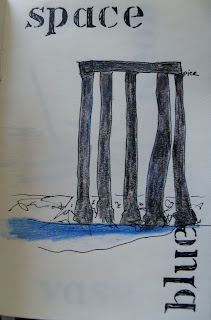
While I was working on the book for the Art House Co-op Fiction Project, several pages presented me with the question of how best to combine text and image. I had read, a long time ago, a critic who believed that even the labels next to paintings in museums and galleries distract from, and ultimately trump, the picture. When the two come together, text seems, to many of us, more important than image.
Illustration -- think of your childhood copy of Alice in Wonderland -- can be beautiful and can engage a reader. It is always something of a shock for children to begin reading more demanding books that don't have any pictures by John Tenniel or Maurice Sendak alongside all those newer, harder words. Alice even asks "What is the use of a book ... without pictures or conversation?" But, when I read a novel now, I don't want someone else's "illustration" of what they think Moll Flanders looks like ... (I am with Tristram Shandy, who leaves us a blank page so that we can conjure up our own Widow Wadman). I don't believe that mere illustration --- here is the description of the house in words, here is a drawing "faithful" to those same words --- is enough...because it can shut down the reader's own imagination (specifically, the picture-making part, to use a technical term). I think it might be useful to try ... for the adult imagination ... to combine words and pictures in a way that might wake us up.
I found a series of text & image pages in a sketchbook where I experimented. See what you think; can the images and the words pull away from each other in this way... usefully? imaginatively? pulling in, or pushing away, an audience?
(above: Beach rocks... Sea Gulls...)
(above: A pier with water, vs. an abstract reference to... sky?)
(above: Sand shovel and pail, vs. common household items)
What do you think?


No comments:
Post a Comment